|
|
|
Showing 121 - 130 of ~875 |
| Image |
Comment |
| 08/28/2012 10:16:32 AM | Jamesby kettleComment: While the man himself is rather interesting. The point of view and nasty ground bokeh are distracting. A B/W might have taken some emphasis off the grass. |  Photographer found comment helpful. Photographer found comment helpful. |
| 08/24/2012 01:04:01 PM | | | Photographer found comment helpful. |
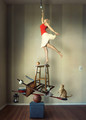
| 08/24/2012 12:43:22 PM | My Little Teapot by JudiComment: I'll be completely honest. I don't get it at all. It resembles a pumpkin tea pot with a human-plant-jesus planted inside. And why is it shattered?
If I may be so bold, if the objects were not made from fragments of the human body, it would be an otherwise terrible picture. I appreciate the imagination and work involved, but it doesn't do anything for me. Maybe that's purely because I can't figure out what it's trying to say. It don't see any message or story here. Just a jumble of random stuff.
However, whatever it is, it looks like it took a ton of work. I'd love to see more of an explanation of what you feel it is in your comments. Kudos for making the vast population stare in wonder! | | Photographer found comment helpful. |
| 08/23/2012 10:28:14 AM | El Vaqueroby FtWorthphotogComment: Congrats on the ribbon!!
I think this is potentially better than the other two. A candid smile like this is difficult!
Great job. Interesting processing, at first I wasn't so keen on it, but it grew on me. | | Photographer found comment helpful. |
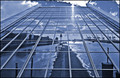
| 08/22/2012 03:50:41 PM | A Matter of Perspectiveby h2Comment: Awesome perspective, excellent explanation (it was as I expected in voting - should have commented!). Quite a crazy building, and kudos to you for finding an interesting view to shoot from. | | Photographer found comment helpful. |
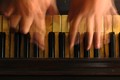
| 08/21/2012 03:08:53 PM | Life is like a piano... what you get out of it depends on how you play it.by p-chanComment: Greetings from the Critique Club!
My first take-away is the title in particular. Great title. So much meaning can be extracted from it.
Image wise, I like the concept. Obviously something hit voters well, as a 5.95 is in very good territory. Still, I think it could potentially be improved. When I first look at the image, to me it looks rather yellow. I decided to play with it a bit myself, and applied an auto-levels layer at about 70% opacity in photoshop. That seemed to cut off the overtly yellow hue, while not really disturbing the yellow aged look of the keys.
I like the composition. The horizontal layers work well together. There's a nearly abstract quality to it and I really like that you focused in on a unique viewpoint. I do think the out-of-focus lower section detracts from the image a bit. If that had been in clear focus, I think it could have brought out even more of an aged feeling to the image. In an image like this, I think that's what makes it. The piano is representing life. Life is full of stories, memories, etc. which are represented by the scratches, nicks, scrapes, and other patina that grow over the years of use. That very interesting bit of photograph are however rather obscured by the lens blur. I'm actually a bit surprised that at F8 on a DX body it wasn't more in focus. I'd suggest testing a few stops down, f11-f16 and see how that affects the blur. If nothing else, since it's advanced editing, you could stack two photos with the two different focus points to achieve the desired level of detail. Again, this is just thought. Detail there could completely ruin the photo, who knows!
As I stated before, I did import your photo into PS and started playing with it some. As an alternative to making the lower section in focus, I ended up cropping off 75% of the out of focus area. That became a very wide photo, and as I've found, wide crops don't do so well. So that leaves us with two options, both of which I felt were potentially stronger than your original image. (Keep in mind, it's just my opinion.) One option is to add in a letterbox frame. I think it helps emphasize the horizontality of the shot, and ensures the eyes aren't drawn out of frame by the bright hands. Option two is to crop off the left and right most of the frame. This crops off the pinky of each hand, but actually gives a very balanced image, in my opinion. Just enough visual information to let the viewer know what you're doing, while keeping the subject front and center. Of the two crop options, this may be my favorite as it emphasizes the abstract quality of the image.
Again, a great concept, and a nice execution! Looking forward to seeing more from you in the future!
Food for thought.
James Downing | | Photographer found comment helpful. |
| 08/21/2012 09:34:09 AM | Caldera Kittenby Samantha_TComment: I love the composition. Great little cute cat too. Nothing to possibly dislike about this image. | | Photographer found comment helpful. |
| 08/20/2012 04:08:14 PM | Hesitantby AmmieComment: Where was this? What's the background on this shot? Lots of stuff to tell here, wish there was more to your photo description. | | Photographer found comment helpful. |
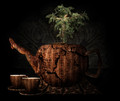
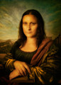
| 08/20/2012 10:30:10 AM | la giacondaby tangueraComment: Again, a great shot. I can't believe the amount of work that went into it... and to result in a lowish score... pity. I scored it an 8 for the effort involved.
Getting critical, the thing that annoyed me most was the processing on the hands. They look hairy, but I think you were going for the aged paint look. They stand out too much from the rest of the image.
If you can liquify and shrink the head a bit too, it would help. If you're going that far on the final edit, see if you can extend the chin a bit more too. (Or maybe just bring the neck back a bit) She has a bit of a manly pose right now, and with an extended chin position relative to the neck, it might assist in feminizing the pose more. | | Photographer found comment helpful. |
| 08/17/2012 12:48:35 PM | ReCycled Mosaicby banmornComment: Looks like this must have been an HDR of some sort? The image is way too even for my tastes. The foreground blends with the background way too much. There's no depth. You might have been able to pull this off with a wide aperture so as to blur the background out. Even then, the light feels too even. The depths of the image would look better if darkened somehow, at least to separate it. Crop off the bottom half of this image with your hand. See what I mean? The top half of the image is basically the same all the way across. Not meaning to be harsh here, but I figured you may want an honest opinion. | | Photographer found comment helpful. |
|
Showing 121 - 130 of ~875 |
Home -
Challenges -
Community -
League -
Photos -
Cameras -
Lenses -
Learn -
Help -
Terms of Use -
Privacy -
Top ^
DPChallenge, and website content and design, Copyright © 2001-2025 Challenging Technologies, LLC.
All digital photo copyrights belong to the photographers and may not be used without permission.
Current Server Time: 08/02/2025 07:03:20 AM EDT.
|