| Image |
Comment |
| 09/01/2012 03:41:37 PM |
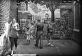
Everyone's Futureby LydiaComment: Interesting processing, but I do not understand the message. The lighting is a bit flat, except on one person, and ends up almost emphasizing her instead. |
 Photographer found comment helpful. Photographer found comment helpful. |
| 09/01/2012 03:38:08 PM |
|
| Photographer found comment helpful. |
| 09/01/2012 03:37:44 PM |
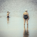
Spillby h2Comment: Quite appealing composition. The expression of concentration makes it. |
| Photographer found comment helpful. |
| 09/01/2012 02:03:42 PM |
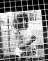
Gretelby posthumousComment:
Being fairly new to in-depth image critiquing, I'm excited to have been given one of yours to review. I know that when I see a posthumous comment, or a photo by posty himself, there's something different or deep to the image itself, and it probably deserves a second look at a minimum.
I could go through the normal critique path, but I don't think that's how you operate anyways. I could bring attention to the overexposed highlights, or bring attention to the crookedness of the image, or bring attention to the fact that portrait images never seem to do as well as landscapes. But none of that would really be applicable because they are probably calculated.
So, obviously my first objective was to refamiliarize myself with the old tale. I had forgotten about the part where the witch puts Hansel into a cage (it might be the not-so-kid-friendly version) and tries to fatten him up. Seems your image is reflecting on Gretel visiting her captive brother. Her innocence still cannot comprehend what evil the witch is planning for her brother. I think it goes quite well with the story, which I never doubted.
I love the uneven and skewed framing of this image. Something that's so easy for us to keep horizontal and aligned, and until you see it skewed, most minds wouldn't even consider the alternative options like this.
The composition really is quite superb and even, despite being disorienting. The eyes are at a perfect 1/3 in the frame, so the viewer is immediately drawn to them, while the hand is at the other, and immediately gets second glance. The Cartesian grid overlays offer a great balance. One being black and one being white, they complement each other, and don't get in the way of each other. The eyes are perfectly placed between grid marks, and further draws the viewers attention.
Now is where I get to criticisms. You make this part difficult. My first fuss is that it's a portrait. I know I already dismissed that as not being an issue, but to be honest, I wish I could see the whole image at once. As is, I have to scroll a bit and that detracts some from the ability to comprehend the entire composition at once. Maybe I just need a larger monitor if I'm going to critique images, eh?... My second and third criticisms have to do with the few minor elements that potentially distract some from the image. The vertical (lamp?) post in the background doesn't add much to the theme, and the pattern on the girl's dress also doesn't add much (although it does add some whimsey to the character).
A really interesting image. The composition, story, and the processing combine here into an image that deserves a second look to capture the true meaning behind it. While she is really just curious about a bunny, the theme and story behind the photo make it something more devious. Enjoyed it! Thank you for clicking the little check-mark and inviting me to review your image.
Food for thought.
James Downing |
| Photographer found comment helpful. |
| 08/31/2012 08:11:00 AM |
Who Invited The Black Guy?by VenserComment: I think an innuendo could have worked, but your title might be a bit too obviously racial - which I would imaging may hurt you. A title like "what am I doing here?" might have been more appropriate. Still, I enjoy it enough. |
| Photographer found comment helpful. |
| 08/31/2012 08:08:20 AM |
Ready to drive....by ELLIPSComment: A very strange land indeed. Looks like terrible traffic. :) The image almost looks like a selective desat, but apparently everyone just chooses the same cars and colors there. |
| Photographer found comment helpful. |
| 08/29/2012 10:46:58 AM |
She's coming homeby MichaelCComment: This is a truly great portrait. Perfect focus, interesting composition, and a somewhat unplanned and unposed look to it. Really wonderful. |
| Photographer found comment helpful. |
| 08/29/2012 10:14:28 AM |
|
| Photographer found comment helpful. |
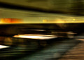
| 08/29/2012 10:11:04 AM |
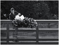
The 4:10 Outboundby sfaliceComment: A really nice shot. Great lines, but I do not like the bokeh in the foreground. Looks rather strange for some reason. |
| Photographer found comment helpful. |
| 08/29/2012 07:07:32 AM |
|
| Photographer found comment helpful. |
Home -
Challenges -
Community -
League -
Photos -
Cameras -
Lenses -
Learn -
Help -
Terms of Use -
Privacy -
Top ^
DPChallenge, and website content and design, Copyright © 2001-2025 Challenging Technologies, LLC.
All digital photo copyrights belong to the photographers and may not be used without permission.
Current Server Time: 08/01/2025 09:15:23 AM EDT.