| Image |
Comment |
| 11/11/2003 02:17:10 PM |
Embracing Wrenchesby DCThiessenComment: Very cool subject. You picked the perfect set of wrenches to use, as there are no unsightly measurements or designs inscribed on the surface. The color is perfect, the aspect is perfect, but the shadow in the lower right corner...what is that? it totally detracts attention from the texture and impact of the design. it's gotta go. You were borderline, but I gave you 7 because, if you look at it now, isn't it glaring? |
 Photographer found comment helpful. Photographer found comment helpful. |
| 11/11/2003 01:41:10 PM |
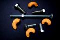
Nuts and Boltsby SMW409Comment: Creative, but ultimately not up to par. You might start by utilizing the space better and photographing your subjects from interesting perspectives. Let's be honest: the straight-on camera angle makes this photo boring. |
| Photographer found comment helpful. |
| 11/11/2003 01:39:06 PM |
enoughby claudiadfComment: It's cool, but it needs work. Keep trying to capture this image using different techniques, perspectives, design elements. Aim the stream of water differently, maybe. Water splashes can be beautiful, or they can just get in the way. Yours gets in the way. |
| Photographer found comment helpful. |
| 11/11/2003 01:34:05 PM |
Spice up your lifeby timmiComment: It's more suited for a cookbook, but I do like the colors. The downfall of this picture is the background. Not only is it wrinkled (seeminly accidentally), but it's boring altogether. Here we have the spice, nuts, and grains of the earth. Well the background is anything but earthy. |
| Photographer found comment helpful. |
| 11/11/2003 01:30:23 PM |
Cracked Heartby ParentxComment: A very contrived scene. But it works, I guess. I really have no other comment, I'm just not a huge fan of this kind of photography. |
| Photographer found comment helpful. |
| 11/11/2003 01:29:42 PM |
Pairby dsidwellComment: This just gives me the wrong vibe. I love the detail you used, the black and white film, the shadow. I just can't put a meaning to this picture, and I don't find it particularly beautiful. There are different perspectives, different spatial patterns that can be used to convey a sense of beauty. |
| Photographer found comment helpful. |
| 11/11/2003 01:25:28 PM |
Country Livin'by Spanish_GreaseComment: Upon further dissection, I'm gonna give you a 7. This really does feel like sunrise in the country. I think that, after spending so much time making comments to this challenge, I though your apples were tomatos, and that made no sense whatsoever to me. Keep trying; the submissions to this challenge were excellent, and this isn't on par with the 10s, 9s, or 8s. But you've definitely got it in you. |
| Photographer found comment helpful. |
| 11/11/2003 01:23:29 PM |
Champagne Was Korbel...by basia03Comment: good filter. i'm not too crazy about the whole dinnerware setup (centerpieces aren't meant to be photographed), but you've got a good sense of design. This photo needs more clarity, better resolution. Textures go a long way when applying monotone filters. Texture goes a long way regardless, actually. |
| Photographer found comment helpful. |
| 11/11/2003 01:18:03 PM |
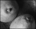
Apples and Pearsby catpixelComment: The leaf on the apple...it's just bad. In fact, the whole front apple is out of focus. This shot has ultimate potential because of its rustic nature, but you've got to concentrate more on detail and clarity.
...and get rid of that leaf. |
| Photographer found comment helpful. |
| 11/11/2003 01:09:15 PM |
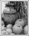
Untitledby byetkoComment: Kudos for using black and white...it so classicly captures this picture; it gives it it's own story. This picture is very good, but it could stand to gain from changes in contrast. All the objects (and there's a lot of them) have very similar color patterns, except for this urn. Exploit that. Make the blacks blacker and the greys lighter, without washing out the whole picture. You'd get more gnarly pumpkins, more delicate cornstalks, and a more weathered urn. |
| Photographer found comment helpful. |
Home -
Challenges -
Community -
League -
Photos -
Cameras -
Lenses -
Learn -
Help -
Terms of Use -
Privacy -
Top ^
DPChallenge, and website content and design, Copyright © 2001-2025 Challenging Technologies, LLC.
All digital photo copyrights belong to the photographers and may not be used without permission.
Current Server Time: 08/17/2025 06:01:06 PM EDT.