| Image |
Comment |
| 12/19/2004 01:59:20 AM |
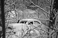
Brokenby Dim7Comment: not sure, but i'm guessing the broken part of the image here is what looks like either a strangely shaped fallen tree or (much more likely) an abandoned car. however, not sure most people will catch this - a different angle might have emphasized this aspect of the photo better. good colors/contrast however. |
 Photographer found comment helpful. Photographer found comment helpful. |
| 12/19/2004 01:57:16 AM |
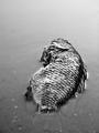
Circle Of Lifeby faidoiComment: interesting. not sure i like the negative space at the top, or the close cut to the tail at the bottom - perhaps a different angle. texture is great, and so is the contrast. |
| Photographer found comment helpful. |
| 12/19/2004 01:55:41 AM |
Broken But Not Beatenby KaralewComment: interesting use of this common subject - if you want to use one light source however, i would prefer to have it illuminating the broken side of the egg, its insides, and the pan rather than the untouched/unbroken side. possibly including the entire egg would be beneficial as well. |
| Photographer found comment helpful. |
| 12/19/2004 01:54:13 AM |
No! Not the HB!by ursulaComment: great idea, with some humor included as well. two suggestions: one, the two shadows is semi-distracting (just for normal situation/reality purposes) - it does happen, but in this case it just reminds me that it's a setup shot with (i'm guessing) two lights shining on the pencil. two, get a newer and smoother textured pencil (and maybe sharpen it as well) - texture is sometimes interesting, but a smooth texture would appeal more to me here. still, a good shot and worthy of a solid score. |
| Photographer found comment helpful. |
| 12/19/2004 01:49:59 AM |
Shattered Thoughtsby KDOComment: interesting. i feel the gradation to black is a little too sudden for my tastes, but this is a good idea and an interesting twist on this common subject. |
| Photographer found comment helpful. |
| 12/19/2004 01:49:09 AM |
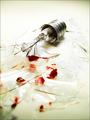
Oopsby scottwilsonComment: oh no - hate it when that happens. perhaps less lighting on the hand would help improve this interesting shot... or if you're feeling daring, i have an inkling that a very shallow DOF that only keeps the cork in focus would work quite well here (if that's possible - i realize everything is at a relatively equal distance from the camera) |
| Photographer found comment helpful. |
| 12/19/2004 01:44:46 AM |
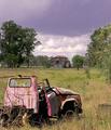
Neglected and Run Downby HeavyComment: interesting, but purple hue of the sky gives it a look that i'm not sure is best for this image. perhaps a darker/rustier looking hue/saturation modification for the truck would work wonders. |
| Photographer found comment helpful. |
| 12/19/2004 01:43:51 AM |
Fortune and Misfortuneby Keith ManiacComment: haha - interesting. maybe a rearrangement of the middle cookie (it seems to remove some attention away from the fortune) combined with slightly less DOF. |
| Photographer found comment helpful. |
| 12/19/2004 01:42:26 AM |
Broken Stemby DCThiessenComment: i like your choice of alignment. so far it's the only 'orderly' broken glass that i've seen in the challenge, which makes it interesting. choice of a cool-toned background color also provides the 'calm' environment that helps fit with this orderly arrangement. well done. |
| Photographer found comment helpful. |
| 12/19/2004 01:38:50 AM |
Scene from my Nightmareby nico_blueComment: intense. normally i would say it looks overexposed, has a color cast, and some vignetting - but they all seem to give it a unique look that is appealing this time around. |
| Photographer found comment helpful. |
Home -
Challenges -
Community -
League -
Photos -
Cameras -
Lenses -
Learn -
Help -
Terms of Use -
Privacy -
Top ^
DPChallenge, and website content and design, Copyright © 2001-2025 Challenging Technologies, LLC.
All digital photo copyrights belong to the photographers and may not be used without permission.
Current Server Time: 08/05/2025 03:03:22 AM EDT.