DPChallenge: A Digital Photography Contest You are not logged in. (log in or register
 
Browse Settings
Currently viewing:
Registered Userbrianlh

Show comments:

Per page:

Order:

Comments:


Comments Made by brianlh
Pages:   ... ... [67]
Showing 421 - 430 of ~664
Image Comment
Feed me!
12/29/2004 12:57:56 AM
Feed me!
by snackwells

Comment:
underrated - i guess cuz of the people aspect. i like the background - blue could've worked too, if it was light enough to not 'blend' with the fish.
Photographer found comment helpful.
so windy
12/28/2004 10:52:23 PM
so windy
by Halim

Comment:
This comment comes courtesy of the Critique Club :)

The first thing that strikes me here about this image is that it is full of motion. It definitely depicts 'Wind' well. Where it falls short, however, is some of its technical aspects. Color rendition could have been a little better - possibly editing this in some kind of graphics program, or exposing a little differently at the time of the shot (the main thing is that it seems a little dark - the whites on the US flag aren't quite as white as they could be in this image).

Other small things - the branches in the foreground are slightly distracting (and the sign in the background) - especially due to their static nature. This could be a great shot if you eliminated some of the distracting elements and possibly brought the exposure level up a notch or two.
Photographer found comment helpful.
The Warrior Princess
12/28/2004 07:18:32 AM
The Warrior Princess
by totaldis

Comment:
given that the two subjects overlap, i wish the boy was maybe slightly more out of focus (or that it was shot at a diff angle). just a matter of personal taste. i do like the profile shot and the crop on the boy.
Photographer found comment helpful.
Gentle Breeze
12/27/2004 03:06:57 PM
Gentle Breeze
by thommo

Comment:
This comment is provided courtesy of the Critique Club :)

You've been fortunate enough this far to have already received a few insightful comments, so some of this will sound familiar.

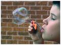
First looking at the image, I can't help but think that the composition here is quite solid. The boy's closed eyes convey a relaxed mood, which is appropriate for a playful image like this. I think your choice of a straight-on profile shot probably works much better than if you had approached this at an angle, as it leaves plenty of room for separation and distinction between the boy and the bubbles, and potentially the background.

I do not think the background is too distracting, as it gives the image a schoolyard feel. However, to address some of the comments you have received, it perhaps might have been advisable to try to throw it slightly more out of focus. Since you used an aperture of 4.5 here, I don't see you necessarily being able to lower that without possibly losing some sharpness in the foreground. Moving yourself and the subject further away from the wall may have been an option.

You've nailed the timing, catching the bubbles at just the right moment. The slight blur in the bubbles could (depending on the viewer) be interpreted as a good way to convey motion and action (especially contrasted against the stillness of the boy). Others yet may prefer a stiller image to capture the exact 'moment', although I think that it would give it more of an artificial feel.

The main thing here that I think holds room for improvement is, like others mentioned, the coloring of some areas on the subject's skin and hair, which occasionally appear to have a bluish-green tint. I have an inclination to believe that this probably was not in the original shot (though I may be wrong), and may actually be due to your use of Auto-features that you mention in your description. While these auto features can sometimes make an image better, they can also sometimes interpret things incorrectly and create problems. In the future, you might find it more advantageous to perform all the post-processing 'manually' without the auto feature.

Overall a great shot, and anything seen with room for improvement is nothing that can't be performed/fixed in photoshop - possibly via Layer Masks for the background and some Adjustment Layers for the Color Balance (may want to mask this as well, to avoid affecting the color in the bubbles).

Message edited by author 2004-12-27 15:16:04.
Photographer found comment helpful.
I'm Going Slightly Mad
12/27/2004 04:44:47 AM
I'm Going Slightly Mad
by Tranquil

Comment:
lol, great title. i love the tonal contrast and texture here.. i think the choice to use b&w was probably a very good one. wish it was maybe slightly more straight on, but what's a person gonna do.
Photographer found comment helpful.
Homage to Jacko & Rackat
12/27/2004 01:11:56 AM
Homage to Jacko & Rackat1st Place
by hughletheren

Comment:
from your description:
"In the unlikely event that it does well, I will explain further some of the lessons learned."

i guess you have some explaining to do!
Photographer found comment helpful.
Sunset from Iberville, Qc, Canada
12/25/2004 04:14:22 PM
Sunset from Iberville, Qc, Canada
by nicklevy

Comment:
strong silhouettes and beautiful colors
Photographer found comment helpful.
Torn by the Wind
12/25/2004 04:11:36 PM
Torn by the Wind
by Sandymaya

Comment:
beautiful picture - severly underrated (i'm guessing if it were a different challenge, you may have scored much better)
Photographer found comment helpful.
Let There Be Life
12/25/2004 03:56:57 PM
Let There Be Life
by Tranquil

Comment:
great find. i would've liked to have seen this possibly with a greater DOF (to span the entire scene) if possible, since the focus here seems to bring our attention to the plant.. which, i just realized might work well if (judging by your title) the Life of the plant is what these rays are bringing/offering - in this case, it works well the way it is. If, however, the plant was more to offer a foreground interest, a great DOF would probably be called for.
Photographer found comment helpful.
This Just In! Summer's Here...Relax...
12/25/2004 03:52:05 PM
This Just In! Summer's Here...Relax...
by Tranquil

Comment:
i really like your choice to have the focus begin in the hammock, rather than the ropes leading into it. this helps us look straight into the inviting hammock, and then the ropes leading out bring us into the beautiful and serene surroundings that we can enjoy while we lay there. if you're on a stock photo site, you may want to try uploading this one.
Photographer found comment helpful.
Pages:   ... ... [67]
Showing 421 - 430 of ~664


Home - Challenges - Community - League - Photos - Cameras - Lenses - Learn - Help - Terms of Use - Privacy - Top ^
DPChallenge, and website content and design, Copyright © 2001-2025 Challenging Technologies, LLC.
All digital photo copyrights belong to the photographers and may not be used without permission.
Current Server Time: 08/05/2025 11:23:07 AM EDT.