| Image |
Comment |
| 07/22/2005 12:08:11 AM |
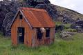
Still Standingby DeniseBernadetteComment: i like the idea of the old tree. i think your composition only went half way. i could see things working if you juxaposed it against those brand new homes as a way of showing it wouldn't go away or showing it alone with the other old building, but not doing both. |
 Photographer found comment helpful. Photographer found comment helpful. |
| 07/21/2005 11:33:40 PM |
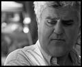
My houseby biggisComment: good showing of independence. though it has a snapshot feel to me. wonder if there was a way to get another angle where perhaps there was just his silouhette in the window for a bit more artistic impression. just thought how it would have been cool to have him walking up to the front door with a briefcase like he was coming home from work...i know i'll stop now. |
| Photographer found comment helpful. |
| 07/21/2005 11:28:31 PM |
"Love for my Country"by bcobleComment: interesting perspective. though not very compositionally appealing for me. would have been cooler if the star section was shaped more like a heart...it looks more like a clog or the outline of one of those goldfish snack crackers. you seem to have some coloring problems in the upper right and under the stars...kind of curious what caused that. |
| Photographer found comment helpful. |
| 07/21/2005 11:23:30 PM |
Going My Wayby bucketComment: wonderful colors. maybe just too much leg...it feels like you've unintentionally cut off her feet...perhaps you had. i'm thinking cropped right at the knee and this shot would be perfect...but what do i know, i'm sure it will do well as is. just realized why i really like this shot...the way her arms mimic the sides of the roads...nice work. |
| Photographer found comment helpful. |
| 07/21/2005 11:15:58 PM |
Indy Thinkerby fulgentComment: damn paparazo...nice candid. perhaps some unavoidable grain from enlargement? i guess his buddy wasn't that important...unfortunately his moustache got in the way. |
| Photographer found comment helpful. |
| 07/21/2005 10:57:57 PM |
Princess Audreyby Man_Called_HorseComment: i think you've done a great job of capturing her head strongness. many probably won't like the soft focus on the face...i find it very intriguing, once again adding to the personality of the shot. i think that asphalt line could have been problematic, but your choice of composition has handled it well...i find it very complementary to her eyes. |
| Photographer found comment helpful. |
| 07/21/2005 10:36:33 PM |
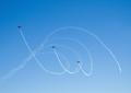
A Celebration of Freedomby NodeComment: at first i was concerned the last plane was a bit lagging. but the more i look, the more I enjoy the fact that his position breaks up the monotony of the shot...well maybe not. anyway perhaps a bit more saturation or contrast could have helped pump up this shot a bit for me. |
| Photographer found comment helpful. |
| 07/21/2005 10:32:15 PM |
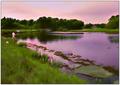
Fisherman at Duskby Bear_MusicComment: nice composition and feel to this shot. i wish the colors were a bit more subdued. perhaps a nice warm colored duotone would really enhance the feeling of the moment. but what do i know i've never done duotone coloring before. the leading line to the fisherman is quite nice as well. the more i look, the more that stick in the foreground bothers me...perhaps you could have broke it off...i'll stop now. |
| Photographer found comment helpful. |
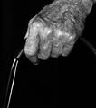
| 07/21/2005 10:24:42 PM |
Out And About Againby lshlesComment: great idea. i want to really like this, but i'm having alot of trouble with being up too close and having the walker missing a side. i think this might have worked better at this angle with a cane...not that you had those kind of options at your disposal. i'm seeing straight on with both hands on each side in sharp focus and the subject blurred in the background. but it is your art, so good job it got me to stop and think. nice focus btw. |
| Photographer found comment helpful. |
| 07/21/2005 10:17:46 PM |
More Alternativesby KatheComment: good crisp focus. unfortunately, it brings out alot of what appears to be dust issues. i would have liked to not have the main subject upside down as it makes it hard to look at for me. he looks like he staring off in a longing sort of way. perhaps you could have used that in a composition to more inhance your point, other than just all of the currency itself |
| Photographer found comment helpful. |
Home -
Challenges -
Community -
League -
Photos -
Cameras -
Lenses -
Learn -
Help -
Terms of Use -
Privacy -
Top ^
DPChallenge, and website content and design, Copyright © 2001-2025 Challenging Technologies, LLC.
All digital photo copyrights belong to the photographers and may not be used without permission.
Current Server Time: 08/05/2025 12:38:53 AM EDT.