| Image |
Comment |
| 07/30/2005 11:21:56 PM |
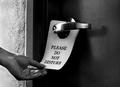
Privacy Pleaseby kmbr2001Comment: interesting take. i would have thought to show the hand from the inside placing the sign on the door...but perhaps that's a bit cliche. really like your toning. |
 Photographer found comment helpful. Photographer found comment helpful. |
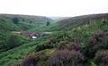
| 07/30/2005 11:19:54 PM |
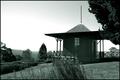
A Room With a Viewby datcatComment: good clarity. i'm left wondering if you could have found another compositon without the grass in front and the tree on the right and with a stronger view of the mountains. perhaps it wasn't possible...but i'm still left wondering. |
| Photographer found comment helpful. |
| 07/30/2005 11:16:27 PM |
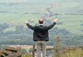
Space-A-Plentyby barbaraanneComment: good focus. i'm wondering if a tighter composition or daring him to get up on those rocks would have even improved the vastness feeling by removing all of the stuff at the bottom of the pic. |
| Photographer found comment helpful. |
| 07/30/2005 11:11:05 PM |
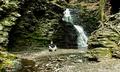
My Cornerby MinstrelComment: cool location. nice focus for the longer shutter. the colors seem kind of bland. probably not much you could do with overcast light. maybe converting to b/w would have strengthened it for me. i would have cropped a bit more down on the left side as the bright rock and the moss seems to grab a bunch of attention and pull my eye off of the main interest |
| Photographer found comment helpful. |
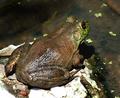
| 07/30/2005 11:03:36 PM |
Amphibian Denby vtruanComment: like that i can feel the slimy texture of his skin. flash ended up a bit hot on his back and the rock. would have been a bit more personal if the guy was looking at the camera. the shadow under his head is a bit distracting as well. |
| Photographer found comment helpful. |
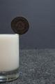
| 07/30/2005 11:01:28 PM |
Room To Dunkby MarkBComment: good focus. not sure i like the 2 textured background. and it kind of looks like a carpet which would be a strange place for a glass of milk. not sure i get how there's any room to dunk as the milk looks like it couldn't be fuller. would also make the milk a bit more appealing if it was drunk down a bit, perhaps adding a little froth might help as well. it kind of looks like a big block of elmer's glue as is. |
| Photographer found comment helpful. |
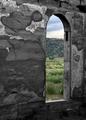
| 07/30/2005 10:55:26 PM |
With A Viewby SammieComment: nice texture. nice contrast between inside and out. would have liked to see the window from more of a straight on pov if possible. |
| Photographer found comment helpful. |
| 07/30/2005 10:53:39 PM |
|
| Photographer found comment helpful. |
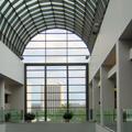
| 07/30/2005 10:48:58 PM |
Atriumby BikerGregComment: i really like how the outside building mimics the lines of the inside room. i wish the background was a bit darker. with the strong contrast between the outside and the inside window panels you could have probably done some nice looking selective leveling on it if you so chose. |
| Photographer found comment helpful. |
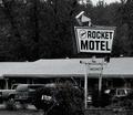
| 07/30/2005 10:40:14 PM |
...By The Hour.by tsheetsComment: cool feel with the grain. i really feel like i'm in the car with the photographer scoping things out. |
| Photographer found comment helpful. |
Home -
Challenges -
Community -
League -
Photos -
Cameras -
Lenses -
Learn -
Help -
Terms of Use -
Privacy -
Top ^
DPChallenge, and website content and design, Copyright © 2001-2025 Challenging Technologies, LLC.
All digital photo copyrights belong to the photographers and may not be used without permission.
Current Server Time: 08/05/2025 02:38:33 AM EDT.