| Author | Thread |
Comments Made During the Challenge  |
|
|
08/05/2005 10:44:58 AM |
|
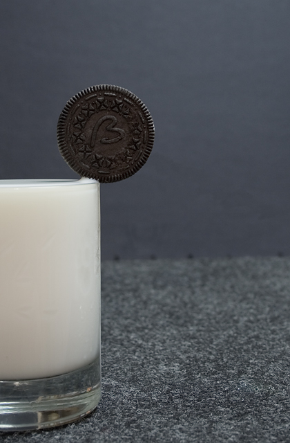
Oh man....cookies are my weakness. Nice DOFand the comp work well for me here. I really like the texture of the surface under the glass. it adds to this photo. |
|
|
|
08/01/2005 06:13:30 PM |
|
Nice balance ;) great fun shot good job! 10 |
|
|
|
07/31/2005 12:52:05 PM |
|
Remarkable composition, just wish the lighting wasn't so flat. |
|
 Photographer found comment helpful. Photographer found comment helpful. |
|
|
07/31/2005 08:53:59 AM |
|
need better foregrouind and background |
|
| Photographer found comment helpful. |
|
|
07/31/2005 12:06:37 AM |
This is a super idea and a very well executed picture. Is that skim milk? It looks a bit watery to my eye. I wonder if full cream would have made a better picture. Probably wouldn't have helped in the post-shot cleanup though... yech.
Also, I just read a little tutorial on fixing horizons. If you are interested, it is in the tutorials section of this website. I feel this picture would have benefitted from a minor rotate. |
|
| Photographer found comment helpful. |
|
|
07/30/2005 11:01:28 PM |
|
good focus. not sure i like the 2 textured background. and it kind of looks like a carpet which would be a strange place for a glass of milk. not sure i get how there's any room to dunk as the milk looks like it couldn't be fuller. would also make the milk a bit more appealing if it was drunk down a bit, perhaps adding a little froth might help as well. it kind of looks like a big block of elmer's glue as is. |
|
| Photographer found comment helpful. |
|
|
07/30/2005 03:49:16 PM |
|
|
|
07/30/2005 03:33:54 PM |
|
Nice balance, tighter crop with a better background would be good. |
|
|
|
07/30/2005 01:46:01 PM |
|
Cool! Nicely done. What did you attach the cookie to? Maybe the title could use a question mark ... :) |
|
|
|
07/30/2005 12:49:18 PM |
|
not bright enough... the milk is not white. and the background is not flattering |
|
|
|
07/30/2005 11:56:03 AM |
|
i don't like the background, cool idea though |
|
|
|
07/30/2005 09:16:48 AM |
|
|
|
07/30/2005 09:16:06 AM |
|
Clever! How did you get that to stay? It's a good idea but the colours and lighting in the actual photo are a bit dull I think. |
|
|
|
07/30/2005 01:15:10 AM |
|
I'd love to know how you achieved this look. |
|
|
|
07/30/2005 12:51:35 AM |
|
How'd you balance that?? I love the composition and use of negative space. Really good. |
|
|
|
07/30/2005 12:44:10 AM |
|
|
|
07/30/2005 12:33:29 AM |
|
|
|
07/30/2005 12:11:40 AM |
|
ha! great and very original. i only wish the lighting was a little better, seems a little bland. maybe more contrast would have helped. 8 |
|
| Photographer found comment helpful. |
Home -
Challenges -
Community -
League -
Photos -
Cameras -
Lenses -
Learn -
Help -
Terms of Use -
Privacy -
Top ^
DPChallenge, and website content and design, Copyright © 2001-2026 Challenging Technologies, LLC.
All digital photo copyrights belong to the photographers and may not be used without permission.
Current Server Time: 06/30/2026 08:47:01 AM EDT.