| Image |
Comment |
| 08/01/2005 06:36:41 PM |
The Only Place I am Kingby bruskiComment: i like the lens you've chosen, and your lighting is interesting. i wouldn't want to be the next guy in after someone had to use up the super duty roll on the right. |
 Photographer found comment helpful. Photographer found comment helpful. |
| 08/01/2005 06:32:21 PM |
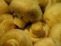
Not Mush-ROOMby benhurComment: i used to have a computer science teacher that always quipped to "not be a mushroom". Of course it did get old at some point. But still, this image holds a special place in my heart for that. Unfortunately your focus is way too soft unless you were going for something hallucinegenic. And those black specs and the white balance doesn't add to their appetizingness. Anyway thanks for the memories. |
| Photographer found comment helpful. |
| 08/01/2005 06:15:22 PM |
|
| Photographer found comment helpful. |
| 08/01/2005 06:11:21 PM |
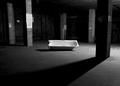
Bath ~ Roomby MatthewComment: nice mood. i really like that strong shadow cutting across the frame. perhaps just a bit too much on the left as that left column steals some unwarranted attention and messes with some really nice balance i feel without it. |
| Photographer found comment helpful. |
| 08/01/2005 06:06:31 PM |
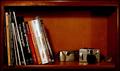
Room to Growby ShutterPugComment: i would have liked to see more light on the right side of the image. your left side is very clear and i can read all the titles, but i can't tell what kind of camera you have. also maybe the problem for that is your focused on the book and you have a shallow depth of field, perhaps setting back would have given you greater dof or else closing your aperture and using a tripod. a final note...as i bet your tired of me by now...your choice of border doesn't seem to do its job. i choose borders that accentuate my subject. in this case, silver would have been an easy choice to bring more attention and tighten the image around the cameras and the photoshop binding. |
| Photographer found comment helpful. |
| 07/31/2005 06:53:21 PM |
The chatroomby andriComment: what a well conceived idea...thank you, as they are so few and far between. this is a fantastic photo...don't get me wrong...but what would be really killer would be having each model experiencing a different type of emotion based on their fictional discussion...but then again i don't chat much...so maybe everyone has that expression when they im :) for me, nice work nonetheless. |
| Photographer found comment helpful. |
| 07/31/2005 06:44:02 PM |
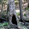
Room Enough for One.by HighwayFlowerComment: good idea. background's a bit blown. i would have shot for the hole being totally black and that might have toned things done a bit. what would be really funny is having someone standing inside the tree and just seeing their legs. since they couldn't fit, maybe you could doctor up something that looked like legs and feet...just a thought |
| Photographer found comment helpful. |
| 07/31/2005 06:37:57 PM |
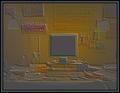
Office Perspectiveby banmornComment: cool take on the challenge and a super crisp picture. i like the pristine, cold feeling you've created with the white balance it feels almost like an operating room. the composition itself feels kind of cluttered to me. that first desk looks very intriuging with the number and the lone keyboard and all that white counter space. concentrating on that and calling it cubicle with this lighting would be an idea i would explore further. |
| Photographer found comment helpful. |
| 07/31/2005 06:31:21 PM |
Workroom addictionby TitiaComment: personally i like the idea. i think you should have stopped at just making a negative of the original, which i still believe conveys the feeling and keeps it a bit more real and related back to photography. this filter is a bit over the top for this site. |
| Photographer found comment helpful. |
| 07/31/2005 06:25:43 PM |
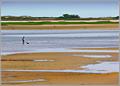
Room to Themselvesby Bear_MusicComment: i really like all the lines moving throughout the pic. i know it's probably going a bit too far but i wonder what it would look like if you converted it to have just 2 main colors. the green just feels overpowering to me, and just a single blue and sand color would allow the sky to merge into the water... maybe too artistic looking. nice capture as it stands. |
| Photographer found comment helpful. |
Home -
Challenges -
Community -
League -
Photos -
Cameras -
Lenses -
Learn -
Help -
Terms of Use -
Privacy -
Top ^
DPChallenge, and website content and design, Copyright © 2001-2025 Challenging Technologies, LLC.
All digital photo copyrights belong to the photographers and may not be used without permission.
Current Server Time: 08/05/2025 04:57:51 AM EDT.