| Image |
Comment |
| 02/01/2006 10:12:14 PM |
Dreamy gazeby isonajComment: nice expression. seems a bit soft and muted. most likely an extremely difficult shot with the long shutter. perhaps even a bit too long as the candle is a bit over exposed |
 Photographer found comment helpful. Photographer found comment helpful. |
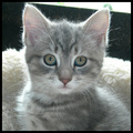
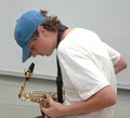
| 02/01/2006 09:51:35 PM |
Ready to play!by kteachComment: After a second look, the details in the face are quite nice, especially the eyes. I feel the wide angle takes away from them. With all that detail, I bet you could have cropped down to just around the eyes and mouth and would have gotten alot more second looks. |
| Photographer found comment helpful. |
| 01/25/2006 10:28:30 PM |
|
| Photographer found comment helpful. |
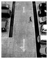
| 01/25/2006 09:28:26 PM |
Just Let Her Cryby KaDiComment: this and the one above it in the competition are just missing a third to complete the series. i am really on board with what you were going for (except the hootie and the blowfish part ;)). for me a little was lost due to the car taillights, but i suppose that really wasn't an option for consideration in an open challenge. nice submission |
| Photographer found comment helpful. |
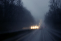
| 01/25/2006 09:20:41 PM |
Blue Nights on the Highwayby theMilkManComment: i'm not sure i agree with hotpasta in that anyone could take this shot. i don't know how many shots you took, but it looks like you either got very lucky or spent some time chosing this one. that overpass and that headlight on the left adds alot of interest to the composition for me. the lighting is also quite well controlled. nice job Message edited by author 2006-01-25 21:21:57. |
| Photographer found comment helpful. |
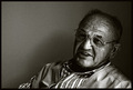
| 01/25/2006 08:00:09 PM |
Good old daysby skyoneComment: really nice tones. i get the feeling he's relaying a story to someone, i just wish there was something more than just the barren wall to help set the scene. |
| Photographer found comment helpful. |
| 01/25/2006 07:56:45 PM |
Sixteenth Restby auntek 3Comment: good focus. a bit overexposed as the white of the shirt is a bit too hot and pulls the eye away from his face. perhaps another angle could have avoided the wall molding that cuts through the center? |
| Photographer found comment helpful. |
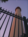
| 01/25/2006 07:54:30 PM |
Guiding Lightsby jrjrComment: interesting angle. i like how the composition leads up to the moon. at first i thought the leaves might help frame the shot, but the more i look, the more i like the sky less cluttered. |
| Photographer found comment helpful. |
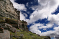
| 01/25/2006 07:52:17 PM |
Mountain Manby striderx77Comment: at first i didn't like how the composition was perfectly split between rock and clouds, but the more i look the more i'm warming up to their strange juxtaposition. very vibrant. I do wish the subject was a bit more visible. |
| Photographer found comment helpful. |
| 01/25/2006 07:45:52 PM |
Frog's Delightby hyperfocalComment: i really like how the cutout in the clouds mimics the cut out in the reeds. the lighting is very intriguing and the ir or whatever processing you did definitely helps. The blur of the reeds seems awkward as it is only on the tips over the water. perhaps it added interest. |
| Photographer found comment helpful. |
Home -
Challenges -
Community -
League -
Photos -
Cameras -
Lenses -
Learn -
Help -
Terms of Use -
Privacy -
Top ^
DPChallenge, and website content and design, Copyright © 2001-2025 Challenging Technologies, LLC.
All digital photo copyrights belong to the photographers and may not be used without permission.
Current Server Time: 08/07/2025 04:05:21 AM EDT.