| Image |
Comment |
| 02/05/2006 11:14:07 AM |
|
 Photographer found comment helpful. Photographer found comment helpful. |
| 02/05/2006 11:10:18 AM |
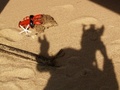
a lobster "tale"by dolphnz8Comment: looks like you put some time into this setup, but it's too small for me to figure out what is going on. i like how the top has been squared off. i'm left wondering... |
| Photographer found comment helpful. |
| 02/01/2006 11:09:49 PM |
Pete and Wendyby PedroComment: nice tones, interesting composition. excellent sharpness. i like the brick background, but the image seems to favorite it more than necessary by showing so much at the top |
| Photographer found comment helpful. |
| 02/01/2006 11:00:48 PM |
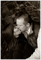
I love herby anaperaltaComment: very sensual, kind of like "The Kiss" closeup. i wish this wasn't so soft, and had a bit more contrast to give it a bit more edge. |
| Photographer found comment helpful. |
| 02/01/2006 10:53:27 PM |
"Love Is....."by JudiComment: great idea. the sky is obviously quite dramatic. i would have liked the silhouettes true black or with a bit more detail. he seems hesitant to her advance. Not sure if this was your original intent, but it adds a strange air of tension to the pic, that I don't believe suits it. that said...don't listen to me I'm sitting at a low 4 and this should do well. |
| Photographer found comment helpful. |
| 02/01/2006 10:45:54 PM |
Young at Loveby Man_Called_HorseComment: like the colors. I see this doing well...funny thing is, he seems really quite indifferent to her advances...not exactly romantic. But, I think your image is the perfect commentary on how men and women view romance differently, even more so with younger men. |
| Photographer found comment helpful. |
| 02/01/2006 10:33:00 PM |
|
| Photographer found comment helpful. |
| 02/01/2006 10:31:15 PM |
Little Romeoby CookieMonsterComment: cute kid with cute expression...i think i looked a bit too long and noticed his nostrils |
| Photographer found comment helpful. |
| 02/01/2006 10:29:04 PM |
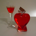
Love Potionby AnmitsuComment: nice idea. seems a bit unintentionally grainy and soft. would be really cool if we could see that steam a little better...but I know how hard that is to do. i really like that light source on the right which is balanced quite well in the reflections. The cork on it's current angle seems awkward and doesn't help the composition for me. |
| Photographer found comment helpful. |
| 02/01/2006 10:24:05 PM |
Heartbeatsby adyusComment: like the soft dreamlike effect, but the contrast seems almost too high. my eyes are having trouble focusing on something. I wish the eyes and heart didn't compete so much for my interest. Perhaps I'd like this more if the crop was tighter on one of them. |
| Photographer found comment helpful. |
Home -
Challenges -
Community -
League -
Photos -
Cameras -
Lenses -
Learn -
Help -
Terms of Use -
Privacy -
Top ^
DPChallenge, and website content and design, Copyright © 2001-2025 Challenging Technologies, LLC.
All digital photo copyrights belong to the photographers and may not be used without permission.
Current Server Time: 08/06/2025 09:45:12 PM EDT.