| Image |
Comment |
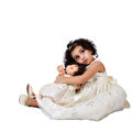
| 05/16/2010 05:31:04 PM |
2 Dollsby AmeedEl-GhoulComment: you've done such a good job of concealing the background, she looks cut out...perhaps that's the effect you were going for. -8 |
 Photographer found comment helpful. Photographer found comment helpful. |
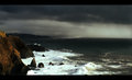
| 05/16/2010 05:27:36 PM |
Contrastby Prime_TimeComment: aptly titled. i like the negative space, but i also wish i could see more details in the building-8 |
| Photographer found comment helpful. |
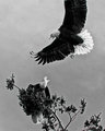
| 05/16/2010 05:24:53 PM |
Conflict 2by jbsmithanaComment: dramatic capture. at first i thought it was too bad you lost the wing, and that it hurt the overall composition. but perhaps it does well to mimic the continuation of the tree. a bit over-sharpened as the edges are haloing for me. and i've decided to go with too bad you lost the wing ;) -8 |
| Photographer found comment helpful. |
| 05/16/2010 05:19:01 PM |
|
| Photographer found comment helpful. |
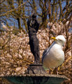
| 05/16/2010 05:17:35 PM |
what have you got on your head by steve100Comment: yes the bird appears to be very curious about the statue. i like how the statue has its own aloof personality by facing away and appearing to ignore the inquisitiveness of the bird. -9 |
| Photographer found comment helpful. |
| 05/16/2010 05:14:50 PM |
Carleneby pkingmiComment: in a set shot you are responsible, in my mind, for needing to get every detail under your control. you need to be aware of the contrast of that stick and the shadow falling on her as they both feel unintended and don't help strengthen your composition-8 |
| Photographer found comment helpful. |
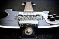
| 05/14/2010 10:22:15 AM |
Home after three weeks of touring..by MaartenvanastComment: Originally posted by smardaz:
all critique can be helpful, i notice you only marked the compliment as helpful.....You can't be surprised that the voters saw a shot of a guitar and didn't think of team sports? |
Unfortunately, only one of the comments actually had to do with the technicals of the photo. This will always be the problem with the site in that it focuses too much on parameters. Based on your details I can see why only 1 comment was useful. For me, compositionally the guitar strap connector is kind of annoying. I like the gritty nature of the photo, it feels road weary, but I think it might have been more interesting if you tried to incorporate more of the environment to help solidify the tour concept or the returning home concept. And sports being pastimes and a band being a team isn't really that much of a stretch for someone with an ounce of creativity to make, so it is even more ridiculous that people would feel the need to focus on what this photo isn't about. Unfortunately that is the governing mindset here. How'd the tour go? Message edited by author 2010-05-14 10:23:09. |
| Photographer found comment helpful. |
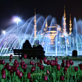
| 05/13/2010 12:53:21 AM |
Sultanahmetby mwwbackComment: Let's talk turkey ;)...actually I don't have much to say. It's an interesting shot with the 4 different layers. It feels all mashed together for me though. i assume that is from a big zoom. Maybe if you chose 1 layer to focus on and left the others a bit more abstract, i'd be more drawn into this scene.-8 |
| Photographer found comment helpful. |
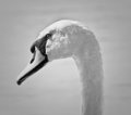
| 05/13/2010 12:45:42 AM |
Portrait of a swanby hojop25Comment: i think the choice of b/w might be enhancing the over exposure at the top. perhaps you were going for a more elegant look with the desat...feels forced to me. your focus needs to be tighter on that bill-8 |
| Photographer found comment helpful. |
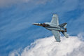
| 05/13/2010 12:28:21 AM |
Wild Blue Yonderby dahvedComment: cockpit controls could use a bit more focus...the altimeter feels a bit fuzzy to me ;) -8 |
| Photographer found comment helpful. |
Home -
Challenges -
Community -
League -
Photos -
Cameras -
Lenses -
Learn -
Help -
Terms of Use -
Privacy -
Top ^
DPChallenge, and website content and design, Copyright © 2001-2025 Challenging Technologies, LLC.
All digital photo copyrights belong to the photographers and may not be used without permission.
Current Server Time: 08/02/2025 03:35:07 AM EDT.