| Image |
Comment |
| 11/23/2003 09:57:58 PM |
Dim Bulbby adineComment: Good Shot. I like the contrast. Focus is excellent. I feel like it's missing something though. It feels a little bland. - 8 - |
 Photographer found comment helpful. Photographer found comment helpful. |
| 11/20/2003 09:10:49 PM |
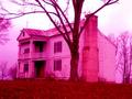
Our Children's Heroes?by jpb323redComment: This photo is small, a bit grainy, and has a reddish tint to it that I don't care for. I do like the message. After a second look, I'm going to raise my vote 1 point.
|
| Photographer found comment helpful. |
| 11/19/2003 11:02:37 PM |
Communionby ellamayComment: I still think this should have won. I love this photo. |
| Photographer found comment helpful. |
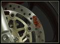
| 11/19/2003 06:52:28 PM |
Jam on the Brakesby NatatorComment: This shot is great. Bravo on the creativness.. and the willingness to either put jelly on your bike, or the ability to convince someone else to allow you to do it to theirs.
I do wish the focus as a bit more on the jam but over all, excellent shot. |
| Photographer found comment helpful. |
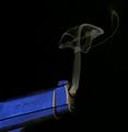
| 11/19/2003 06:51:01 PM |
Smoking Gunby QuadrajetComment: Very creative. Wonderful delivery. Composition is great. Clearity, foucus are excellent. Way to Go. |
| Photographer found comment helpful. |
| 11/19/2003 06:50:01 PM |
You drive me nuts by darixComment: I like this shot. IT is sharp, crisp, creative, lighting is excellent. Good Job
|
| Photographer found comment helpful. |
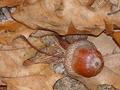
| 11/19/2003 04:42:17 PM |
Mighty oaks from tiny acorns growby amsmythComment: Many comments on this photo.
I like the idea. I think you could have done a lot more with it.
The colors seem flat, perhaps because you used flash?
I think if you had spent a little more time setting this up the result would have been profound.
This is a very loose literalism. I am sure you have seen the other examples within the challenge.
Keep up the good work. Your composition is good. I do like how the acorn is off centered right |
| Photographer found comment helpful. |
| 11/19/2003 04:38:36 PM |
Walk a mile in my shoes...by WILDBLUEComment: I have thought about this photo for a couple of days. I like the concept, just not keen about the delivery. I feel a literalism photo should shout the literalism at you, without needing a title for support.
With this title, I would have preferred to have seen something along the lines of a small child in daddy's shoes or something more illustrative of the title, theme, or idea you are trying to portray.
The photo is not a bad one, it just seems cold, and unrelated to the challenge and loosely related to your title.
|
| Photographer found comment helpful. |
| 11/19/2003 04:30:35 PM |
Looking at History through Rose Colored Glassesby jpb323redComment: I do not care much for this photo. Although the idea is a good one, I think I may have liked it better executed differently. I find the magenta a little harsh.
There seems to be a tilt here that is not very pleasing to me. Also, photo is a little small to judge focus. And Lastly, This may have been more interesting with a different angle and composition. |
| Photographer found comment helpful. |
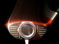
| 11/19/2003 12:33:44 AM |
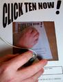
CLICK TEN NOW!by PaulkComment: Roflol! How can I resist!?
Great example of Propaganda. Lighting is a little harsh(ish) If it weren't for that, I would give you a 10. Will ya settle for an 8?? |
| Photographer found comment helpful. |
Home -
Challenges -
Community -
League -
Photos -
Cameras -
Lenses -
Learn -
Help -
Terms of Use -
Privacy -
Top ^
DPChallenge, and website content and design, Copyright © 2001-2025 Challenging Technologies, LLC.
All digital photo copyrights belong to the photographers and may not be used without permission.
Current Server Time: 07/31/2025 03:37:11 PM EDT.