| Image |
Comment |
| 10/17/2013 09:35:19 AM |
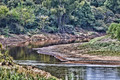
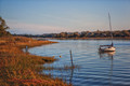
A Bend in the Riverby moondogComment: I like this shot and think it could have worked really well, but it's a little too harsh for my liking. A little too much on the tone mapping, IMHO.
The title is fitting. The colors are nice.
A little softer look and I would have scored it higher.
Gave it a 6 |
 Photographer found comment helpful. Photographer found comment helpful. |
| 10/17/2013 09:34:26 AM |
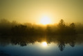
The Sun Also Risesby MarfunComment: I absolutely love the reflections in the water in this shot. The fog that's around the trees gives it a mysterious feel.
This shot would have worked in the Sun-something challenge as well.
Fitting title. Great colors. Well done. Gave it a 6, but bumping to a 7 |
| Photographer found comment helpful. |
| 10/17/2013 09:33:21 AM |
Esperanza Corderoby odriewComment: I really enjoy the softness of this photo.
The colors give it a vintage/retro feel.
Never heard of the title.
Gave it a 6 |
| Photographer found comment helpful. |
| 10/17/2013 09:32:44 AM |
|
| Photographer found comment helpful. |
| 10/17/2013 09:32:17 AM |
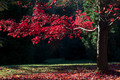
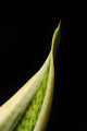
The Secret Gardenby giantmikeComment: I love the red burst of colors.
There is nice DOF and detail.
I almost feel as if I walk into the darkness behind the foreground, I would enter a Secret Garden.
As a child, I really loved that book.
Nice work. Gave it a 6 |
| Photographer found comment helpful. |
| 10/17/2013 09:31:19 AM |
Exit Music by Ian Rankinby MAKComment: Good title.
The angle is a little too steep for me. But I like the DOF and the detail that's involved.
Gave it a 6 |
| Photographer found comment helpful. |
| 10/17/2013 09:30:33 AM |
|
| Photographer found comment helpful. |
| 10/17/2013 09:29:57 AM |
The Old Curiosity Shop-Charles Dickensby MonaComment: The way that you've angled and how the sign takes up the majority of the window space makes me wonder what's in there. So the title fits the image well, or the other way around. Whatever.
Anyways.
I like the contrast of the red and blue as well.
Nice shot.
Gave it a 6 |
| Photographer found comment helpful. |
| 10/16/2013 12:44:42 PM |
Kafka's "The Castle"by RyanWComment: I like what you've chosen to depict your title.
I like the angle of the shot. But it seems it's missing something to make the photo truly pop.
Gave it a 6 |
| Photographer found comment helpful. |
| 10/16/2013 12:43:54 PM |
|
| Photographer found comment helpful. |
Home -
Challenges -
Community -
League -
Photos -
Cameras -
Lenses -
Learn -
Help -
Terms of Use -
Privacy -
Top ^
DPChallenge, and website content and design, Copyright © 2001-2025 Challenging Technologies, LLC.
All digital photo copyrights belong to the photographers and may not be used without permission.
Current Server Time: 07/30/2025 06:23:14 PM EDT.