| Image |
Comment |
| 12/07/2012 09:52:48 AM |
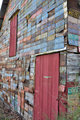
BarnTag-7by DamonComment: I think I would have scored this image higher... simply because of the perspective. The angle it's shot at gives the barn a more 3D look. Also, I love the hanging license plate about to fall off on the upper right of the shot.
I gave your entry a 6. I think I would have given this one (with the right processing) an 8 or higher. |
 Photographer found comment helpful. Photographer found comment helpful. |
| 12/07/2012 09:45:00 AM |
Head in the Cloudsby LydiaComment: I like the concept of this shot. The head, in proportion to the body, looks overly large, like a bobble head. lol
It seems, however, that there is not much focus in the shot. The only focus I am seeing at all is the iris of her eyes (and did you do PPing on the color/detail? It looks really good!)
I would have liked to had seen a little more focus on her face, and perhaps soften it a touch...
Also, the bright lighting on the bottom right corner of the shot makes the floor appear washed out. Maybe a little spot editing to darken this area? Just my opinions.
But overall, great capture.
Will come back to vote. :) |
| Photographer found comment helpful. |
| 12/07/2012 09:41:37 AM |
Black and the Catby AmmieComment: I like the colors of this shot... how the cat and the wall are harmonious together.
However, my only issue with the shot is that the brick wall seems a little too blurred. I would of liked to had seen a little more focus there.
Proportionally, I think the shot was done well.
Coming back to vote. |
| Photographer found comment helpful. |
| 12/07/2012 09:39:40 AM |
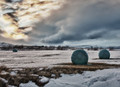
In the proportion of πr² by PaulComment: BEAUTIFUL shot.
I'm not usually a fan of landscape shots. But... there's something different about this photo.
I really like the softness. As well as the bright colors in the sky on the left side.
The horizon looks a little odd... and I know that it's a hilly area, so it's how the land is laid... but did you try straighten the photo at all? I'm not sure if that would help out thought?
The only other critique is that that snow covered mountain top on the right of the photo seems to disappear into the sky... perhaps a little burn or spot editing to that area?
I guess if viewers are looking quickly and voting without taking the time to study the photograph, they would miss it... so not sure it would make that much of a difference to the average voter? Just a thought, however. :)
Overall, I really like this image.
Right now, I'm giving it a 7. :) |
| Photographer found comment helpful. |
| 12/07/2012 09:30:58 AM |
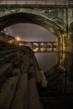
Steps & Archby NikonJebComment: Beautiful shot! Love the "grunge" appearance. Wonderful PPing choice for this image.
Before looking at the title, I saw proportion between the two sets of arches.
After reading the title, I'm a little thrown off, which is why I'm not going to let the title affect my judging on the quality of the photo.
One of the things I don't like about this photo is what is at the top of the arch. I'm assuming that's rails or something of that nature? I'm thinking that it would have been better if you would of cropped that area out. Other than that, I like the processing, the starburst effect on the lights, the darkness of the photo... it all blends well together.
Nicely done! One of my highest voted in the challenge (so far). An 8 |
| Photographer found comment helpful. |
| 12/07/2012 09:27:25 AM |
Out of Proportion by jovan91Comment: LOVE this shot. The reflection, the DOF, the bright pop of the neon green!
My only complaint is that it appears slightly tilted. Had it been straighter, I would have given it a 9.
But I'm still giving it an 8.
So far, one of my highest voted in the challenge. :) |
| Photographer found comment helpful. |
| 12/07/2012 09:26:00 AM |
Big and smallby hajekaComment: I like the lines in the shot... the different angles...
however, it does look a little over saturated? Not sure if you adjusted the saturation or not, but it seems a bit much, IMO.
It does shot a nice portrayal of proportion however. :) |
| Photographer found comment helpful. |
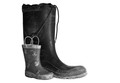
| 12/07/2012 09:22:46 AM |
Proportionby wejoeyComment: Nice portrayal of proportion.
Some edges of the boots seem a little soft... but overall, I really like the cleanness (minus the dirt on the boots, lol) of the shot.
Well done. |
| Photographer found comment helpful. |
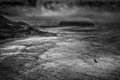
| 12/07/2012 09:21:29 AM |
Condor, Clearing Storm, Point Sur by Bear_MusicComment: Beautiful photograph!
I love the rich dark blacks with the light hitting the water in different areas. The fog/mist adds a bit of "feeling" to the photograph.
The bird (condor?) adds a nice dramatic touch to the photograph, a stark darkness where there is light.
It also gives the viewer the concept of proportion, as the bird is so small in this vast area!
Great capture. |
| Photographer found comment helpful. |
| 12/05/2012 10:42:18 AM |
U-Turnby onarComment: there's a curve like this right down the road from us. tho not nearly as pretty as this one.
great shot. Love the colors! |
| Photographer found comment helpful. |
Home -
Challenges -
Community -
League -
Photos -
Cameras -
Lenses -
Learn -
Help -
Terms of Use -
Privacy -
Top ^
DPChallenge, and website content and design, Copyright © 2001-2025 Challenging Technologies, LLC.
All digital photo copyrights belong to the photographers and may not be used without permission.
Current Server Time: 08/05/2025 01:56:08 AM EDT.