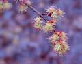
SpringTimeby
kandyjComment: Greetings from the Critique Club!
The colors here are just lovely, and they represent Spring beautifully. The purple background is very nice, but not so much as to be distracting. I am curious about what is the bg comprised of, but that's besides the point. Your depth of field (dof) is good, and sufficient to blur the bg enough to make the subject stand out. A slight improvement would be to have the foreground subject just a little sharper, but it is within the bounds of acceptable in my opinion.
The exposure is good, allowing great visibility of the subject.
The composition is strong, with a good diagonal lead line.
Post processing is fine, with no visible artifacts or noise.
As for meeting the challenge, well....in my mind's eye it's sort of a stretch, and as someone mentioned, a play on words, but it comes in close. I wouldn't personally have consdidered this as a "time" picture for my own submission, but in a very broad sense, it is.
Overall, I like this photo. It's very pretty and you did a good job capturing it. Keep up the good work! :-)
Regards,
Grayce