| Image |
Comment |
| 04/29/2008 04:09:17 PM |
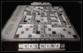
Oh No, Not Boardwalkby GreatJobBobComment: I think the title kind of ruined the image in this case. By calling out Boardwalk, I would then expect to see the token on that square and the square in the focal plane. (Oops, looking back I noticed that you rolled a two, hence then focus on the dice and the title). |
 Photographer found comment helpful. Photographer found comment helpful. |
| 04/29/2008 01:41:05 AM |
|
| Photographer found comment helpful. |
| 04/29/2008 01:41:01 AM |
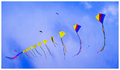
Big Boys Kiteby JimiRoseComment: I am a bit thrown off by the rotation of this image. I would expect the line of kites to go from the bottom up as opposed to top done. I am still debating as to whether it is simply disorienting or an interesting perspective that I have yet to open my mind to. I will pass on voting and come back to it later with a fresh mind. |
| Photographer found comment helpful. |
| 04/29/2008 12:32:00 AM |
America's Pastimeby acoppolaComment: Strong vibrant colors, nice use of depth of field to emphasize the pitcher, crisp clean focus, excellent composition, and a great expression on his face. A very well done image. |
| Photographer found comment helpful. |
| 04/29/2008 12:28:59 AM |
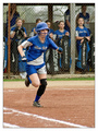
The Sprint To Firstby JeniYComment: The subject is de-emphasized by being placed against the teammates in the background. I would prefer to see her against a uniform background such as the field so that there is a clear definition of the subject. Alternatively, reducing the depth of field so that the dugout is heavily out of focus would also work nicely. |
| Photographer found comment helpful. |
| 04/29/2008 12:25:30 AM |
|
| Photographer found comment helpful. |
| 04/29/2008 12:20:48 AM |
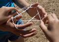
Cat's Cradleby snsComment: Leaving the torso and legs of one of the players takes a lot away from the composition. I think the image would be better with a top down view showing only hands, string, and ground. |
| Photographer found comment helpful. |
| 04/29/2008 12:18:42 AM |
|
| Photographer found comment helpful. |
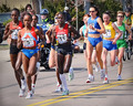
| 04/29/2008 12:02:44 AM |
The Road to the Olympic Gamesby bassboneComment: The lighting is a bit harsh and the background is cluttered, taking away contrast from the subjects. Perhaps by taking the photograph while the were passing through the shade of a trees or a bridge could have improved the lighting. As far as the clutter, narrowing the field to just one or two lone runners would make it easier to ensure a clear definition between the subjects and the background. |
| Photographer found comment helpful. |
| 04/28/2008 11:59:25 PM |
Lookin Sweetby RamblinRComment: I have nothing negative to say about the photograph itself as far as technical merit. It is all very well done, lit, and composed. Subject wise, however, I would have gone with a straight flush instead of four aces. Basically, the king, although needed to complete the hand, doesn't play any role. With the straight flush, all the cards would have had a meaning. |
| Photographer found comment helpful. |
Home -
Challenges -
Community -
League -
Photos -
Cameras -
Lenses -
Learn -
Help -
Terms of Use -
Privacy -
Top ^
DPChallenge, and website content and design, Copyright © 2001-2025 Challenging Technologies, LLC.
All digital photo copyrights belong to the photographers and may not be used without permission.
Current Server Time: 08/27/2025 02:23:36 PM EDT.