| Image |
Comment |
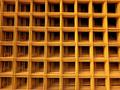
| 05/07/2004 01:19:23 PM |
Squaresby GabrielComment: The lighting on this is superb. I love the simplicity of the composition. It borders on abstraction just enough to keep me interested, but not so interested that I'm searching for a "subject". The dark squares in the upper right seem to cascade into lightness in the lower right, which draws my around the frame nicely. Great work. |
 Photographer found comment helpful. Photographer found comment helpful. |
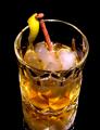
| 05/07/2004 12:27:23 PM |
Rusty Nailby drgsoellComment: This is nice, but I think a few things could have made it great. First, it would have been nice to see good, clean ice that doesn't look fresh out of the ice tray in your freezer. The composition is weighted too heavily in the center of the frame. If you'd have cropped some of the bottom out, it would have been a stronger image. The lemon peel, though perhaps accurate to the drink recipe, takes away from the comedy of an actual rusty nail being thrown in the glass. It just looks out of place to me. Lastly, I wouldn't have put the glass on a mirror...it confuses the eye and makes the glass seem distorted near the bottom. Still, I give it a 6. |
| Photographer found comment helpful. |
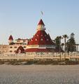
| 04/29/2004 02:02:37 PM |
Hotel Del Coronadoby CDSComment: Not seeing a real representation of proportion (or lack thereof) here. The shot could be more interesting if the circular portion of the hotel was filling the entire frame. The inclusion of the other elements on the beach in the photo takes away from the interest of the main subject. |
| Photographer found comment helpful. |
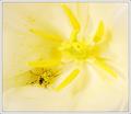
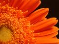
| 04/29/2004 01:59:58 PM |
Heart of a Flowerby BobsterLobsterComment: DOF could definitely be longer in this shot to get all of the flower in focus. The black of the beetle makes a nice contrast to the yellow pollen. Good work. |
| Photographer found comment helpful. |
| 03/29/2004 07:41:48 PM |
Sunkistby GringoComment: This image will not likely score very highly, which is a shame. It's so hard to pull off a good DOF with this kind of shot but you have done it. Also, the difficulty of getting a proper exposure in the harsh light of midday has been overcome adroitly. The ever-so-slight slant in the composition adds interest, while the blurry background prevents the abundance of flora from being overwhelming. Good work. |
| Photographer found comment helpful. |
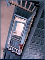
| 03/29/2004 05:13:03 PM |
Adieu!by ndsComment: Orange? Not a bad picture, but it simply has not met the requirements of the challenge. Is the persons shirt orange? I can't tell on my monitor. I'll give it a 5 because it's a decent composition with overall good lighting and effect. If only those stairs were orange instead of blue! |
| Photographer found comment helpful. |
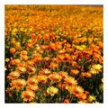
| 03/29/2004 04:53:37 PM |
Navel Orangeby sherComment: Fantastic. I've always wanted to do this shot, but I have neither the talent for setting up such perfect lighting, nor the eye to know how close is too close. You've managed to capture an orange flower in this open challenge and do it without being cliche, do it creatively, and do it without resorting to unoriginal sponaneity. I only wish the center of the flower had a little more punch...more color. 9. |
| Photographer found comment helpful. |
| 03/29/2004 04:49:30 PM |
Santa Fe Updraftby jperez1690Comment: Brilliant. Sometimes the subject just presents itself and sometimes, as in this photo, the photographer seeks it out with the deference and fortitude of a master. You have managed to combine two fantastically composed photographs into one without any great feat of technical ability, just a well-trained eye. 10, 10, 10, 10...plus one. |
| Photographer found comment helpful. |
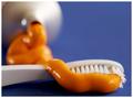
| 03/29/2004 02:33:28 PM |
Opps, wrong tube!by cabaComment: Interesting idea. I wish it was lit a little more, um, clinically I guess (?). Something about it just seems off. I think I like the DOF, so that's not it. I definitely like the placement of your subject and how the tube in the background is out of focus, but still can be identified. Maybe I'm looking for more contrast in the toothbrush, something to make it pop a little bit. I give it a 7. |
| Photographer found comment helpful. |
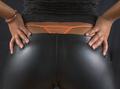
| 03/29/2004 02:26:21 PM |
Orange is the color of fashionby stevelenzComment: Great shot! I particularly like how the dual light source provides a symmetry to the shot. The bracelet, thong, and the fact that the shirt exposes the waist tell us about the woman in this shot and who she might be. The black background helps to keep the focus in the middle of the shot, but it might have been interesting to lighten it up a bit so we could make out her curves. Still, I really like this shot, technically. It's a 10 in my book. |
| Photographer found comment helpful. |
Home -
Challenges -
Community -
League -
Photos -
Cameras -
Lenses -
Learn -
Help -
Terms of Use -
Privacy -
Top ^
DPChallenge, and website content and design, Copyright © 2001-2025 Challenging Technologies, LLC.
All digital photo copyrights belong to the photographers and may not be used without permission.
Current Server Time: 08/26/2025 12:13:54 AM EDT.