| Image |
Comment |
| 12/04/2003 11:31:25 PM |
Flipin' My Family "the bird"by joannadivaComment: Good colors and tones for the bird. I think the composition could have been improved by getting rid of distractions like the counter behind, and maybe providing a wonderful context like a fully set table with flowers and the bird as the centerpiece. |
 Photographer found comment helpful. Photographer found comment helpful. |
| 12/04/2003 11:29:55 PM |
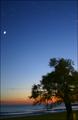
Thanks for this world!by AlexysComment: Wonderful light and good "thanks" message.
Technically, I think this might have worked better as a landscape. I find too much space at the top above the moon, and overall too much blue sky. Also, I note that the horizon is tilted. I think it would have been better with enough DOF to have the tree sharp as well. |
| Photographer found comment helpful. |
| 12/04/2003 11:23:07 PM |
My daughterby KevinRiggsComment: Good shot of your daughter, I think you could have given it more impact by a different crop. The arm is distracting, so it might have been a good one to try a "real crop chop" and use part of her face and head. Sometimes that works really well, or maybe you had another shot wiithout the hand. Moving her off center would halp too (and that would happen with the crop.) |
| Photographer found comment helpful. |
| 12/04/2003 11:21:08 PM |
Thank you!by SharQComment: ? There are so many natural and truly important things to be thankful for-- but it's your thanks.
I find the shallow depth of field doesn't work well for me here. There just doesn't seem to be much to the photo, and it doesn't work aesthetically because of the DOF and upper left glare, at least for me. |
| Photographer found comment helpful. |
| 12/04/2003 11:17:35 PM |
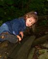
My Little Explorerby delarimanComment: Cute shot. I would suggest cropping the top to make her even more significant in the frame and put her head in the top 1/3.. Also, she's very nicely lit, but the surroundings could be a bit brighter. |
| Photographer found comment helpful. |
| 12/04/2003 11:15:57 PM |
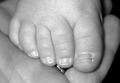
Little Piddiesby Spork99Comment: Good idea, and well done. Did you consider having for the foot coming in at an angle compositionally, and did you try a softer focus? I think that might have improved it personally, Little feet are soft, but the sharpness here makes this look adult. Also, the ring showing through would have been better if not there, and even for sharp focus, the lighting is a bit harsh and reflective. |
| Photographer found comment helpful. |
| 12/04/2003 11:12:20 PM |
|
| Photographer found comment helpful. |
| 12/03/2003 11:05:34 PM |
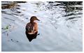
Duckby faidoiComment: I scored this above average but it might have done better if larger FYI. |
| Photographer found comment helpful. |
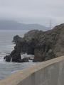
| 12/03/2003 11:02:00 PM |
Overcast skyby faidoiComment: I don't like the wall here, but I don't think the shot has enough compositionally without it either. Might have worked better in landscape withouut the wall, or move to a better location with better view of the GG bridge (Not a voter here, just offering some feedback). |
| Photographer found comment helpful. |
| 12/03/2003 01:56:42 AM |
|
| Photographer found comment helpful. |
Home -
Challenges -
Community -
League -
Photos -
Cameras -
Lenses -
Learn -
Help -
Terms of Use -
Privacy -
Top ^
DPChallenge, and website content and design, Copyright © 2001-2025 Challenging Technologies, LLC.
All digital photo copyrights belong to the photographers and may not be used without permission.
Current Server Time: 08/29/2025 02:51:49 AM EDT.