| Image |
Comment |
| 08/08/2004 11:12:34 PM |
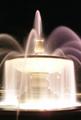
Splish Splashby CoreyLanComment: This looks like a very good fountain shot--really smooth water! But it's too small to see much here. The crop seems too extreme--the sides of the fountain are important here, and the crop is otherwise too tight. all around. Perhaps you were trying for a macro effect, but a macro effect isn't the same as a tightly cropped photo--you need to be closeup or show fine details of the image that you would only see if you were closeup. |
 Photographer found comment helpful. Photographer found comment helpful. |
| 08/08/2004 11:06:20 PM |
Mmmmm.... Lunchby bmatt17Comment: I love the angle here, and the effect of the moving tongue. His eyes and more of his head should really be in focus though. |
| Photographer found comment helpful. |
| 08/08/2004 11:05:01 PM |
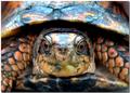
box turtleby shutterflyComment: Well composed and good sharpness and color. It would have been good to try and avoid the glare on the top of his head and shell -- maybe a polarizer would have helped. I think a bit more DOF would have been good too. |
| Photographer found comment helpful. |
| 08/08/2004 11:00:41 PM |
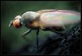
Quit Bugging Meby KonadorComment: This is one of the prettiest bug macros--what it lacks in sharpness and detail it makes up in aesthetics. |
| Photographer found comment helpful. |
| 08/08/2004 10:30:29 PM |
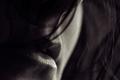
Lipsby sahkoComment: This has fantastic aestheics. Great use of black and white, great camera angle, etc. I am not sure it can compete against the bugs which are "screaming" macro, but you have my vote as one of the best. |
| Photographer found comment helpful. |
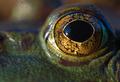
| 08/08/2004 09:59:47 PM |
Quite a Lookerby GatorguyComment: Amazing detail and great color. However, to me this misses compositionally, even though the eye is in the sweet spot for the rule of thirds. The problem, to my eye, is that the detail is "increasing" with the folds to the right, and yet it's cropped off there. Just looks to me here that if the eye were in the upper left sweet spot it would work better. Also, the brighter area in the back left distracts a little. |
| Photographer found comment helpful. |
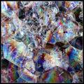
| 08/08/2004 09:55:59 PM |
Rainbow Loopsby annasenseComment: Very nice color scheme. It's quite simple, but also effective. Seems to have a lot of noise hought--maybe jpeg artifacts, and this takes away from all the interesting texture. |
| Photographer found comment helpful. |
| 08/08/2004 09:47:35 PM |
Intersectionsby MickComment: Wonderfully different and very beautiful. Makes a great abstract--I wonder if the macro impact might have been greater though if you limited the scope a little more--it's busy for a macro (but works well aesthetically anyway).. |
| Photographer found comment helpful. |
| 08/08/2004 09:45:59 PM |
|
| Photographer found comment helpful. |
| 08/08/2004 09:45:05 PM |
wallpaperby binkyat3Comment: Beautiful color and overall work. I hope you also have this in 16 bit color; I bet there are many more gradations and variations in this beautiful capture. Well composed as well. |
| Photographer found comment helpful. |
Home -
Challenges -
Community -
League -
Photos -
Cameras -
Lenses -
Learn -
Help -
Terms of Use -
Privacy -
Top ^
DPChallenge, and website content and design, Copyright © 2001-2025 Challenging Technologies, LLC.
All digital photo copyrights belong to the photographers and may not be used without permission.
Current Server Time: 06/21/2025 02:13:57 AM EDT.