| Image |
Comment |
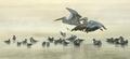
| 11/08/2004 09:24:04 AM |
Fog Boundby duncesComment: Great capture--one of my favorites from the challenge. |
 Photographer found comment helpful. Photographer found comment helpful. |
| 11/07/2004 08:42:58 PM |
|
| Photographer found comment helpful. |
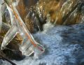
| 11/07/2004 05:43:31 PM |
First frostby mijakComment: The magical light and reflections here make this look like a drawing! It would be nice to tame the highlights on the stick itself though (I realize it's the ice, but it falls right on the stick). |
| Photographer found comment helpful. |
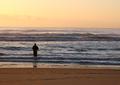
| 11/05/2004 08:50:51 AM |
The Fishermanby dhareComment: Nice colors and scene! You might want to straighten it though, the horizon is not level. Also, it might be possible to bring out more detail in the sky (clouds) by using a copy of this layer, blended to multiply (and perhaps masked to the sky). |
| Photographer found comment helpful. |
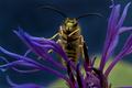
| 11/04/2004 09:02:09 PM |
The Waspby spydrComment: Perhaps the most artistic bee/wasp shot I've ever seen. Nicely done! |
| Photographer found comment helpful. |
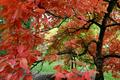
| 11/04/2004 09:01:00 PM |
All Aflameby ElemmennopeComment: Beautiful color contrast of the red and the green. Because the contrast is so important here, I think it would have a better "gestalt" if you cropped the bottom up to the green. Then it's almost an abstract painting! |
| Photographer found comment helpful. |
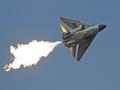
| 11/04/2004 08:56:30 PM |
F111 - Dump & Burnby NatatorComment: Very cool flame effect anmd distance capture. It might be a difficult exposure, or compensation, but I would have liked to see more exposure control in the flame. Maybe a second layer blended with multiply might have brought that out if there's any detail/color there. Perhaps levels too--a bluer sky? |
| Photographer found comment helpful. |
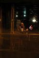
| 11/04/2004 08:54:08 PM |
Not Really Lateby hyperfocalComment: Interesting shot with nice star effects. I think a slight rotate would have helped, to make the foreground lines appear straight (even if it's truer perspective this way). Also I'm not sure why the "distant" view is used here. I think the left and bottom could have bbeen cropped bringing him a bit closer, but I'm not sure if that affects your message, because I don't quite understand the photo. |
| Photographer found comment helpful. |
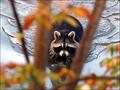
| 11/04/2004 04:29:24 PM |
Rockyby scrum8Comment: Good catch, and the water and light look good here. While the foreground serves to frame the racoon, it is also very distracting (because it's colorful and bright). Also using foreground for framing typically works better if it extends to the edge of the photo. |
| Photographer found comment helpful. |
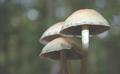
| 11/04/2004 04:27:07 PM |
Fall's Starsby PatochComment: Nice composition and shot. It looks like this has not had its levels adjusted. That is, there are no blacks anywhere in the photo, even in the shadow areas. Also, the stem is overexposed. A photo with proper or even a little "too much" contrast stands out more and is pleasing to view. |
| Photographer found comment helpful. |
Home -
Challenges -
Community -
League -
Photos -
Cameras -
Lenses -
Learn -
Help -
Terms of Use -
Privacy -
Top ^
DPChallenge, and website content and design, Copyright © 2001-2025 Challenging Technologies, LLC.
All digital photo copyrights belong to the photographers and may not be used without permission.
Current Server Time: 06/22/2025 09:55:26 AM EDT.