| Image |
Comment |
| 06/01/2003 12:48:24 PM |
Spooning Candiesby BigSmilesComment: Critique Club Critique
Title: Spooning Candies, by Bigsmiles
Composition: A well composed shot with good use of basic rules of thirds and negative space.
Technical: Great color rendition without much use of post processing. Focus is too soft on blue candy, could have used better control of depth of field. Very nice whites.
Challenge: Definitely meets the challenge with true colors.
Suggestions: Your original concept has proven the impact of this type of photo, but your use of an unoriginal idea has hurt you quite a lot. Probably a hard lesson, but still a nice picture. I scored you a 6 in the challenge based on your soft focus on the blue candy.
Your contribution to the site is a pleasure for all of us and I look forward to seeing more of your work.
Disclaimer:
Bear in mind that I am here to learn, just as many others and any comments that I have made are not intended to be offensive in any way, and are only constructive criticisms. If you wish to comment or discuss this critique please feel free to do so at any time.
Thank you,
Dick Pattee (Autool)
Autool@attbi.com
|
 Photographer found comment helpful. Photographer found comment helpful. |
| 05/31/2003 08:34:38 PM |
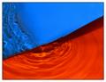
submerged blue and orangeby deceptiveComment: Critique Club Critique
Title: submerged blue and orange, by deceptive
Composition: This is a very well composed abstract photo. I like the diagonal line formed by the two colors and the curves developed by the ripples of water. The water ripples add wonderful texture and interest to the picture.
Technical: I feel that your focus, exposure and use of light are right on. Your post processing is clean and it appears that the colors are true and vivid. Your simplistic border fits the picture well.
Challenge: You have met the challenge with not only a picture that included complimentary colors but one that is interesting and pleasing to the eye.
Suggestions: I have studied this picture and the comments left by others. The color might be a little more orange but I think this is nit picking. You have controlled the light very well with no harsh spots, a technical part that I wish I could master as well as you have. I find no need for improvement other than it could use a little sparkle to liven it up a bit. I don't know exactly how you would accomplish that, so I hated to mention it. Maybe you could have let some of the light bounce back, but not so much as to create hot spots.
Disclaimer:
Bear in mind that I am here to learn, just as many others and any comments that I have made are not intended to be offensive in any way, and are only constructive criticisms. If you wish to comment or discuss this critique please feel free to do so at any time.
Thank you,
Dick Pattee (Autool)
Autool@attbi.com
|
| Photographer found comment helpful. |
| 05/30/2003 10:55:06 AM |
|
| Photographer found comment helpful. |
| 05/30/2003 10:52:52 AM |
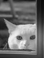
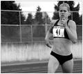
Mommy is coming Home !by melissartsComment: It meets the challenge well, I wish you had gotten the focus sharper. I don't see a need for it being soft or I wouldn't say anything. The light is a bit harsh from the window. 6 |
| Photographer found comment helpful. |
| 05/30/2003 10:48:41 AM |
|
| Photographer found comment helpful. |
| 05/27/2003 11:56:51 AM |
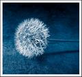
Fragility in Blueby moodvilleComment: It looks like you found a perfect dandelion. I would have liked to see it in a natural position though. One this nice wouldn't have been laying down. Youe background is also distracting to me. 5 |
| Photographer found comment helpful. |
| 05/27/2003 11:53:17 AM |
|
| Photographer found comment helpful. |
| 05/27/2003 11:37:49 AM |
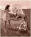
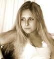
In Her Roomby progersctComment: You have a wonderful subject but you didn't do her justice. I see two things that need attention. The hair on her arm is distracting and her pose makes one eye appear larger than the other. It is open more showig more of the white. 4 |
| Photographer found comment helpful. |
| 05/27/2003 11:21:51 AM |
Splashby e301Comment: Very good clarity and contrast on the splash itself, but the strobe,(I thnk thats what you used) added the drops in that detractfrom the crown. 4 |
| Photographer found comment helpful. |
| 05/27/2003 11:18:38 AM |
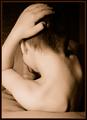
Study in Form and Toneby GeneralEComment: IMO the light is too harsh washing out his ear and shoulder. also a confusing pose with his foot being the focal point of the shot. At least I am led there. 5 |
| Photographer found comment helpful. |
Home -
Challenges -
Community -
League -
Photos -
Cameras -
Lenses -
Learn -
Help -
Terms of Use -
Privacy -
Top ^
DPChallenge, and website content and design, Copyright © 2001-2025 Challenging Technologies, LLC.
All digital photo copyrights belong to the photographers and may not be used without permission.
Current Server Time: 06/24/2025 06:49:26 AM EDT.