| Image |
Comment |
| 10/17/2003 02:20:18 AM |
Beef Goulashby cvt_Comment: Great color usage. The noodles look fairly well defined. The food does look good. I like the use of the black background, but I find the ingredients spilled in the back a bit distracting. Would've rathered the shot be filled by the goulash instead - not cut off in the right hand corner, I think it is strong enough to stand on its own - no props needed. Lighting looks good. 6 |
 Photographer found comment helpful. Photographer found comment helpful. |
| 10/17/2003 02:15:07 AM |
Antacid Aftermathby GeneralEComment: I like the idea behind the photo, but I think it needs a few more elements to add interest. I don't have any off the cuff suggestions though. A different colored plate, may be a solution - I don't think that particular color offsets the pale coloring of the tablets very well. Great idea - rather unique, but needs a little better presentation. 4 |
| Photographer found comment helpful. |
| 10/17/2003 02:07:25 AM |
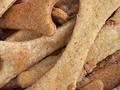
Homemade For Fidoby GraciousComment: I'll be looking this recipe up when the challenge is over, my dog loves treats, and honestly - these look kind of appetizing to me too. I love the detail showing on the 'bones', the colors are a nice array of neutral tones, excellent texture. Great lighting. Focus is perfect. I don't see anything I would change. 10 |
| Photographer found comment helpful. |
| 10/17/2003 02:05:16 AM |
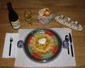
Fast and Easy Tex Mex Dipby GolferDDSComment: Great set up, I like how it gets all aspects in the photo without it feeling busy or crammed. Nice space. I do wish though the food had more presence than it does, I think it was lost due to the perspective the photo was taken from. I would've also liked the whole presentation to be brighter - with the nice feeling of space, comes a need imo for greater light depth. Other than those points I think its a very good photo. 7 |
| Photographer found comment helpful. |
| 10/17/2003 02:02:30 AM |
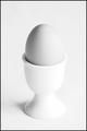
Boil for three minutes.by tomlewis1980Comment: Simple, great impact. I do have to be honest and say that I don't really like white on white presentations - I like a little color contrast to shake things up. That said I do like the composition of this photo. The egg gives just enough difference in color to keep it interesting. lighting does seem a little harsh on the right side - to the point of losing definition on the egg cup. Good image. 7 |
| Photographer found comment helpful. |
| 10/17/2003 02:00:05 AM |
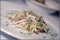
Tunafish pastaby heidaComment: Interesting set up. I like the off-kilter perspective and the light tones. Lighting is great. I even like the small focus area - it really works for this photo. The food looks appetizing, the bits of parsley? give it extra texture. Nice! 7 |
| Photographer found comment helpful. |
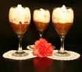
| 10/17/2003 01:57:31 AM |
Two's Company, Three's A Crowd!by browntComment: Hmm.. I like the set up. Black background works nicely with the white doilies and carnation. The food looks good, but it has a lack of dynamic to keep me in the picture - I find the props hold my interest more. Maybe if there were more layers in the dessert, then the view we have of it would attract my attention better. Lighting is great and the arrangement of items works well. 7 |
| Photographer found comment helpful. |
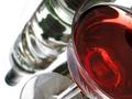
| 10/17/2003 01:54:22 AM |
Cosmopolitanby WILDBLUEComment: Great shot! I love the differing perspectives all in one go. With the cocktail/wine glass and the glass liquor bottle, it has a clear crisp feel that is shaken up a bit with the vivid read coloring. Everything looks splendid to me. 9 |
| Photographer found comment helpful. |
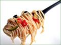
| 10/17/2003 01:48:34 AM |
Bite Meby BitzComment: Heh, great title. Works perfectly with the shot. The food looks great, love the lighting. Crisp lines and good focus. Would've liked all the tendrils of spaghetti to be fully in the shot. Nice solid photo. 7 |
| Photographer found comment helpful. |
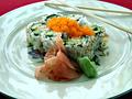
| 10/17/2003 01:40:16 AM |
California Rollby TooCoolComment: Nice presentation! Good color contrasts. The food looks well put together, and more importantly it looks like it would be good to eat. Only complaint on that end I have is the orange stuff on top (carrots?), it brings a great color contrast but has focus issues for me. The lighting makes the rolls look nice and crisp, but I find the plate due to the light reflection has too cool of a hue to it, competing with the food's coloring. Perhaps a solid colored plate in light blue or purple might have offset the food better. Very sound photo. 7 |
| Photographer found comment helpful. |
Home -
Challenges -
Community -
League -
Photos -
Cameras -
Lenses -
Learn -
Help -
Terms of Use -
Privacy -
Top ^
DPChallenge, and website content and design, Copyright © 2001-2025 Challenging Technologies, LLC.
All digital photo copyrights belong to the photographers and may not be used without permission.
Current Server Time: 08/17/2025 03:46:15 PM EDT.