| Image |
Comment |
| 10/20/2003 02:56:22 AM |
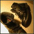
"Like an Old Boot"by tfarrell23Comment: I'm not sure what mood you are going for with this image, the title says to me tired and worn. The lighting is good, though I think its a bit bright on the left side - that said, I do like how the shoe mostly contains that bright light to the one side giving a nice tonal difference. Great focus but the image doesn't speak to me much - perhaps it would have a bit more drama in b&w? 5 |
 Photographer found comment helpful. Photographer found comment helpful. |
| 10/20/2003 02:47:48 AM |
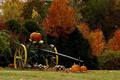
Autumn Eveby amsmythComment: A nice picture that evokes both autumn and harvest for me. The colors look like they were brilliant, though I think the evening? light doesn't do them justice. I do like how the machinery is highlighted slightly by light, but since that looks to be the focus of the image, I wish the highlighting was more pronounced, stronger lighting, etc. So it seemed lighter like the two pumpkins at the front, instead of starting to blend in the darkness of the background. All said, a strong image. 7 |
| Photographer found comment helpful. |
| 10/20/2003 02:42:18 AM |
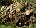
Logsby MikeOComment: The dappled lighting does give this log pile some nice shadows, the focus is pretty good, but honestly I don't find the subject terribly interesting. I'm not sure what mood you are trying to convey here. Its a nice photo of logs. 5 |
| Photographer found comment helpful. |
| 10/20/2003 02:38:32 AM |
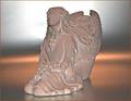
Still Life ~ Terracotta Vaseby BitzComment: This is a nice image. The terra cotta goes well with your choice of background and lighting. The coral/peach color along the horizon brings out the color in the vase. I also like the way the light plays on the surface - it gives me an impression of a sunset viewed through a cloud layer so the light and color is diffused. I do find the white light a bit harsh where it is centered in the background. It looks as though there is a barrier between it and the subject, but its still a little bright especially compared to the soft color along the image's horizon. Focus is great, nice and crisp. 6 |
| Photographer found comment helpful. |
| 10/20/2003 02:34:02 AM |
Morning Dipfer Ducksby dacrazyrnComment: Gorgeous sky, I love the color. The trees and brush in silhouette really enhance both the color and the use of light in this image. The reflection of the sky in the lake/river adds a nice counterpoint and the dog brings additional interest. Beautiful. 7 |
| Photographer found comment helpful. |
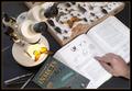
| 10/18/2003 03:17:38 AM |
Entomologist at workby NatatorComment: Very nice set up. Not overly busy, good lighting. Most important aspects are well focused. This truly says 'entomology' to me. Clean photo, I like the human addition with the hand, keeps it from being a boring cold image of bug science. :) 7 |
| Photographer found comment helpful. |
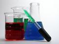
| 10/18/2003 03:06:12 AM |
Beakers!by dsa157Comment: Nice composition, the varying heights add interest. I like it against the plain white, really brings out the colors. Since the eyedropper is the closest item, I think it'd look better if it was totally in focus, it gets soft towards the black end. One other suggestion would be to have either back beaker that's filled with green have yellow in it and then keep the eyedropper with the green, or vice versa. Might add more depth and if you were to go with the former it would add in the 'mixing of primary color' aspect. Just a thought. Otherwise a nice solid shot. 7 |
| Photographer found comment helpful. |
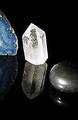
| 10/18/2003 03:02:31 AM |
Mineralogyby bormicComment: Good subject. I like the lighting on the blue (thunderegg?) and the clear/white crystal. Its a bit harsh on the silvery looking rock. I like the way the items reflect and these against a pure black background really adds pop. A suggestion might be to put the blue rock where the white one is, and have the white one more in the foreground. The blue in the one rock is very vivid and nice, but it positioned where it is, leads my eye out of the photo, a slight rearrangement might still keep the brilliant white crystal as a focus but allow for full impact of the blue. 7 |
| Photographer found comment helpful. |
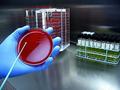
| 10/18/2003 02:57:01 AM |
E. coli, it's what's on your plate by fas-ligandComment: One of the nicer 'science lab' photos. I definitely like the range of colors, brings additional interest. The lighting looks good - sterile and cold, fits the general idea of labs. Good title - anything with E.coli gets my attention! The action with the hand and the pointer thingie adds movement and additional story. Well done. 8 |
| Photographer found comment helpful. |
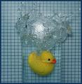
| 10/18/2003 02:50:36 AM |
Arquimedesby anirenoComment: Great fun example of displacement. At first I didn't get the connection, but luckily I'd recently seen something on PBS about Archimedes. Everything looks good, my only wish would be that the duck have a bit more light on it. 8 |
| Photographer found comment helpful. |
Home -
Challenges -
Community -
League -
Photos -
Cameras -
Lenses -
Learn -
Help -
Terms of Use -
Privacy -
Top ^
DPChallenge, and website content and design, Copyright © 2001-2025 Challenging Technologies, LLC.
All digital photo copyrights belong to the photographers and may not be used without permission.
Current Server Time: 08/17/2025 07:10:30 AM EDT.