|
|
|
Showing 451 - 460 of ~983 |
| Image |
Comment |
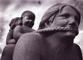
| 06/12/2004 09:09:04 PM | Terni Statuariusby terjeComment: Greetings from the Critique Club!
This is a very striking image. Let's dig a little deeper, shall we?
Focus: The focus on the first face is excellent, very nice textures and detailing shown. The ability to see the pitting really gives an added point of interest. That said, I find the limited focal range - specific only to the first figure - to draw away from the essence of three. The image of course does have three obvious subjects, but I think a deeper focus would pull the other two figures in more and highlight the three aspect to a greater degree.
Color: The color is wonderful. I love the cool, dark feeling of it. Gives a nice stone atmosphere, and the color reflected in the background adds a nice touch of melancholy to the picture. The darker tone really plays up the melodrama.
Composition: I like the composition, however I do agree with the previous commenter that it would be nice to see the third figure just a bit more. This also falls in line with my mention about spreading the focus out more. Other than that, the composition is excellent. Its uncluttered and free, really helps play up the color/tone usage and allows the eye to focus on the great detail you've put on display.
All in all this is a very solid entry and I'm surprised it didn't do higher than 5.3. I find it humorous and dramatic, it really caught my eye. Your work on the background is very nice and enhances the image rather than overshadowing or overpowering it.
Very well done. Thank you for such a pleasant image to critique!
- Sia |  Photographer found comment helpful. Photographer found comment helpful. |
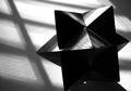
| 12/19/2003 05:48:22 PM | Trianglesby WILDBLUEComment: Hello from the Critique Club!
This is a wonderful interpretation of the challenge. It is clearly a perfect fit, so I'll dwell on the mechanics instead.
Composition: I find the composition excellent. The subject choice is blatantly shape driven, which in itself has a point of interest. The use of the shadows to further the shape representation is what I think really brings this photo its extra depth. It gives a nice variated background with the play of light and dark, as well as continuing the shape trend. Nicely visioned.
I also like the object placement in the corner and up close. I think further away there would still be some dynamics but the close view really gives us a sense of the figure's strong structure. I do think though the bottom crop is too close, if a few centimeters more were given so it matched the distance on the right, it would give a nice sense of balance.
Lighting: This looks to be natural lighting to me and it was well used. I believe the light has that harsh tone that natural light can have and its duality in the very deep shadows works perfectly. This usage makes the linear and rigid triangular shapes really come out. I think a softer, more flattering light as the primary light source would have eroded the inherent strength shown.
That said, I do believe a soft, faint light positioned in the bottom right hand corner would both enhance the rest of the figure, bringing out the lost triangular nature behind those shadows, and still allow that rigid aspect of the photo to flourish. I think the way the shadows are hiding that bottom half breaks the triangle focus in that area - this is the only major 'flaw' that I can see however.
Focus: The focus is great. I think its sharpness on the front two triangles really shows the viewer what the intent of the photo is. I can still see the other various shapes in the image, but with the focus as it is, that triangular theme is what hits me first and foremost. Very well done.
Finally, the use of black & white was an excellent choice. Its stark and dramatic nature really lends itself to this composition. I think it highlights the great contrasts between the light and shadowed areas which I believe would have been lost - to the detriment of the photo - had this been in color.
Over all, this was well envisioned, very well taken and has a very powerful feeling to it.
Excellent work. :)
| | Photographer found comment helpful. |
| 12/06/2003 01:28:57 AM | I'm thankful for my wifeby StevePaxComment: Hello from the Critique Club!
I think this has great appeal, I'm not at all surprised it did well, as it was well taken.
Here's why I find it a pleasant image:
Firstly, your model (wife) has a lovely and open face. It has a friendly, natural feel and that tends to draw viewers in. She looks comfortable, happy, you can see the emotional connection.
I like the use of B&W, it really isolates the subject of the image and gives it more punch, particularly because you have done a nice job with this portrait - the background is blurred well making a great foil for the sharper focus on the face.
I do think that it would be worth a try to use one of those soft focus techniques to give that slightly soft look while keeping the sharp focus you have currently. Sounds like a weird contradiction the way I phrased it - hopefully it makes sense to you!
The use of natural light is great, very few shadows and the ones there add rather than detract. On the other hand, I do agree with the comment about the shirt and its over-exposure, I also think this gives a bit of brightness and foil for the slightly darker tones in her skin so its a bit of a wash. I also think that a different background may be better - only because it is in black & white and any punch from colors or textures can be muted, especially if the background is blurred due to the portrait style.
I think this is a well-executed image, it fits the challenge to a tee, and has a nice emotional impact and investment. Very nice. | | Photographer found comment helpful. |
| 12/06/2003 01:16:56 AM | My Pride and My Joyby TooCoolComment: Hello from the Critique Club!
Fantastic subject, it makes a connection with the viewer, not in a specific sense necessarily but in general at the very least.
I like the choice of B&W, I find it really works well to convey emotions because there is no color splashes to distract.
The perspective is great, definitely out of the norm and really adds a nice unexpected element to the photo.
The lighting is adequate, but I agree with some of the other commenters in that the overall tone of the photo is very dark, which mutes some of the emotional impact. I would also recommend increasing the light while diffusing it - thereby increasing the soft focus/tone. This I think will give more flattering shadows and highlights instead of the somewhat harsher light currently shown.
Your son looks very comfortable and natural, great smile you can really see an engaging personality there. Your wife also has a nice beauty, but it looks as though she is a little uncomfortable pose-wise - I think this comes out in her slightly strained smile and odd neck position - perhaps if her chin was tucked down towards her neck it might look more natural.
I like the focus in this - it has a softer quality which I think really helps embody and portray the feeling behind the image. I think a sharp focus would have stifled this aspect.
Over all a great photo for the challenge and it stands alone very well too. You're a lucky person to have a great family like this and it shows in this image! Well done. | | Photographer found comment helpful. |
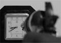
| 11/29/2003 01:52:54 AM | Just Killing Timeby CamComment: Hello from the Critique Club!
Excellent photo! There are some great contrasts visible here and it clearly meets the challenge.
What first catches my eye is the wonderful contrast between the crisply rendered clock and the blurred out gun. I have to disagree with many of the previous comments, I think the photo has an increased impact with this obvious contrast, and a good deal of the punch would be lost if the whole image were in complete focus. I think the emphasis/focus of the image should be on the clock, as it is the recipient of the action as described by the title.
The second great contrast is that of the black & white. The image is really accentuated with the black & white choice - I don't know if the clock surrounds are actually black, but it makes for a very clean image with this color scheme all the same. The crispness generally inherent to black/white really lends itself to boosting the contrast in the focus.
Secondly I think the low light, or at least low tone of the photo is great. A brighter look, while stark, would probably overpower an already striking image. The low light instead forces the focus on the two main entities in the photo and doesn't compete with the energy they display. Even if it isn't able to highlight the contrast in the black & white as mentioned previously.
The composition is excellent - I really like how the image seems to grow out from the bottom left corner. I do have a suggestion, and that would be to see how it would look if the perspective was straight down the barrel instead of the side view. I'm not sure if this would block out too much of the clock and render the gun unrecognizable.. thereby nullifying much of the dynamic of the photo or not. Its a thought though.
I think this was a well thought out idea, set up and executed nicely. I also think, though I found it a plus, the low lighting may have affected some of the scores, as did the choice for the gun to be out of focus. I find both of those to enhance the essence of the image.
All in all, an excellent submission. There really isn't anything I would suggest changing besides the alternative perspective. Nicely done. | | Photographer found comment helpful. |
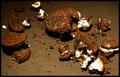
| 11/27/2003 08:25:24 PM | That's the Way the Cookie Crumblesby DiamondPeteComment: Hello from the Critique Club!
Splendid image! Fits the challenge perfectly and works well on its own. I especially enjoy the contrasts and the textures shown. There are a few areas that I think could use some work though, so let's get cracking:
First lighting: I like the lighting here, I think the position is good, however something to either diffuse the light or alternative positioning may have helped combat the overexposure of the creamy goodness, while still allowing for the nice spotlight-ish effect currently in the photo.
Composition is great. I really like how the cookie crumbling turned out, the random placement of the cookie pieces gives it a very natural look, avoiding the stiff blockiness that a setup shot might have. Granted, if you did arrange the pieces specifically, extra kudos to you - you got it to look perfectly natural.
The contrasts are what really bring my eye in and keep me interested. The obvious being the dark color of the cookie and background against the light of the cookie creme. This type of image always has a nice punch to it, and this one is no exception. I think the lighter black tone of the background gives another contrast element and adds to the image.
A more subtle contrast that I am really enjoying is that of the textures shown with the two main ingredients: The brittle, gravel-like texture of the cookie vs the soft, smooth, creamy nature of the filling. Both are evident in the photo - though with the overexposure of the filling some of that is lost - were it toned down a bit I think that would show to greater effect.
Finally, my main issue with the photo aside from the blown out white, is the focus. Other commenters have mentioned it as well, and I have to agree. With an image like this, having such contrasts and textures available, a nice crisp focus would really make the photo pop and give it a bit more depth. I think this aspect is even more crucial than the overexposure because it blankets the whole image, whereas the whites are only a part of the image - though a noticeable one.
Very nice idea, well executed though some improvements could be made. Well done. | | Photographer found comment helpful. |
| 11/25/2003 11:47:26 PM | CCNAby mikemtiComment: Hello from the Critique Club!
I really like the different aspects coming into play in this photograph. I find the contrasts very nice, the composition to be great and I think the lighting is good as well. On the other hand I think the focus and cropping could use a little tweaking. Let's go into more depth:
The cropping issue I think is very minor, its more of a personal preference for me. I think that corner in the top left should be cropped to right where the book starts because the other side has a nice consistant blackness and the two tone background on the left gives it a bit of an off-balance. I also think a less close crop at the bottom - allowing the area just below mode to show so the wording isn't crowded at the bottom of the photo would give a more finished look.
Your focus choice is great, I really like the DOF use, but I have to agree with some of the other commenters in that I think a slightly longer field would have been better. Certainly I don't think the whole image should be in sharp focus, but I think allowing the eye a longer area of crispness would improve the image a bit.
The lighting is great. It really highlights the sharp focus on the left and helps create that nice shadow trailing into oblivion on the right.
The composition is excellent in my opinion. I know others wondered about having the book in the photo, but I found it a great reference as a viewer because I have no clue what your title (CCNA) would have stood for or how it would relate to the photograph without it. I think keeping it out of focus was also an excellent idea because it then doesn't become an obvious focal point for the eye, but instead merely a reference point.
Finally I love the contrasts, both in the muted colors shown on the electronic components against the bright red and white of the book and also the contrast between sharp and soft focus, and I especially like the subtle contrast with the play of the light on the left against the shadowed area of the right.
I think this could have been a very flat photograph but you've brought out enough contrasting elements and added some other interest points (as mentioned above) to give the image a nice bit of oomph. I notice a few conflicting comments below and I think the subject matter may have hurt your score, but I find it to be a nice solid image. Nicely done. | | Photographer found comment helpful. |
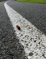
| 11/16/2003 06:29:44 PM | From Here to Infinityby NeilComment: Hello from the Critique Club!
My initial reaction is that this is an excellent capture. Let's delve a little deeper into why I think so.
The lighting is perfect, while this is using natural light and we don't have a whole lot of control over that, this was taken at a great time of day, because there are few shadows over the image - the lighting is nice and even, rather than distracting. This is a simple shot in essence and over-done light/shadow play would have detracted.
The focus as mentioned in some of the earlier comments is exceptional. I really enjoy seeing the grit and texture of the road, it gives the image a real punch. The perspective helps this along as well as bouying the infinite scope you were looking to achieve.
The composition is great. The long line of the road draws the eye into the infinite horizon, clearly meeting the challenge requirements. The starkness of the black/grey and white have a nice contrast with each other as well as the green bits of grass on the side. As an aside, I personally would rather the grass was cropped out, but I can't see a way to do that without compromising the photo.
All these aspects alone would make this a worthy infinite photo, but the addition of the catepillar really gives an added punch. There's a softness to it that contrasts nicely with the rough street and the animal/nature touch makes for its own contrast against the urban/machine aspect of the road. This all combines into a photo pleasing to the eye in general, but with some nice subtle gems to keep the mind working. Well done. | | Photographer found comment helpful. |
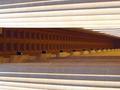
| 11/16/2003 03:16:43 PM | unendingby wetlandComment: Hello from the Critique Club:
A very eye-catching image! I find myself agreeing with some of the previous commenters about its abstract feel. I really like the contrast between the deep, warm colors of the ceiling? played against the harsher white columns - I do think the white toned down just a bit giving it a creamier feel might improve this contrast though.
The lighting adds very much to the abstract nature of the photo, I think the shadows along the top and bottom, give the eye many areas to explore and find meaning.
I do agree that the photo overall has a grainy texture that does interfere slightly with the enjoyment of the image, however I think, because that graininess manifests itself mostly on the white columns, it does add another point of interest and contrast between the two main focal points - the columns and the wooden ceiling(?) area. In this case I think what could have been more of a detriment, does have some saving graces.
There is definite interest in the photo, I find myself continually letting my eyes run the length of the patterned left side, and enjoying the color and shape differences. Very nicely envisioned. | | Photographer found comment helpful. |
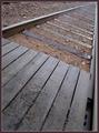
| 11/16/2003 03:03:28 PM | To Heaven Or Hell ?by MonaComment: Hello from the Critique Club:
First, I really like your take on an often used subject, it has a nice freshness to it. The composition and perspective are excellent, the use of the right-hand rail to lead the eye into the infinite horizon works perfectly for me. I do wish a bit more of that rail was visible in the photo leading towards that top corner, but it works very well as is. I think the use of natural light is great here as it gives almost a tracer light up the rails, helping to guide the eyes as well.
The focus is spot on, on that wooden platform at the beginning of the photo, though I am of two minds about its use (the platform) - in general it makes an excellent point for the eye to begin its travel down the track, and is used very well for that. On the otherhand, taking infinite in consideration, it also serves to cut off the repetitive aspect of the train tracks, and thus removing some of that infinite nature, ie: no beginning & no end. I didn't think of this point of view with my submission either, but it was pointed out and I find it a valid thought.
I really enjoy the detail and contrast shown between the smooth but worn wood and the crumbly dirt & stones - it helps solidify depth in the photo - there are only a few major players in this image and your attention to all of those details really shows. This is an excellent photo. Well done. | | Photographer found comment helpful. |
|
Showing 451 - 460 of ~983 |
Home -
Challenges -
Community -
League -
Photos -
Cameras -
Lenses -
Learn -
Help -
Terms of Use -
Privacy -
Top ^
DPChallenge, and website content and design, Copyright © 2001-2025 Challenging Technologies, LLC.
All digital photo copyrights belong to the photographers and may not be used without permission.
Current Server Time: 08/08/2025 10:54:22 AM EDT.
|