|
|
|
Showing 431 - 440 of ~983 |
| Image |
Comment |
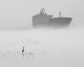
| 03/05/2005 08:28:49 PM | Waiting Out The Fog by lennywellsComment: Lovely image!
I really enjoy the dynamic the fog plays in this picture. It gives everything a nice ghostly stillness that works well with your title and of course the challenge. The focus looks pretty good, considering the fog gives everything a general haze as it is. The use of natural light works very well.
I wish there was a bit more contrast to the image though, if the ship was a smidge darker, its dark hull being brought out a little more to let it coincide with the silhouette of the bird, I think that would make the image just that much more interesting. It would also help create an even stronger contrast to the grey fog/mist.
I'm not sure about this, but I think a slender border might be helpful too. As it is, the fog glides across the frame, and my eyes tend to trail with it, so a border would be a nice "stopping" point and cradle the image all together.
Two fairly minor points really. All in all this is an excellent capture, great composition, lovely imagery. Well done. I gave a 7. |  Photographer found comment helpful. Photographer found comment helpful. |
| 03/05/2005 12:34:05 PM | Happy Timesby MontereykiddoComment: Splendid! This image is so fresh and light. I really enjoy the vivid green of the grass and the richness of the wood in the guitar.
The focus is great, fits the challenge very nicely. I would've liked a bit more light on the young man in the area closest to the bottom of the image, just to lighten it up a bit more, particularly by his face since his hands seem to have some highlighting on them.
I like the composition for the most part, I would've liked to see just a bit more grass around the bottom so it didn't feel like his elbow was being cut off, but really that's a minor point. A very solid image, I find the freshness of it to be my most favorite aspect. Well done. I gave a 7. | | Photographer found comment helpful. |
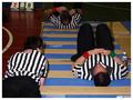
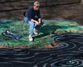
| 03/05/2005 12:22:33 PM | Failing Camouflage 101by BradComment: Ha! This image tickles my funny bone. They look like rejects from a situp contest or something.
I like the use of contrast in this image, the black & white versus the colorful floor is very nice. The Focus is pretty decent, seems to mostly center on the ref to the right.
The lighting is iffy. I have problems with indoor shots myself so it probably needed flash as the ambient lights (assuming its in a gym) were probably useless. Not sure what I could suggest to help with that. The colors are a little on the bland side, possibly washed out from the flash, again I'm not sure how you'd be able to compat it, unless in post processing you gave the saturation a bit more of a nudge.
Otherwise I think its a good shot, has a humorous aspect that that the title highlights and the play of color against monochromes adds interest. There are some aspects that could use work and I'm not sure if the composition couldn't be shifted a bit to add a little more oomph or not, but I gave it a 5. | | Photographer found comment helpful. |
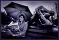
| 03/05/2005 12:09:49 PM | In the Land of Adventureby eirasiComment: Simply fabulous image.
Immediately I love the color/tone of this photograph. The composition is very good, though it might be a tad too busy, there are a lot of things to look at, each with a high interest value and that might take away from the image but only in the slightest bit.
The focus is excellent, use of the available light is wonderful. The border is just right, doesn't overpower at all. I'm curious, did the umbrella get chosen because it was raining or to help blot out the sunlight? The reason I ask is I'm wondering how the image would look without it there, seems like it is covering the sun which is a smart move, but if not, there might be interest in that portion of the background being lost.
Otherwise this is one of my favorites of this challenge. Very nicely done. I gave a 9. | | Photographer found comment helpful. |
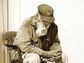
| 03/05/2005 12:01:13 PM | Nearly Out Of Timeby realdealphotoComment: What an interesting subject!
The man is definitely the whole of this image, he has quite a few details about him that just draws you in to look deeper. I'm not sure if the title does the image justice or not, but nevertheless it still fits the challenge.
The focus is pretty good, and the use of natural light is decent, though the whites are in danger of being blown out. There is a soft area just above the left shoulder that draws my eye away from the focus of the subject. I'm not sure if a shift in position would have helped combat that or not.
I don't know if I like the use of sepia for this image, I'd have to see the original color. The tones are very warm and for some reason I see this as a more melancholy image, suitable for black and white or a slightly blued tone, rather than sepia. Might be worth checking out.
The one thing that REALLY draws my eye are the man's hands. The back of his hands seems so wrinkled and old, but the tips of them look quite youthful, its a strange paradox and I think that little detail is what keeps my interest in this image.
Overall a VERY strong photo. A slight tone change and something to control the white in the photo could make it better. Very nicely done. I gave a 6. | | Photographer found comment helpful. |
| 03/05/2005 11:54:57 AM | Learning to Flyby HeavyComment: Great capture! I love the energy in this image. Fits the challenge of course and the focus is pretty good.
Subject helps create interest which draws my attention into the photo and the composition works very well for me. The title helps enhance the imagery of the biker against clouds too.
Use of natural light is decent, the one thing I do notice though is the sky seems fairly washed out and and undramatic.
Maybe using a polorizing filter could help really bring that blue sky out and add a bit of shadow and definition to the clouds. I think that might help tie the blue of the biker's bike & pants in and add an bit of pop to the image. I'm torn on whether the image needs more sharpening or not. I kind of like the looseness of the clouds compared to the angular feel of the biker, plus additional sharpening may create more haloing around the bike's tires. Its a toss up.
Overall a nice high energy shot with a great idea behind it. There are some things that might have improved the shot but its a solid entry in my book. I gave a 5 | | Photographer found comment helpful. |
| 03/04/2005 10:19:47 PM | Lazy Day Fishingby scalvertComment: Very creative indeed.
Excellent drawing ability, fun, good colors. The natural lighting works well, helps give a bit of a nature feel too it, I can almost imaging a tree further up the 'bank' offering the shading. Focus is great, just love the uniqueness of your approach. Image is crisp and clear. Well done. 7. | | Photographer found comment helpful. |
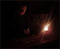
| 03/04/2005 10:09:45 PM | The good and quiet timesby hjolliComment: Interesting idea. I can see that the subject is playing cards.. I think? So it does fit the challenge. I think the use of the candle as the only light source did the image a disservice however because nearly all detail is lost in the shadow. I'm not good with using low light (it looks as if it was used to give a more intimate feel?) so I don't have any suggestions on what to do differently and keep the feeling you're looking for. The lack of lighting makes it difficult to see other aspects that may be excellently done. The composition looks as though it might be good and the idea works. The lighting just needs a bit more work. Sorry to harp on that! I gave the image a 3 since I couldn't really see much of what was going on. | | Photographer found comment helpful. |
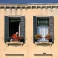
| 03/04/2005 10:05:43 PM | Siestaby ImagineerComment: I think this is a gorgeous photo. The natural light really brings out the color of the building, the matching windows give a very nice congruency. I love the human interest and that little pigeon on the ledge just gives a bit of whimsy.
Excellent focus, composition is great. Very well done.
I absolutely adore the color and tone, I think its the best part of the image, it feels so alive and fresh. The only thing I'd say that would improve the image would be to crop it at the top, the sky/roof is simple unnecessary in my view. All the action is where the windows are so I think from those slats across the top for the roof, up is dead weight.
The title kind of takes away from meeting the challenge since the lady doesn't seem to be taking a siesta and she's where my eyes go first, though it could be in reference to the pigeon. The photo though certainly meets the challenge so all is well. All in all though this is an excellent capture. I gave it an 8 | | Photographer found comment helpful. |
| 03/04/2005 09:54:59 PM | Stargazersby JoziComment: Lucky kid! I wish I had a telescope myself, great hobby.
The photograph has some wonderful aspects to it as well as filling the challenge. I like the 'dad helping child' sentiment to it as well as the instant feeling of wonder I get when I put myself in the photo and think about looking through a telescope. So the idea and emotion of the image are great!
There are a few technical issues with the photograph that could use a little work. The main one is lighting. There is a odd tone to the image that I see often when I'm doing pictures indoors myself, that may come from insufficient light. The focus is also rather soft, this could relate to the lighting issue as well.
I gave this photo a 4 because there is quite a bit of potential to it, just a few technical aspects that need work. I really like the emotion tied to it. | | Photographer found comment helpful. |
|
Showing 431 - 440 of ~983 |
Home -
Challenges -
Community -
League -
Photos -
Cameras -
Lenses -
Learn -
Help -
Terms of Use -
Privacy -
Top ^
DPChallenge, and website content and design, Copyright © 2001-2025 Challenging Technologies, LLC.
All digital photo copyrights belong to the photographers and may not be used without permission.
Current Server Time: 08/08/2025 08:15:14 AM EDT.
|