| Image |
Comment |
| 06/15/2005 08:11:10 PM |
Darkness Awakensby jtstreetComment: I really like how different this looks. Great colors and the texture showing with the way the colors are manifested is wonderful. Has a very spooky feeling to it. I gave a 6. |
 Photographer found comment helpful. Photographer found comment helpful. |
| 06/15/2005 08:09:24 PM |
Imminent... Darknessby ourwebstopComment: Other than the candle feeling a bit too cropped off at the bottom I think this is fantastic! Well.. actually if there was any way to highlight just the smoke with a strategically placed light source I think that'd be the only other thing that'd make the image better. Even though the darkness is what is being portrayed a smidge more light (on the smoke) would give just a nice highlight I think. I gave a 7 |
| Photographer found comment helpful. |
| 06/15/2005 07:59:59 PM |
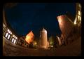
Surrounded by the Dark Agesby janbruderComment: Nice perspective, great colors, great focus/clarity. I love the tones, its got a nice richness and I of course love the textures surrounding the whole picture. The only nitpick I have would be to crop it a bit more on the left to get rid of what looks like a glare spot in the bottom left. Nicely done. I gave a 7. |
| Photographer found comment helpful. |
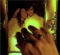
| 06/15/2005 07:58:10 PM |
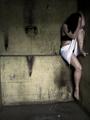
Cornered and Aloneby mesmerajComment: Nice dank image. I like the emotion behind it and the title. I enjoy the atmosphere where its created. There are a couple of things I'd suggest trying differently if you've a mind to: Shifting the focus of the image just a smidge to the right so you cut out the beginning of the wall on the left where it triangles out and changing the color of your models skirt. The pristine nature of the white seems very out of place in the environment and with what she's wearing. I'm not sure why. It DOES pull your attention TO the model but just something about its extreme contrast to the surroundings seems a bit off. Maybe if it was dirtier or a more muted color.. not sure. Oh.. maybe if just a hint of the model's face was visible, that might be an idea, maybe just seeing one eye peeking through her hair.. not a huge deal really though. I think this is a great image over all, I gave a 6. |
| Photographer found comment helpful. |
| 06/15/2005 07:53:56 PM |
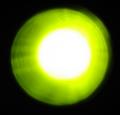
Darkness is an opportunity to explore Lightby virtualmeComment: I was going to just rate this and move on but I figured I'd do better to comment as well. I found myself a bit disappointed in the image due to the title. The title gave me an expectation of light being explored somehow that I didn't find the image to live up to. It definitely fits the challenge and the greeny-yellow color works well against the black background but I'm not finding anything that captures my attention with the composition. If an example of what I'm trying to say would help, the first thing that comes to mind when thinking of your title and an idea of a photograph that could portray it, would be an image of dustmotes in a stream of light, this I think would give some interesting things for the viewer to look at and (to me) delves more into the wonder of light. But that's just my opinion and as we know everyone has them for better or worse. I hope this helps in some way! I gave a 3 |
| Photographer found comment helpful. |
| 06/15/2005 07:44:24 PM |
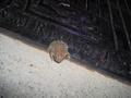
Frog Aloneby bffatwComment: I'm afraid I don't relate to the darkness you're trying to convey here. In general, I find the composition a bit uninspired - what are you trying to say with the frog being alone? Is it loneliness? Ugliness? Both? Being little in a big world? Being drab in a colorful world? Any of those could be dark related but I can't see your vision at the moment. I think the focus is pretty good, the lighting is decent, though could be better. I would have to say that the biggest improvement would be an evident purpose in the composition. That said, it could just be me as a random viewer who is missing something obvious, which wouldn't be the first time. I can only go with what I see/interpret so I gave a 3. |
| Photographer found comment helpful. |
| 06/15/2005 07:38:00 PM |
A Widow Reaches In The Dark And Longs For His Lightby JunieMoonComment: I think the title is carrying a heavy burden in this image, conveying what you see with the picture - I have done this as well, its not a bad thing necessarily. That said, I DO see (just based on the picture alone) many ways it could be interpreted with something dark, there is definitely an emotive aspect to it and the imagination can come up with a number of scenarios light & dark from it. I would say with a sharper focus and perhaps a slight shift to the left, so the frame on the left is completely in the photo and there isn't that blackness on the right it would be an even better image. I gave a 4. |
| Photographer found comment helpful. |
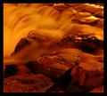
| 06/15/2005 07:33:38 PM |
Aphotic Flowby CutterComment: Beautiful tones, lovely image and very nice clarity/focus, but I don't envision 'darkness' when I see this really. That said, obviously you do so its really a moot point. The picture doesn't speak to me of darkness so I'm scoring on general impact and technical work. I gave a 6 |
| Photographer found comment helpful. |
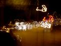
| 06/15/2005 07:30:44 PM |
On alcohol at night... Finding my way home?!?by ApeeComment: Yikes, with landmarks like that you'll be lucky to end up in the right state/country. Interesting take on the challenge, I like the abstract nature but I wish there was something a bit more.. I don't know.. solid to the image to anchor it a bit. I realize its showing something alcohol induced but I think if you had something solid to counter-balance the floating squiggles it might enhance the intoxicated look to the image. With an image like this I also think a simple black border might tie it all together, my eyes tend to wander out of the picture as I follow the squiggles up and to the right. Interesting. 4. |
| Photographer found comment helpful. |
| 06/15/2005 07:27:13 PM |
Consumingby Joey LawrenceComment: Now this is dark. Both in the emotion and in the image itself. Great title, nice tones. I wish there was a bit more 'grit' to it, physically - maybe dirtied hands or something, but otherwise, I really dig it. - 7. |
| Photographer found comment helpful. |
Home -
Challenges -
Community -
League -
Photos -
Cameras -
Lenses -
Learn -
Help -
Terms of Use -
Privacy -
Top ^
DPChallenge, and website content and design, Copyright © 2001-2025 Challenging Technologies, LLC.
All digital photo copyrights belong to the photographers and may not be used without permission.
Current Server Time: 08/08/2025 01:33:13 AM EDT.