| Image |
Comment |
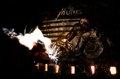
| 07/16/2006 01:22:19 PM |
10 litresby boysetsfireComment: Clearly meets the challenge but I am having difficulty determining exactly what it is I am looking at. I like the drama of the sparkler(?), it gives a nice zing to the image but there isn't enough definition to the rest of the pieces of the photo to help me a.) understand the significance of the sparkler & candles(?). b.) fully see what the dirtbike 10 litre thingie is. c.) get insight into how everything has been laid out. As it is, it looks like just a mish-mash of different things put together, no "story" to it. I do like the way the lighting used highlights the 10 litres wording and the dirtbike/motorcycle image adds loads of interest. I just wish I could understand the purpose of the rest of the items and what they are. I gave a 4. |
 Photographer found comment helpful. Photographer found comment helpful. |
| 07/14/2006 08:31:03 PM |
10x10 = 100by NeuferlandComment: I like the idea of this, however I think the mirror image suffers some from the lighting used and that detracts from the image. I like the black and white look and I like the way you've laid out the titles. The image is a bit stark and the lighting rather harsh. I think this might have been a stronger image if you'd used opposite tiles (traditional black on white) as the mirror image instead, might be worth trying. Focus looks good. I gave a 5 |
| Photographer found comment helpful. |
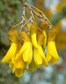
| 07/14/2006 08:28:34 PM |
Togetherby trainComment: I'm going to assume there are ten blossoms there, I can't see them all or differentiate them all from one another so.. benefit of the doubt! Now then I think the coloring is gorgeous, very vivid, love that. The focus is pretty good. I wish it encompassed all of the blossoms rather than mostly the stem/branch portion. Composition is a bit boring. They feel just plopped there in the middle of the scene, nothing too dramatic going for them other than the bright color. Use of natural light is good though and the bokeh affect in the background is excellent. I gave a 6. |
| Photographer found comment helpful. |
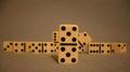
| 07/14/2006 08:25:56 PM |
magic numberby posthumousComment: I like the different portrayal of the number 10. The composition is good. Lighting looks good though maybe a smidge too harsh. Focus is okay, though I'm not sure if its so raw and harsh looking just because of the light or if some oversharpening or overcontrasting has been used. The different textures are nice and I like the earthy colors and how they interact with one another. I really enjoy the choice of counting to four to depict ten. I gave a 5 |
| Photographer found comment helpful. |
| 07/14/2006 08:00:55 PM |
Russian Rebelby timfythetooComment: Cute. I like the concept and the composition is good. Lighting looks nice to me (though the reflection off of some of the dolls is a lttle distracting - no idea how to minimize it without jeopardizing the good stuff though). Great focus, I like the clarity and crispness. I think its hilarious how the rebel doll is there smoking with sunglasses yet still holding her hanky. I think the border works well and of course the image fits the challenge without trouble. I gave a 7. |
| Photographer found comment helpful. |
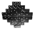
| 07/14/2006 07:57:10 PM |
The Leaderby zillahlewisComment: I think this shot has a whole lot of potential. The focus is a bit soft, but I like the composition. Especially that dominoe that's tilted like its peeking behind the double fives. I think what hurts this image the most is the coloring. The dominoes (IMO) should be a brilliant white, as should the background and whatever its set upon. To me, the tone it has now makes it seem like the incorrect white balance was chosen while photographed under incandescent light so it has that sort of tannish/yellowy tone instead of a crisp white. You've also created a horizon with your placement of the dominoes and it looks a bit tilted. Finally there is a bit of artifacting around the edges of all of the pieces which could either be compression issues (mostly unavoidable) or from too much USM. I think though the biggest issue is the tone. I realize that its possible that is the actual color of the tiles and the area you took the picture in, but if not, and it is a White Balance issue, I'd suggest redoing it with the correct setting and see if it has more pop and brightness to it. I gave a 4. |
| Photographer found comment helpful. |
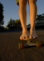
| 07/14/2006 07:51:32 PM |
Hangin Ten In Suburbiaby jdannelsComment: I love the feeling of action and movement in this photo. Interesting take on the challenge, if someone didn't agree with the title connection to ten they can always say there's ten toes in it! I like the perspective. I think the composition is good in that it has an "in your face" feel so the viewer is right where the action is and the background certainly helps promote the suburbia the title references. I think a different placement for the feet, apart with the knees bent in a more "surfer" pose might help the composition along. I think a bit crisper focus on the feet and skateboard would be good and I'm not sure that the white balance and/or exposure is the best because the whole image is bit dull colorwise. I gave 5. |
| Photographer found comment helpful. |
| 07/14/2006 07:43:21 PM |
Nine Too Many...by pidgeComment: Good title, fits the challenge. I think the composition is good, the pyramid is a nice change from things just all lined up. I don't think I like how isolated it is, at least not on pure white. While it certainly highlights the corks and makes them stand out, I find myself at a loss on what to look at next. The corks have some good interest in them but much of it is obscured by the pyramid usage, maybe if the pyramid was skewed slightly to one side so more of the cork writing was visible that'd help. I don't know.. I wish the image was warmer I guess, inviting. Technically its nicely done but it doesn't hold my attention upon viewing. I gave a 5 |
| Photographer found comment helpful. |
| 07/14/2006 07:39:04 PM |
10by JacquiDComment: I think this could be vague for those who aren't familiar with the Ten Commandments, which is possible. That said, I think the lighting is good. I like that the ring basically highlights the partial passage. I do like that the entire commandment isn't listed out but I don't know that I like the very small DOF. It helps bring attention to the line and commandment that you are referencing but I think having 80% if the image blurred out is rather distracting. I tend to find simple text dependent images somewhat flat and uninteresting but that's just a personal opinion. This one has the ring to add interest but only to a slight degree for me. I gave a 4 |
| Photographer found comment helpful. |
| 07/14/2006 07:30:55 PM |
Money down the drainby hannekeComment: Nice stark image. The lighting here really highlights the mood of the shot to me. The tones of the sink are very nice and the cool palette furthers a feeling of starkness, and the inevitableness of wasting money that I get from this photo. Not sure if that's what you were going for but that's what I get out of the shot. I like that the paper money is sharp and clear. The blown out white above that is a bit distracting but I think if it were toned down just a smidge it'd go from a distraction to another aspect that helps the feel of the image. Nicely done. I gave a 7. |
| Photographer found comment helpful. |
Home -
Challenges -
Community -
League -
Photos -
Cameras -
Lenses -
Learn -
Help -
Terms of Use -
Privacy -
Top ^
DPChallenge, and website content and design, Copyright © 2001-2025 Challenging Technologies, LLC.
All digital photo copyrights belong to the photographers and may not be used without permission.
Current Server Time: 08/05/2025 01:56:42 AM EDT.