| Image |
Comment |
| 08/11/2006 04:31:28 PM |
Just 4 Haulingby BeckyTComment: This may not be for many people but it instantly caught my attention. I love the tone in this, I'm not sure if a filter was used to grab those wonderful purple colors or how that was accomplished but it has a very abstract/modern neon thing going that I think really really works with the explosion of shapes you've captured here. The clarity is great, nice use of the natural light and I love composition for the most part. The one thing I do wish is that it could've been composed so that gap in the top where the trees aren't cover was not there - either they'd be visible through the window/reflected in something else so they have the purple/yellow toning too or just composed so they aren't in the image at all. Still that's a fairly minor issue. I'm bumping up from a 7 to an 8 and adding a favorite. |
 Photographer found comment helpful. Photographer found comment helpful. |
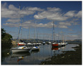
| 08/11/2006 04:28:37 PM |
Waiting for the Tideby agwrightComment: I like the lines in this image. It seems a bit subdued to me, perhaps a polarizer was used? I like the fact that you can tell its a sunny day but the whites are not going crazy and there is some nice details on the boats still visible. The sky looks interesting and organic, it is a nice foil for the more rigid shapes of the boat masts too. I think I might like this even better if the blue was just a shade deeper/darker, as it is I did give it a 7 |
| Photographer found comment helpful. |
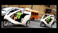
| 08/11/2006 04:26:08 PM |
Go Green!by RompyComment: I like the movement and freshness of this image. The lighting is a bit bright with the white of those bikemobiles but luckily I don't think it harms the image at all. I'm enjoying the engaging street scene, nice and urban but fun with your capture. I also like how it looks tilted. Typically I would not like an non-uniform border but in this case I like how it gives it a letterbox(is that the right word?) format almost as if I'm watching a widescreen movie. The focus is good though I wish I could see the faces of the drivers. I gave a 7 |
| Photographer found comment helpful. |
| 08/11/2006 04:23:05 PM |
Well Worn Transportationby walrus451Comment: Wonderful clarity here. The rich colors are wonderful. You've made what could have been a boring, flat photo of some sandals into something worth investing more than a few seconds looking at. I love the richness of the various brown shades. The background looks more brown than black to me too so that's a nice difference as well. The composition is interesting, nice and simple yet allows the shoes to show off their details nicely. Definitely fits the challenge in my estimation. Well done. 8 |
| Photographer found comment helpful. |
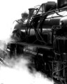
| 08/11/2006 04:21:08 PM |
Steam Loco - Dianaby trainComment: Absolutely beautiful. I love the richness of the black, the white is not too bright as to overwhelm, instead it offsets the deep black perfectly. The composition is great, excellent focus, just a great image all around. I kind of wish there was some sort of more substantial border just to make it have that finished/framed look, but that's just gravy. Nicely captured. I am upping from an 8 to a 9 and adding a favorite. |
| Photographer found comment helpful. |
| 08/11/2006 06:09:16 AM |
Out to seaby bogusComment: Great idea, definitely meets the challenge. I like the long negative space but I don't like the colors. It feels very very drab and boring.. like a painting that hasn't been cleaned in many years. The focus is a bit soft but I find that it works for the most part. The low light is both a blessing and a curse in my mind as its affecting the colors (adversely imo) and yet its giving a softness to the image that is appealing. Still over all I found myself not too enamoured with the overlying effect so I gave a 4 |
| Photographer found comment helpful. |
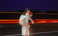
| 08/11/2006 06:04:25 AM |
Piggy Back Rideby itsselvComment: Nice capture of light trails but I'm not sure why that and the piggy back are being composed together. The two could make fine subjects separately but here together I find they instead distract from one another - the trails pull the eye away from the piggy back, the piggy back do the same - and all to the detriment of the image. The title indicates the subject is the piggy back ride, so to me that should be the subject. Perhaps a change in position would have provided a better background or at least one less distracting. The focus looks good and use of light (flash?) works here. I gave a 4 |
| Photographer found comment helpful. |
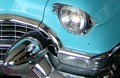
| 08/11/2006 06:02:03 AM |
Classic Ironby moondogmtComment: Good use of the light, focus looks good too. Not so crazy about the composition. I am not seeing what you may have seen here, as its just a bit of a car that isn't keeping my attention. I don't know if zooming in on just one aspect of the car would help or not. By that I mean just the grill or just the headlight. I do like the color and how it plays off of the chrome on the car but it just doesn't spark much interest in me. I gave a 4 |
| Photographer found comment helpful. |
| 08/11/2006 05:57:35 AM |
Transportation @ Speed of Lightby names_amitComment: Interesting capture. I like what you tried to do, though I don't know if you succeeded since I'm not sure what you were going for. I like the abstract nature of the bright light trails and the colors are lovely. In fact I could see an image that was simply made up of the yellow portion of the image as a print (or painting for that matter) on someone's wall. The section with the bike not so much. I think it offers an interestingish place for my eye to explore but after a glance I lose interest - though sitting here looking at the image while I give my comment I am growing to like it better, bike included. I think the lighting is good and the composition works. Meets the challenge of course. I am bumping this up from a 4 to a 5 as I'm still not in love with the bike portion, sorry! Probably would be a six without the bike for me (I love abstracts). |
| Photographer found comment helpful. |
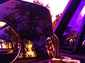
| 08/11/2006 05:48:44 AM |
Looking back in time...by MelGilliganComment: I like the concept but the execution loses some impact in great part to the lighting. The low light is giving the image a sort of dirty haze to my eye and might be affecting the focus (which seems a little soft). Since the subject is the car in the mirror, the surrounding stuff in the background isn't really adding to the image, imo. I would suggest revisiting the shot and try putting a length of black velvet behind the mirror so you have a nice black background to contrast the mirrored image against. Or simply crop the image to 1/2 inch above the top of the mirror and see if that changes the dynamic any. I gave a 4 |
| Photographer found comment helpful. |
Home -
Challenges -
Community -
League -
Photos -
Cameras -
Lenses -
Learn -
Help -
Terms of Use -
Privacy -
Top ^
DPChallenge, and website content and design, Copyright © 2001-2025 Challenging Technologies, LLC.
All digital photo copyrights belong to the photographers and may not be used without permission.
Current Server Time: 08/04/2025 01:41:36 PM EDT.