| Image |
Comment |
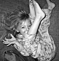
| 11/18/2004 06:37:05 PM |
Lilyby KaBooMComment: To bad there wasn't a dark background. It would have enhanced the idea that she was falling thru space. |
 Photographer found comment helpful. Photographer found comment helpful. |
| 11/18/2004 06:34:46 PM |
Let There be Lightby umbrisComment: This reminds me of a Steichen photo that he did during ww1. You have a fantastic range of tones and very good light control. |
| Photographer found comment helpful. |
| 11/18/2004 06:27:53 PM |
icy stareby ajschmidtComment: The focus is on his/her nose. It's a nice nose. Lots of texture. Good subject. |
| Photographer found comment helpful. |
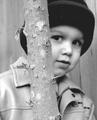
| 11/18/2004 04:31:22 PM |
Tree Huggerby riotspyneComment: Cute. The focus might be off a bit. I know how frustrating that can be. It wouldn't be so bad, you could have said you did it for that soft focus look, but that darn tree is right there in front. I do have a suggestion though. When you want to focus on the boy and he is cooperating, move him a bit away from anything that might grab the camera's attention. On this one you could have had him step a foot away, prefocused on him and then have him step back to the tree. He would have to be in the mood to do that, but it might be something to think about. |
| Photographer found comment helpful. |
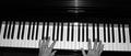
| 11/18/2004 04:24:03 PM |
Pianoby chookieComment: I can see the age and texture in the hands. The tones are good(hehe,tones). Maybe a different angle would have helped it seem a little more interesting? |
| Photographer found comment helpful. |
| 11/18/2004 04:16:14 PM |
Leeby JSchoComment: Almost a tri tone. I can see sepia and the jacket has a blue tint. Ahh. You only partially desaturated it maybe? Hope you're not being sacrificed for this heresy. I like the low key effect, and truthfully, I think it would have been stronger as a pure duotone or b/w. You did capture an intense look and the lighting is beautiful. |
| Photographer found comment helpful. |
| 11/18/2004 04:06:41 PM |
CD Cases and a Lampby aplomb76Comment: Bravo. Just an excellent idea with perfect execution. You could go head to head with Edward S with this one. I have to fav this one. |
| Photographer found comment helpful. |
| 11/18/2004 02:58:30 PM |
Merlotby 77DXComment: Good low key photo. I think I would have liked to see the base of the glass. Other than that, the tones composition and dof are good. |
| Photographer found comment helpful. |
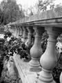
| 11/18/2004 02:51:59 PM |
The Secret Gardenby bigfishComment: The tones are good. Darks, lights and lots of mid-tones. It does look a little soft and I don't know about the tilt. Seems to be disorienting to me, like it's running away or rejecting the viewer when I would want it to be welcoming. |
| Photographer found comment helpful. |
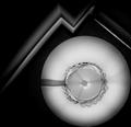
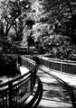
| 11/18/2004 02:34:54 PM |
Rampway to heavenby BullpupComment: Curving lines are pleasant to look at and I like the way you framed it. A little to much contrast, imo. There are hardly any mid-tones in the picture. But that is only my opinion. |
| Photographer found comment helpful. |
Home -
Challenges -
Community -
League -
Photos -
Cameras -
Lenses -
Learn -
Help -
Terms of Use -
Privacy -
Top ^
DPChallenge, and website content and design, Copyright © 2001-2025 Challenging Technologies, LLC.
All digital photo copyrights belong to the photographers and may not be used without permission.
Current Server Time: 08/27/2025 10:26:13 PM EDT.