| Image |
Comment |
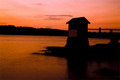
| 03/24/2006 09:31:50 AM |
Twilight At Camp Coveby wibingComment: The darkness wasn't used to the best advantage. The little house blends in with the trees and rocks and becomes a large mass. Maybe using a lower angle would have brought the house up into the sky for a better profile. The horizon is tilted a bit clockwise. |
 Photographer found comment helpful. Photographer found comment helpful. |
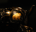
| 03/24/2006 09:25:09 AM |
Our Right to 'Bear' Armsby YoungerComment: To me, the lighting hasn't brought out the beauty of this object. I can't form an idea of what exactly it is. Perhaps a tighter frame on just the bear would have worked. There are hot spots in areas that don't add to the frame. |
| Photographer found comment helpful. |
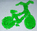
| 03/12/2006 12:05:43 PM |
Green Jell-O Bicycleby posthumousComment: There was a lot of work put into this. The background might have been improved if the jello was placed on a clear surface and then raised above the white surface so there was a distance between the background and the jello. That way everything would look smoother. |
| Photographer found comment helpful. |
| 03/12/2006 11:49:52 AM |
Saint or sinner?by naomikComment: The textures and details were captured nicely. To me, the one shoe that is cut off detracts from the overall presentation. |
| Photographer found comment helpful. |
| 03/12/2006 11:45:40 AM |
Jell-O Martini with Peanut Butter Oliveby fotodudeComment: This was a good idea and it's set up so the pb cherry and jello look good. The major problem with the picture, to me, is the color. Looks like there is an orange color cast. That would be ok but in this case, it makes the jello look dull and gives a general dull look to the rest of the frame.
If you cover the front of the tripod with a black foamboard or cloth, you will cut down the reflection. |
| Photographer found comment helpful. |
| 03/12/2006 11:15:39 AM |
Contempo-jelloby EvaanComment: really original, set up well with pleasing colors. I like the pov but I wonder if it makes some voters question if there is actually jello in the dishes. |
| Photographer found comment helpful. |
| 03/12/2006 10:48:02 AM |
|
| Photographer found comment helpful. |
| 03/12/2006 10:45:18 AM |
Feathered framingby eliniasComment: This is lovely. Good idea. I think it has to much space given up to the feathers. On my monitor, they lack detail and by the title I suppose that is the desired effect but there's just to much lost space. I'm giving a higher score, but would like to mention a couple other things that could be improved. The creases in the camera left shoe might be cloned out and there is someting under the heel on camera right. If that is just a shadow, I'd clone it so it's uniform. |
| Photographer found comment helpful. |
| 03/12/2006 10:25:23 AM |
A Balancing Actby jjbeguinComment: Thank goodness there are no lines in the glasses. Otherwise you would have exceded the "pick two" part of the rules. Now I can give you the good score this picture deserves. |
| Photographer found comment helpful. |
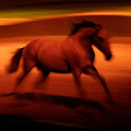
| 03/04/2006 10:03:42 PM |
Freedom's Archetypeby lynnesiteComment: I've been looking at this for a few minutes. It is more than beautiful. It's the perfect expression of what a horse is. It's yes in every way. Perfect. This picture could hang on my wall forever and I think I would never get tired of looking at it. |
| Photographer found comment helpful. |
Home -
Challenges -
Community -
League -
Photos -
Cameras -
Lenses -
Learn -
Help -
Terms of Use -
Privacy -
Top ^
DPChallenge, and website content and design, Copyright © 2001-2025 Challenging Technologies, LLC.
All digital photo copyrights belong to the photographers and may not be used without permission.
Current Server Time: 08/26/2025 05:05:18 AM EDT.