| Image |
Comment |
| 10/09/2003 10:58:32 PM |
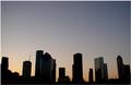
Downtown at sunriseby CamComment: It looks blurry. Like the colors. A little too much negative space, would have been ok if there were some beautiful clouds up there. |
 Photographer found comment helpful. Photographer found comment helpful. |
| 10/09/2003 10:54:29 PM |
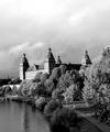
Washington Reflectionsby kostiaComment: The right half is sorta wasted. Would like to have seen the building taking up a little more of that space. Good focus and perspective. |
| Photographer found comment helpful. |
| 10/09/2003 10:24:26 PM |
|
| Photographer found comment helpful. |
| 10/09/2003 10:21:37 PM |
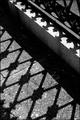
The Webby RockComment: The more of this type of picture, the more I get the feeling that they are really hard to get the right balance between busy and boring. Admire the attempt. I would have maybe cropped it square, using the top portion. |
| Photographer found comment helpful. |
| 10/09/2003 09:56:36 PM |
Unicorn Rainby C-FoxComment: I like the idea. There is a yellow overcast that I don't like. It tends to dull the other colors. The composition is too static.
I am updating my comments. Thanks for the explanation. If you try the unicorn again, I bet it would be really beautiful in a glass of wine in candlelight. |
| Photographer found comment helpful. |
| 10/09/2003 09:36:18 PM |
Concrete and Ironby grigrigirlComment: Good tones and dof composition. Fits the challenge for me even if it's not a building per say. 7 |
| Photographer found comment helpful. |
| 10/09/2003 09:22:18 PM |
Federal Buildingsby GeneralEComment: I know this is your interpretation of what urban means, but I must say I don't like the color treatment. Just wanted to let you know why I didn't give you a higher score. It looks like a very decent image if not for the colors. Only thing composition wise, I'd crop the sky down to just above the highest lightpost. |
| Photographer found comment helpful. |
| 10/09/2003 09:11:22 PM |
Montrealby bormicComment: I somewhat like the foreground. And I know that all the books say you have to have a foreground, but what the books don't say is the foreground should compliment the picture either by framing in a pleasing way or thru repetition of the shape of the body of the picture. The foreground should not be more overpowering than the body of the picture. So using this, the red in the leaves compliment the red in the one building. That is good. The limbs on the side just get in the way and distract from the view. |
| Photographer found comment helpful. |
| 10/09/2003 08:59:51 PM |
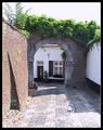
Intimacy of a townby fanfuineComment: I like this. Every city needs it's intimate spaces. A little over exposed but I guess your camera was fooled by the dark door in the center. It looks like you were using spot metering and picked the darkest part to calculate with. Oops, I do that all the time. |
| Photographer found comment helpful. |
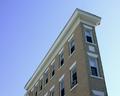
| 10/09/2003 08:42:48 PM |
For Rent , 2 Bedroom Flat.....by medic391Comment: The color seems to be off, too blue. I think the composition does a good job at accenting the narrowness of the building even though ideally I would perfer it being a little futher over to the left touching just above the lower corner and maybe taking up a little more of the frame. The perspective works well also. 7 |
| Photographer found comment helpful. |
Home -
Challenges -
Community -
League -
Photos -
Cameras -
Lenses -
Learn -
Help -
Terms of Use -
Privacy -
Top ^
DPChallenge, and website content and design, Copyright © 2001-2025 Challenging Technologies, LLC.
All digital photo copyrights belong to the photographers and may not be used without permission.
Current Server Time: 08/24/2025 03:23:16 AM EDT.