| Image |
Comment |
| 10/11/2003 07:48:44 AM |
Tueborby TooCoolComment: These shots are so hard to get the right exposure on. If you meter on the bright area you will underexpose everything else and if you meter on a darker area, you blow the light area. |
 Photographer found comment helpful. Photographer found comment helpful. |
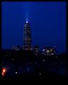
| 10/11/2003 07:38:43 AM |
Deco Blueby JukeDaddyComment: The blue is really pretty. The searchlight is nice too. I've noticed that a lot of the night shots aren't in focus, or at least they appear to be not in focus. I like your composition, but the shot is too dark in the foreground area. Maybe crop the large red light out. |
| Photographer found comment helpful. |
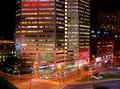
| 10/11/2003 07:27:18 AM |
Urban Skyby richyComment: You have a good combination of elements here. I don't know why, but they don't add up to an interesting picture. Maybe a different point of view would have worked better. |
| Photographer found comment helpful. |
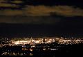
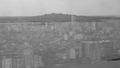
| 10/11/2003 07:18:09 AM |
Gothenburg By Nightby MikaelComment: I like how the skyline is sharp. I would have liked to see more details, maybe a closer view of the city. If you try a skyline picture again, try taking it just at sundown. You will get more light and not have to leave the shutter open as long. |
| Photographer found comment helpful. |
| 10/10/2003 06:27:38 PM |
The Bayou Cityby jab119Comment: I gave you a 9 during my first pass. I like all the textures, the sharpness, colors and the fact you have so much included without the image feeling too busy. You did a really good job. |
| Photographer found comment helpful. |
| 10/10/2003 06:22:19 PM |
The colors of the nightby AmielComment: I gave you a 9 when I was going thru the entries. Now I'm back to comment. What I like best is that your title didn't dissapoint me. It really is colorful. Good job. |
| Photographer found comment helpful. |
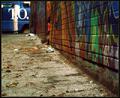
| 10/10/2003 01:18:33 PM |
A Portrait of Pavement, Woof.by xionjaComment: I rated you image low because it doesn't fit the challenge, and the quality is not so good. I like pictures that show movement when it is obvious that that is what was intended. This picture shows movement, but it looks like it's from a lack of light and a lack of planning on the photographer's part. |
| Photographer found comment helpful. |
| 10/10/2003 01:11:12 PM |
Reflectionby ktritoComment: I gave you a low score 2 because the quality is really low. It is difficult to get reflection pictures right. It's difficult to figure out which is the reflection and which is the reality. If you had left it in color, maybe there would not be that confusion. The contrast is too low. |
| Photographer found comment helpful. |
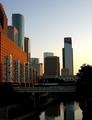
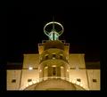
| 10/10/2003 12:50:05 PM |
Metropolisby BobsterLobsterComment: I usually don't comment about the border, but this one is way too big. Not too bad because it blends in on the top, but it really takes away from the beauty of the photo on the bottom. I was really enjoying the symetry as the image came up, only to have the mood broken by the border. 8 and I'll not knock you down for the mistake. Please don't make the same mistake again. |
| Photographer found comment helpful. |
| 10/10/2003 12:16:32 PM |
Human Glaciersby melongrindComment: The colors are exceptional. Great framing. I don't understand the meaning of the title. This conveys, to me, both the permanence and the changing nature of a city. It has it's own personality. Good job presenting a different view of a urban landscape. 10 |
| Photographer found comment helpful. |
Home -
Challenges -
Community -
League -
Photos -
Cameras -
Lenses -
Learn -
Help -
Terms of Use -
Privacy -
Top ^
DPChallenge, and website content and design, Copyright © 2001-2025 Challenging Technologies, LLC.
All digital photo copyrights belong to the photographers and may not be used without permission.
Current Server Time: 08/24/2025 11:17:49 AM EDT.