| Image |
Comment |
| 03/22/2004 10:29:20 AM |
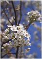
Knowledge(drum&bass magazine)by litboltiComment: I can see this on a artistic magazine. Good job matching the picture to the magazine. High key effect is nicely done, but I wish there was a little more contrast, or perhaps one strong dark point. |
 Photographer found comment helpful. Photographer found comment helpful. |
| 03/22/2004 09:10:35 AM |
|
| Photographer found comment helpful. |
| 03/22/2004 09:00:05 AM |
ESPNby jmleliiComment: The hoop is just a tad too dark, otherwise a good exposure and I like how the wind is moving the net. A lower pov might have been used to get rid of the trees altogether. I don't read sports mags, but this picture might have been more exciting with people in the frame. |
| Photographer found comment helpful. |
| 03/22/2004 08:51:40 AM |
Placesby claudiadfComment: Soothing colors and a pretty picture. I don't know about the magazine you are matching it with. This picture doesn't give me a feeling to any particular place. The light(?) on the left breaks the mood of the photo. |
| Photographer found comment helpful. |
| 03/22/2004 08:46:58 AM |
|
| Photographer found comment helpful. |
| 03/22/2004 08:43:22 AM |
|
| Photographer found comment helpful. |
| 03/22/2004 08:27:26 AM |
BBC Wildlifeby agwrightComment: Beautiful picture. You might have considered mirroring it so he was facing into the magazine. As he is, he's facing the spine of the mag, not that it makes any difference on my score. |
| Photographer found comment helpful. |
| 03/21/2004 07:22:04 PM |
Taschaby johnmComment: The tones in the complection were retained even with such a strong background. It looks like a happy portrait. The backlight is a little too strong for me to rate this outstandingly. I think it was a good choice to use one, as it can really bring out the texture of her hair. |
| Photographer found comment helpful. |
| 03/21/2004 07:11:11 PM |
D'Arcyby jmritzComment: I like her fierce, proud look. You did a great job capturing her attitude. I only gave this a 5 because I think the red in her complextion is too deep. The colors themselves do not blend well together and the design of the upholstery is very distracting. I think it would have been more interesting if you had cropped up to just below her shoulder and cloned out the sofa and corrected the wb. |
| Photographer found comment helpful. |
| 03/21/2004 07:01:39 PM |
The Key's to Successby jefalkComment: This is a good industrial portrait. Suitable for a cd or press release. The lighting is perfect. Very good job. The palette is even harmonious. |
| Photographer found comment helpful. |
Home -
Challenges -
Community -
League -
Photos -
Cameras -
Lenses -
Learn -
Help -
Terms of Use -
Privacy -
Top ^
DPChallenge, and website content and design, Copyright © 2001-2025 Challenging Technologies, LLC.
All digital photo copyrights belong to the photographers and may not be used without permission.
Current Server Time: 08/26/2025 04:56:02 PM EDT.