| Image |
Comment |
| 07/30/2004 11:50:01 AM |
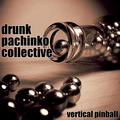
Drunk Pachinko Collectiveby Kha0SComment: I like this. Technically it has some problems, like the highlights and the shadow area below the bottle, but it is a good idea with the visual impact needed to help sell an album. Hope you place well. |
 Photographer found comment helpful. Photographer found comment helpful. |
| 07/30/2004 11:44:21 AM |
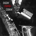
Diggin' Poppin' Cookin' - Sixtyby Herblacklist12Comment: I like the dappled light on the suit. I don't understand why the cigs are there. Sure, they say sixty, but they look way out of place (especially because they don't have the same dappled light as mentioned above) and they don't add to the composition. BTW, I smoke so have nothing against showing cigs. |
| Photographer found comment helpful. |
| 07/30/2004 10:08:33 AM |
Deep Purple Canyonby jefalkComment: It's the pits when they change the wording during the challenge! A pretty picture with room for the title within the frame. Could be cropped into a square format without losing important detail. Nice colors. The only concern I would have with it is the lack of details within the shadows. |
| Photographer found comment helpful. |
| 07/30/2004 09:56:53 AM |
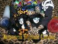
Deezuumeraa Piggybank Clanisausby frychiknComment: Not knowing what the words represent makes it hard to judge this picture. I am assuming that it's the bank clan? If that is it, the bank is to hard to find. The picture is to cluttered to have much of an impact. |
| Photographer found comment helpful. |
| 07/30/2004 09:49:35 AM |
Dangerous Pending Climateby StagoleeComment: I like the rainbow. The colors look muddy. Post processing would help bring out more in this shot. I bet the histogram is all bunched up into the mid section. Try adjusting so there is a greater spread or try a curves adjustment to get some light and darks. |
| Photographer found comment helpful. |
| 07/30/2004 09:05:47 AM |
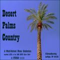
Desert Palms Countryby tfarrell23Comment: I think all the typing will do this one in. The palm isn't so bad and the post processing is ok for the challenge. The typeface is boring(sorry) and all the extra stuff doesn't add to the theme for me. Maybe there is an inside joke that goes with this, but I don't get it. |
| Photographer found comment helpful. |
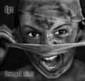
| 07/30/2004 08:57:19 AM |
Darling Precious Corruptedby lizzyc3Comment: Sorry you didn't get the update on the title. Hope it doesn't lower your score. She does look like each of the words you used. She has very expressive eyes and such a lovely pouty mouth, I would have liked to see them closer and with more detail. The picture has noise. I don't know if that was intentional so it will not effect your score but I think it would have looked better without it. The blown highlights have probably been mentioned a lot but I don't mind them. |
| Photographer found comment helpful. |
| 07/30/2004 08:42:13 AM |
DPC - Demerging Personality Conflict by kiwinessComment: I like the opposing "woman in veil" theme of this photo. The dirt lends an especially striking contrast even though it is something I personally dislike. But because it is so bold and so "not pretty", I will give you a 10. |
| Photographer found comment helpful. |
| 07/30/2004 08:27:17 AM |
|
| Photographer found comment helpful. |
| 07/30/2004 08:22:08 AM |
Delirious Puppet Crewby aznymComment: Good concept, well executed. The only thing that could be improved,imo, is the shadow on the side. I would have liked to see the color extend all the way to the edge. |
| Photographer found comment helpful. |
Home -
Challenges -
Community -
League -
Photos -
Cameras -
Lenses -
Learn -
Help -
Terms of Use -
Privacy -
Top ^
DPChallenge, and website content and design, Copyright © 2001-2025 Challenging Technologies, LLC.
All digital photo copyrights belong to the photographers and may not be used without permission.
Current Server Time: 08/26/2025 10:54:08 PM EDT.