Zuriby
PhocalComment: Hey Ronnie - Greetings from the Critique Club...
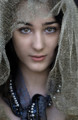
A powerful image, for sure. I scored it with a 7.
What caught my eye in a good way was the immediate impact of the high contrast processing and the intensity of the eyes. It's well-composed and for me, has the right amount of breathing room between the subject and the edges.
What caught my eye in a "hmm... I wonder" way was the combination of grittiness of the high contrast and grain. On first glance I see a sharp, well defined image... as I look more closely, I wonder about what pulling back a bit on sharpening and/or contrast might do.
What caught my eye in a "wish it were different" way is the background. Although the subject is isolated to some degree by the shallow DOF, it remains rather busy and competes with the subject for my attention. the grain is more apparent in the background, too which adds to the distraction. Finally, the dark area (a tree trunk?) in the top right draws attention away from the face, and I can't help but see an old woman's skirt and boney hand in the form.
So... take it FWIW. I hope my comments are helpful. The bottom line is this is a terrific image with LOTS of great stuff going on.
- Bill