| Image |
Comment |
| 03/27/2010 02:21:32 AM |
|
 Photographer found comment helpful. Photographer found comment helpful. |
| 03/27/2010 02:20:45 AM |
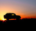
Into The Sunsetby MollyComment: it's a good photo, you have done well to capture it as you have but for me the downfall is it is a little cliche'd. Not sure how to get around that but it seems much like many magazine shots of vehicles (which is good if you want to get published in magazines!) but it doesn't stand out as a 'special' shot for me - sorry. Maybe if there was a human figure in there somewhere it might of lifted it? Not sure.
That is not to say it is a bad photo - it is well done. |
| Photographer found comment helpful. |
| 03/27/2010 02:13:50 AM |
|
| Photographer found comment helpful. |
| 03/27/2010 02:12:13 AM |
The Getawayby PenelopeKComment: technically fine, and I like how you have framed it but I found I was not really captured by this one, sorry. |
| Photographer found comment helpful. |
| 03/12/2010 12:18:00 AM |
|
| Photographer found comment helpful. |
| 03/12/2010 12:14:44 AM |
|
| Photographer found comment helpful. |
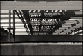
| 03/11/2010 11:45:02 PM |
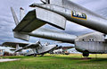
Undersideby npaselComment: I think this has potential. I just found the top beam distracting. Perhaps it needs to be cropped a little to remove the details at the top (so it matches the bottom elements uniformity) or maybe if you could have got enough depth of field to get the framing elements in focus as well as the rest of the image? |
| Photographer found comment helpful. |
| 03/11/2010 11:41:57 PM |
Nature of Lightby AllenPComment: technically I think this is good and good composition but the contrast between the sharp shadows on the model's face and body against the blurred hand and object she is holding don't seem to sit well for me. Wondering if the intricate "busy-ness" of the shadows clashes with the blurred vagueness of the object? Still a well shot and composed photograph |
| Photographer found comment helpful. |
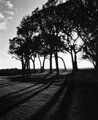
| 03/11/2010 11:37:24 PM |
Treesby LMO366Comment: I think this has potential, I like the strong contrasts and the texture of the grass in the foreground but it feels a little unbalanced to me - the dark areas of the trees and the ground at the bottom right need something to balance them but the left of the photo doesn't do it. That is just me though! |
| Photographer found comment helpful. |
| 03/11/2010 11:31:27 PM |
FireWireby MAKComment: technically I think this is really well done but for me the result is sort of a cliche.
Nothing against Amnesty International but just it is a familiar icon so I found it didn't grab me as particularly striking or interesting... then again maybe Amnesty International copied your photo in which case it is their fault I found it cliche'd!
:) |
| Photographer found comment helpful. |
Home -
Challenges -
Community -
League -
Photos -
Cameras -
Lenses -
Learn -
Help -
Terms of Use -
Privacy -
Top ^
DPChallenge, and website content and design, Copyright © 2001-2025 Challenging Technologies, LLC.
All digital photo copyrights belong to the photographers and may not be used without permission.
Current Server Time: 08/04/2025 08:26:04 PM EDT.