| Image |
Comment |
| 08/20/2012 07:32:17 PM |
DAVIDby RianBotesComment: Great pose showing off a very contemplative person. The color is a little warm with the orange tones dominating the whites in his shirt and eyes. (White balance is a little high) Other than that, good highlights and shadows and the sharpness is pretty good, probably couldn't push it too much more due to noise. I don't feel the noise detracts because to me it is a matter of personal taste to create a mood in the photo. |
 Photographer found comment helpful. Photographer found comment helpful. |
| 08/20/2012 03:34:20 PM |
That Smile makes my world go round! :-)by rockyrajanComment: Great pose by the model and very good interaction between the photographer and the child. Technical problems show throughout the photo include high noise grain, lots of digital artifacting convering the photo particularly on the grey shadow line on the hairline and down the neck, somewhat blown highlights on the cheek. |
| Photographer found comment helpful. |
| 08/17/2012 12:10:01 AM |
|
| Photographer found comment helpful. |
| 08/17/2012 12:07:02 AM |
|
| Photographer found comment helpful. |
| 08/17/2012 12:05:18 AM |
|
| Photographer found comment helpful. |
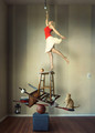
| 08/15/2012 03:03:41 PM |
My blue Heaven.by EgillPComment: Wonderful composition and choice of subject! I like the more muted tones here, but perhaps you could have pushed the black point a little more to create some more contrast. I am just guessing that the histogram is a bit centered here with not many clipped tones on the left. |
| Photographer found comment helpful. |
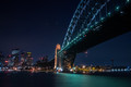
| 08/15/2012 02:59:11 PM |
Connectionsby MichaelCComment: Love the blueness of this image and nice job with the exposure! I think you could have cloned out the two white lights in the sky and possibly cleaned up a bit of the reflected light in the river on the left under the cityscape. As well as the reflected light on the right of the bridge about a third of the way in from the left... |
| Photographer found comment helpful. |
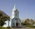
| 08/15/2012 02:56:10 PM |
Previously Occupiedby dtremainComment: A nice choice for subject here. I think this is really underexposed though. There are no highlights to be found. You could have done one of three things here to get a better result... increase ISO, increase your shutter speed, or increase your aperture opening. I think you chose a good fstop becasue the shot has good focus and that's what you want for most architecture shots. So increasing shutter or ISO would have been the way to go. |
| Photographer found comment helpful. |
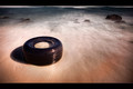
| 08/12/2012 08:19:58 PM |
Retiredby CuttoothComment: I like the view point here. Only thing I would consider changing would be to crop out the break in the surf at the top. |
| Photographer found comment helpful. |
| 08/12/2012 08:18:50 PM |
|
| Photographer found comment helpful. |
Home -
Challenges -
Community -
League -
Photos -
Cameras -
Lenses -
Learn -
Help -
Terms of Use -
Privacy -
Top ^
DPChallenge, and website content and design, Copyright © 2001-2025 Challenging Technologies, LLC.
All digital photo copyrights belong to the photographers and may not be used without permission.
Current Server Time: 08/26/2025 11:42:29 PM EDT.