| Image |
Comment |
| 09/25/2012 09:01:00 PM |
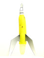
Yes Ma'amby glad2badadComment: Great subject matter for the challenge. I think you overcooked the HDR though. The shadows are way too light for that dappled lighting situation. |
 Photographer found comment helpful. Photographer found comment helpful. |
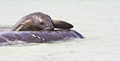
| 09/22/2012 10:45:30 PM |
During a Manatee Estrous (Mating Herd)by Mark of SRQComment: Good documentary photo. I would have no idea that this was a part of the mating ritual of the manatee if the title were not there. This looks like a manatee on a log and having two faces showing would have strengthened the message somewhat. |
| Photographer found comment helpful. |
| 09/22/2012 10:42:27 PM |
|
| Photographer found comment helpful. |
| 09/22/2012 10:40:13 PM |
|
| Photographer found comment helpful. |
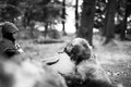
| 09/22/2012 10:16:37 PM |
Little Brotherby karmatComment: I like the slight angle used here. I think the lips and eyes look a little over done in your PP. The area under his eyes are naturally dark. One little trick I use to touch this area up is to sample an area of the skin color using a 5 point average sample on your eye dropper. Then on a new blank layer use a soft brush to brush in some of the sampled color over the dark areas. Then change the opacity of the layer to suite your taste. Of course not everyone wants to photoshop their family to death so you can ignore me if that is not your style. |
| Photographer found comment helpful. |
| 09/22/2012 01:14:50 PM |
|
| Photographer found comment helpful. |
| 09/22/2012 01:13:11 PM |
|
| Photographer found comment helpful. |
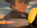
| 09/22/2012 01:11:02 PM |
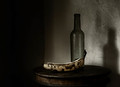
agedby grahamgatorComment: I like the shadows in this still life, however I think the slight desaturation has taken away any luminosity cast by the small amount of available light. The yellow of the banana could stand out a bit more in my opinion. |
| Photographer found comment helpful. |
| 09/19/2012 03:59:52 PM |
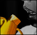
Yumm..mmmmy!by rockyrajanComment: I think you pushed the contrast and the saturation a little too much on this one. I am not liking the white part at the bottom right. The background would have been better as all dark tones. |
| Photographer found comment helpful. |
| 09/19/2012 03:58:35 PM |
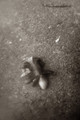
crawlby jmritzComment: A little too much negative space here. Perhaps get closer to the subject. |
| Photographer found comment helpful. |
Home -
Challenges -
Community -
League -
Photos -
Cameras -
Lenses -
Learn -
Help -
Terms of Use -
Privacy -
Top ^
DPChallenge, and website content and design, Copyright © 2001-2025 Challenging Technologies, LLC.
All digital photo copyrights belong to the photographers and may not be used without permission.
Current Server Time: 08/26/2025 11:21:57 PM EDT.