| Image |
Comment |
| 05/22/2015 03:30:40 PM |
Fields of Greenby AnnComment: I think the by removing the sky, this would become much more abstract. Lovely shot! |
 Photographer found comment helpful. Photographer found comment helpful. |
| 05/14/2015 02:10:10 PM |
Curlsby FromDaRockComment: I like the color and the expression and dynamic pose. I think the skin is slightly overprocessed. I think you removed too much texture in the skin. |
| Photographer found comment helpful. |
| 05/14/2015 02:06:24 PM |
chickee babeby timfythetooComment: Great color and expression. The lens distortion from the short focal length adds to the fun of this portrait! |
| Photographer found comment helpful. |
| 05/13/2015 09:18:33 AM |
Hollywood Starby MarioPierreComment: Wonderful. The only thing I would change is to frame this in a 3:4 or a 4:5 format rather than a 2:3 format. It appears tall and thin for a portrait and there is more of her to see that is not shown. |
| Photographer found comment helpful. |
| 05/13/2015 09:12:28 AM |
Ida by wejnaComment: Very good technicals on this. The model appears to be on guard here. Perhaps she is an introvert which if that is so, then you captured her personality well. However some emotion would help the viewer build a connection to the image. |
| Photographer found comment helpful. |
| 05/13/2015 09:08:49 AM |
mumby H-GComment: A luvely mum! The background really makes me dizzy here. I think the saturated colors and contrast in the background draws me right past the subject, who appears to have less contrast and is more neutral in color. Perhaps centering the subject would have caused the background to frame the subject leading to a better composition. |
| Photographer found comment helpful. |
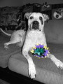
| 05/06/2015 01:31:28 PM |
My Cinco de Mayo Pupby elizadebComment: Fun shot! The internet loves dogs!!! I think a flash was used here which was a little powerful and blew out some of the highlights on the front of the dog. |
| Photographer found comment helpful. |
| 05/06/2015 01:29:41 PM |
|
| Photographer found comment helpful. |
| 05/06/2015 01:19:37 PM |
Communionby mluComment: A good chosen scene. Not sure if all the cups were the same color but if they were, they should all have been left colored. Other improvements would be to darken the shadows and to use a wider aperture or selectively blur the background in PP. |
| Photographer found comment helpful. |
| 05/06/2015 11:01:07 AM |
Back to Basics by RKTComment: Great angle and the selective desat really adds punch to this Red Rod! This is my choice for blue! |
| Photographer found comment helpful. |
Home -
Challenges -
Community -
League -
Photos -
Cameras -
Lenses -
Learn -
Help -
Terms of Use -
Privacy -
Top ^
DPChallenge, and website content and design, Copyright © 2001-2025 Challenging Technologies, LLC.
All digital photo copyrights belong to the photographers and may not be used without permission.
Current Server Time: 08/23/2025 09:00:23 AM EDT.