| Image |
Comment |
| 03/18/2010 03:27:44 PM |
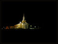
The Light in the Darknessby tfarrell23Comment: You did good with the exposure on the building. You got good color from the lighting. I just think there is too much black. This would benefit a lot from being closer and filling the frame wih the beautifully lit building. |
 Photographer found comment helpful. Photographer found comment helpful. |
| 03/18/2010 01:57:23 PM |
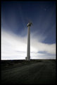
Spinning the night awayby bob_bobskiComment: Looks like you have a great transition from night to day. The long exposure time neglects to show the movement of the fan blades too well. It would have been awesome to see a nice motion blur on those. |
| Photographer found comment helpful. |
| 03/18/2010 07:44:25 AM |
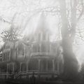
Week 10by KenComment: Super cool effect! It would make a neat print! |
| Photographer found comment helpful. |
| 03/17/2010 08:35:58 PM |
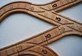
Crooked Housesby KarenNfldComment: This is a great optical illusion which was done with camera rotation. One thing that really throws me for a loop and makes me keep looking is the no parking sign... it appears to be vertical and if the photo was rotated it would be at an angle which makes me want to believe the houses are really built crooked. I just can't stop looking and wondering.
Aside from all that the photo is technically good with great color shot at what looks like nearly mid day light making it pretty average photography.
Technically Good Photo + Optical Illusion = A vote of 7. |
| Photographer found comment helpful. |
| 03/17/2010 08:25:33 PM |
|
| Photographer found comment helpful. |
| 03/17/2010 08:23:09 PM |
the Woods Coffee (and strip mall) Lynden, WAby kellmak10Comment: Great color and very sharp photo! You did good getting the detail in the shaded area of the shop windows and exposing for the awesome sky. I am not a big fan of the fisheye lens for this photo. The curvature at the lower portion of the photo just doesn't look that great. |
| Photographer found comment helpful. |
| 03/16/2010 09:18:51 PM |
Tracksby maddie321Comment: This is a good concept. I think the color of the tracks stands out well from the color of the background. One thing about this that could be presented better is the shape. |
| Photographer found comment helpful. |
| 03/16/2010 09:09:09 PM |
Untitledby CJinCAComment: I get the fit to the challenge here and it is very unique and creative. I do think the scene is very plain and ordinary, something seen all the time. What could have possibly jazzed this up is showing the pop of red from the box. |
| Photographer found comment helpful. |
| 03/16/2010 09:05:48 PM |
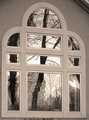
Reflected Branches Framed By Window Branchesby 777STANComment: I like the reflections shown. It has added interest for that. I think the greyscale is pretty flat. It's not quite black and white, not quite sepia... just somewhat of a grey tone with no real depth. I think the depth issue is from shooting a flat surface pretty much straight on. |
| Photographer found comment helpful. |
| 03/16/2010 03:41:39 PM |
honey farms worker takes a smoke breakby whiterookComment: I am not seeing a relationship to the challenge here. Perhaps this is your sister or cousin and there is a branch of the family tree?? Or perhaps Honey Farms is a subsidiary of a much larger corporation?? At any rate, you did good with the lighting on the back highlighting here hair but overall the shot has a fairly unnatural look to it due to what looks like over use of neat image. |
| Photographer found comment helpful. |
Home -
Challenges -
Community -
League -
Photos -
Cameras -
Lenses -
Learn -
Help -
Terms of Use -
Privacy -
Top ^
DPChallenge, and website content and design, Copyright © 2001-2025 Challenging Technologies, LLC.
All digital photo copyrights belong to the photographers and may not be used without permission.
Current Server Time: 08/27/2025 02:38:04 AM EDT.