| Image |
Comment |
| 04/26/2010 08:12:17 AM |
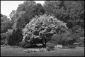
By the Wayby pixelpigComment: With the background clutter containing all the trees, the subject tree doesn't stand out well enough even though it is clearly a different tone. I am sure in color it must really pop out. |
 Photographer found comment helpful. Photographer found comment helpful. |
| 04/26/2010 08:11:02 AM |
Storm Comingby CJinCAComment: Good leading lines along the slopes as well as the snaking river taking tyou through the picture. Over all, there are not many highlights here and it looks as if most of the tones fall in the midrange with not much shadow either. It gives it a grey look. |
| Photographer found comment helpful. |
| 04/26/2010 08:08:59 AM |
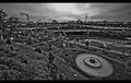
Somewhere by Joker1114Comment: This looks real good out in the background are but there is some severe lens distortion in the foreground of the bottom left corner. Everything just seems to droop off in the bottom left. |
| Photographer found comment helpful. |
| 04/23/2010 07:55:44 PM |
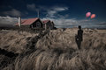
Closedby BrinComment: The two balloons look somewhat distorted. It appears to be some curvature possibly from the wide angle lens. Other wise... no complaints! |
| Photographer found comment helpful. |
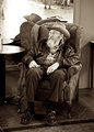
| 04/23/2010 10:19:59 AM |
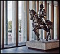
Imprisonedby pwm6Comment: Originally posted by pwm6:
Originally posted by EL-ROI:
WHAT??? YOU WERE ROBBED!!!! I voted this a 9!!! Great shot in my opinion! Don't let this discourage you because this was severely underappreciated work! |
Well, thanks! Your comments really cheered me up considering the very low score this got from the voters. I guess that the problem had to do mostly with what some saw as noise.
Actually this was a very difficult shot to do with basic editing because of the huge number of stops between the indoor and outdoor parts of the scene. I underexposed the indoor part to get at least some detail in the outdoor part and then used Topaz Adjust which brought back many of the interesting reflections in the horse but also gave the concrete a gritty look which I think some mistook for noise. |
I recognized the difficulty you had with exposing this during the contest and thought you might have done some adjustments or perhaps a one shot HDR effect through adjustment layers to get this... I saw the "noise" more as texture and detail during voting. Anyway, at least you know this was appreciated. Hope to see more good stuff coming from you in the future! If I had a member award to give, you'd get one! |
| Photographer found comment helpful. |
| 04/21/2010 08:13:10 AM |
|
| Photographer found comment helpful. |
| 04/21/2010 08:03:20 AM |
Imprisonedby pwm6Comment: WHAT??? YOU WERE ROBBED!!!! I voted this a 9!!! Great shot in my opinion! Don't let this discourage you becasue this was severly underappreciated work! |
| Photographer found comment helpful. |
| 04/21/2010 07:55:39 AM |
|
| Photographer found comment helpful. |
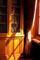
| 04/15/2010 08:34:18 PM |
Light breaks throughby kprasad9375Comment: I was one of your low voters and thought I would drop a comment. Here I find there is nothing for the eye to focus on. It follows the lines of the blinds across the photo and it is pretty much out of focus. It is kind of interesting that the light on each blind is a greyscale from highlight to lowlight, but there is nothing of detail to look at. |
| Photographer found comment helpful. |
| 04/15/2010 02:54:13 PM |
Watching the Contra Danceby tehbenComment: I would recomend getting closer and shooting up on the man as that would serve to add strength. I know you included the mirror for context, but it should be cropped closer to the head. It's more a candid shot than a portrait I know, but I think those improvements would help this and remove the clutter from around him as well (ie. the table at the right and the can on the table left.) |
| Photographer found comment helpful. |
Home -
Challenges -
Community -
League -
Photos -
Cameras -
Lenses -
Learn -
Help -
Terms of Use -
Privacy -
Top ^
DPChallenge, and website content and design, Copyright © 2001-2025 Challenging Technologies, LLC.
All digital photo copyrights belong to the photographers and may not be used without permission.
Current Server Time: 08/28/2025 04:38:30 AM EDT.