| Image |
Comment |
| 08/18/2011 01:29:15 PM |
|
 Photographer found comment helpful. Photographer found comment helpful. |
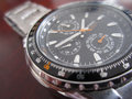
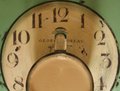
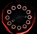
| 08/18/2011 01:25:32 PM |
Every second countsby littlemrshComment: Really great, even lighting on the glass face! Awesome job on that. There are many reflections in the watch case which is ok, but I would like to see it cleaner. Not possible without a light tent I know!! So for use of open natural light, you did a great job. |
| Photographer found comment helpful. |
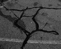
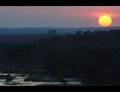
| 08/18/2011 01:23:06 PM |
Time Will Always Have It's Sayby ferrissComment: Decent perspective shot here. However it does suffer from lens distortion. Also the exposure is great for the foreground but leaves lots to be desired for the sky. It is washed out and white. |
| Photographer found comment helpful. |
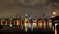
| 08/18/2011 08:52:23 AM |
Time = motionby HarlequinComment: I am not getting the sense of motion from this picture unless it is represented by that yellow line above the lights on the shoreline running from right to left and stopping about mid frame. Otherwise it is a very well done city night shot!! But movement is not highlighted very well. |
| Photographer found comment helpful. |
| 08/18/2011 08:50:23 AM |
|
| Photographer found comment helpful. |
| 08/18/2011 08:49:45 AM |
Time Fliesby franktheyankComment: I think I would have liked a landscape orientation better. But as it stands, very good job on the motion blur and the exposure! |
| Photographer found comment helpful. |
| 08/18/2011 08:48:00 AM |
Landscape Photographers - Right Place Right Timeby HarveyGComment: Right place, right time, wrong exposure! You got the sky exposed so well but the foreground is so dark. I can't make out any details. You really needed to bracket your exposures and blend in post. Or else use a gradient layer to brighten up the foreground and mask out the sky... |
| Photographer found comment helpful. |
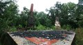
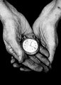
| 08/18/2011 08:44:10 AM |
Decay of 1927by geinafetsComment: The photo is very well processed and emotive. The title detracts from the emotion felt. But I am voting on the picture and not the title in this case because the title is not being used to shoehorn the photo into fitting the challenge. |
| Photographer found comment helpful. |
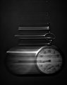
| 08/18/2011 08:42:03 AM |
8.15 a.m. - Coffee Timeby Alex_PetriniComment: You could have done without the light painting on this. The color of the light is not complimentary and the shape is not very even. The light on the subjects is good. A little more shutter and it would have been better exposed. |
| Photographer found comment helpful. |
| 08/18/2011 08:40:32 AM |
Time to goby StanleyDComment: I really don't get the set up on this... What is the empty poster frame for? And who puts a clock and a pot on their luggage when they are ready to go? It just doesn't make sense as a scene you would happen upon or to convey the message you are trying to convey. |
| Photographer found comment helpful. |
Home -
Challenges -
Community -
League -
Photos -
Cameras -
Lenses -
Learn -
Help -
Terms of Use -
Privacy -
Top ^
DPChallenge, and website content and design, Copyright © 2001-2025 Challenging Technologies, LLC.
All digital photo copyrights belong to the photographers and may not be used without permission.
Current Server Time: 06/27/2025 07:37:04 PM EDT.