| Image |
Comment |
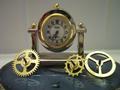
| 05/08/2002 11:04:00 AM |
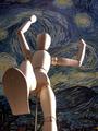
Wheels of Timeby janfriesComment: the clock face seems a little dark, perhaps using some white card stock or something to bounce some light into it would lighten it up without creating a glare. I'm not certain what the two "columns" are on the background. If they can't be removed, I'd consider moving your main elements so those strips are more centered on the rest of the image. You might also try the 10 to 2 or 10 past 10 settings for the clock hands (traditional advertising positions) -- that way they're not all bunched up in the same basic spot. |
 Photographer found comment helpful. Photographer found comment helpful. |
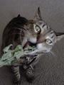
| 05/08/2002 10:44:00 AM |
Got Catnip?by SwashbucklerComment: A clever play on the got milk ads, but the focus really harms this one I think. Instead of a cat trying to get at the catnip, as gross as it sounds, to me it looks like a cat projectile vomiting. I think a sharper focus would have prevented this. |
| Photographer found comment helpful. |
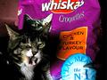
| 05/06/2002 03:03:00 PM |
Need We Say More!by sulamkComment: I hope this won't come across too harsh -- cause I like the idea in the pic -- but it looks kind of like the cat is gagging, not licking it's lips. It looks like you were shooting in low light and had to use a relatively slow shutter speed and so couldn't freeze the tongue too well, which is a shame |
| Photographer found comment helpful. |
| 05/08/2002 11:01:00 AM |
Priceless...by GeneralEComment: Because of the title, I'm trying to make this into a Mastercard commerical, but I'm not able to make the leap. Other than that, I don't know what else you might be trying to advertise. Cute children, I like the slide, but I find the other background elements detract from the kids. |
| Photographer found comment helpful. |
| 04/30/2002 11:32:00 AM |
over exposed selfby nbortonComment: it's interesting -- and I like the way you've left the image a horizontal instead of a vert -- I think I would have tried to find somewhere where the railing in the background could have been avoided -- focus completely on you -- but that's a personal taste |
| Photographer found comment helpful. |
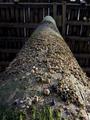
| 04/30/2002 11:39:00 AM |
Under the Pierby langdonComment: nice side lighting -- like the way the nearer barnacles sort of blend into just a texture as you get further away from the focal point -- don't now what to suggest to make it a better image -- maybe a slightly less centered composition? |
| Photographer found comment helpful. |
| 04/29/2002 03:09:00 PM |
|
| Photographer found comment helpful. |
| 04/29/2002 03:14:00 PM |
Towards the Lightby greenem2Comment: Very cool composition. The levels all look great. I love how well the texture of the brick comes out. |
| Photographer found comment helpful. |
| 05/01/2002 12:31:00 PM |
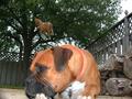
From the groundup horse they make dog food.by David EyComment: it almost looks like the dog is "dreaming" of the horse -- I find the logs on the right, and all the space on the left unnecessary to the idea you seem to be presenting, perhaps a vertical crop? The dog is also a lot brighter than the rest of the image (a flash, I'd guess) which would maybe be OK, except the horse seems to be the same color, just unlit... |
| Photographer found comment helpful. |
| 05/01/2002 03:46:00 PM |
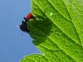
Looking up at a bug looking down.by tomlewis1980Comment: very fun macro -- it feels the tiniest bit fuzzy -- is that due to the camera or focal plane? the scratches/dust in the sky portion are kinda distracting -- and other than despeckle (which would make everything else that much fuzzier) I don't know what you could do to fix them -- somebody give this person a medium format film camera with a serious macro lens and watch out ;-) |
| Photographer found comment helpful. |
Home -
Challenges -
Community -
League -
Photos -
Cameras -
Lenses -
Learn -
Help -
Terms of Use -
Privacy -
Top ^
DPChallenge, and website content and design, Copyright © 2001-2025 Challenging Technologies, LLC.
All digital photo copyrights belong to the photographers and may not be used without permission.
Current Server Time: 08/17/2025 01:08:00 AM EDT.