| Image |
Comment |
| 06/11/2002 07:04:00 PM |
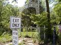
End of the Roadby DigipixerComment: Admittedly, I don't know what the background would do if you shot this way, but I would have been very tempted to shoot the humor of the lower sign straight on so you wouldn't be able to read the "exit only" sign. This reminds me very much of a cemetery my parents were doing some genealogical work at and the sign at the bottom of the road said, "Dead End." As it stands, the photo just seems a little busy in the background -- and the cemetery sign is a little hard to read -- I think because the left end has light colored leaves directly behind it -- the other end of the sign, with the darker background, is easier to read. Anyway, fun shot. |
 Photographer found comment helpful. Photographer found comment helpful. |
| 06/09/2002 04:50:00 PM |
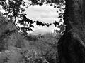
Mountain Through Treesby janfriesComment: I appreciate the way you used the tree and specifically those branches to frame the mountain, but I think it's almost too much framing. This is also really busy -- my eye doesn't really know where to go. Apart from the silhouetted tree in the foregound, the rest of the shrubbery just kind of blends into this patterned gray -- I almost didn't even see the river at first. OK, so a lot of crtiticism with no suggestions... It's because I'm having a hard time coming up with any for this photo specifically. Everything I start to write has to do with taking another picture, and that's not fair. There's a good range of tones, the focus is good, etc etc etc, it just doesn't work for me. So, instead of running off at the mouth, I'd be happy to discuss it later after voting. |
| Photographer found comment helpful. |
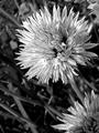
| 06/09/2002 12:52:00 AM |
Magnoliaby elemessComment: On my machine, this falls a little flat in the contrast area. I want some of this to be a brighter white -- and I think you could probably make the dark areas in the corners of the photo darker without losing too much information elsewhere. But, that might all just be my machine. Otherwise, I really like the composition -- makes me think of Georgia O'Keefe. |
| Photographer found comment helpful. |
| 06/05/2002 06:45:00 PM |
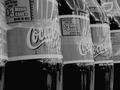
Have a Drinkby karmatComment: This is one I think I would have ignored the true highlights on and would have let them burn out a little further and go for the whites on the coke bottles as my base highlight. The angle on the bottles is a nice touch, adds a little interest to the shot. |
| Photographer found comment helpful. |
| 06/09/2002 12:36:00 AM |
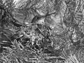
Nesting Hummingbirdby SwashbucklerComment: I can't think of the way I want to word this. The hummingbird and nest are very clearly visible in the picture, and yet they seem to get lost among all those pine needles. While I've tried very hard not to make comments like this, I wonder if the color of the hummingbird and nest would be enough of a difference from the needles to help set them apart. |
| Photographer found comment helpful. |
| 06/09/2002 12:48:00 AM |
Chive Flowerby KarenBComment: This is very pixellated but kinda cool because of it. Assuming that the artifacts aren't something you wanted, trying shooting at a larger image size and a higher quality -- then adjust these things to fit the rules in an image editing program. As for this picture itself, you might want to try to move other flowers out of the way so that only the one you really want the picture of is in the frame. This doesn't apply so much to the bloom in the lower right as it does the few petals I'm seeing in the upper right. |
| Photographer found comment helpful. |
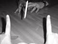
| 05/21/2002 03:05:00 PM |
Footballby karmatComment: This seems somewhat silly to me because at least one of the participants is a married man. But who am I to judge what games people can and can't play at what age. :-) I think it would have been a little more fun if kids were playing. It's an interesting set up though. I wish you could see a different angle of the "ball" but then you wouldn't have been able to get the great first person point of view. foreground hands were a little too cose to the flash and so washed out and all three shadows take away, in my opinion, from the finished image. Hard shot to get without a flash though, so other than a different flash location I don't know what to suggest. |
| Photographer found comment helpful. |
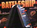
| 05/21/2002 10:39:00 AM |
Battleshipby #1 Bronco FanComment: Well, I already know you've received comments about the grain. Since this seems to me like an advertising shot, I'd suggest trying to move the box a little higher over the game so we can see all of the name of the game. I like the way the hands on the box look like they're actually playing the real life game (especially the one on the left). Maybe you could try doing that a little bit more on the right too. |
| Photographer found comment helpful. |
| 05/21/2002 03:57:00 PM |
Monopolyby tomlewis1980Comment: My favorite of the Monopoly shots. Took for granted that we didn't need to see a major portion of the board or anything like that. (Plus, it's the Brit version. Woo hoooo.) Nice texture captured on the board and money. I appreciate the tears in the bills that show this set has been well used. Nice back lighting on the playing piece. The one thing that doesn't work for me is the overall color (two much of that blah green color that the board and 500 bills are). With the way everything looks aged already, what about a duotoned/sepia toned shot that made it look like an old photo? |
| Photographer found comment helpful. |
| 05/21/2002 10:30:00 AM |
The Games Cats Play. . .by FranziskaLangComment: Is that cat food, or somebody's fingers on top of the Jenga tower? This is very dark -- even a simple "auto-levels" in PS might help. The focus is also very soft -- perhaps in part to the dark shooting environment. I think maybe pointing the camera a little further to the left (moving the subject further into the frame) would have been beneficial. |
| Photographer found comment helpful. |
Home -
Challenges -
Community -
League -
Photos -
Cameras -
Lenses -
Learn -
Help -
Terms of Use -
Privacy -
Top ^
DPChallenge, and website content and design, Copyright © 2001-2025 Challenging Technologies, LLC.
All digital photo copyrights belong to the photographers and may not be used without permission.
Current Server Time: 08/17/2025 01:07:25 AM EDT.