| Image |
Comment |
| 04/29/2005 06:10:55 AM |
Keeping Fitby DannyMComment: The foreground is too boring and not doing anything for this photo, but it fits the theme, maybe you should have lifted your camera higher, having the man lower in the frame, near the bottom and the trees filling the space at top, that would have made more interesting photo, I think. |
 Photographer found comment helpful. Photographer found comment helpful. |
| 04/29/2005 06:03:07 AM |
|
| Photographer found comment helpful. |
| 04/29/2005 06:00:54 AM |
Tomato Cocktailby photogenixComment: Nice idea, but it's like it's taken handheld with slow shutterspeed, making the glass and tomatoes not sharp enough. |
| Photographer found comment helpful. |
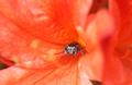
| 04/29/2005 05:59:30 AM |
I'm watching you!by BeetleComment: the bug is too near to the center imo, it should be placed a little bit lower and to the right to get the composition needed to make a better outcome for the photo. |
| Photographer found comment helpful. |
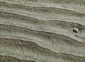
| 04/29/2005 05:57:26 AM |
Rippled Sandby EvaanComment: Good idea that you've got there, but you didn't do the best out of it imo. The stone should have been placed lower and a little bit more to the left (but still on the right side), you should have had the rule of thirds in mind for the composition in the photo. |
| Photographer found comment helpful. |
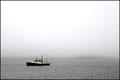
| 04/29/2005 05:54:22 AM |
mooringby byoungComment: Nice image fitting the theme well, but would be better with the boat placed more to the right so it wouldn't be like it's sailing out of the frame. But the faded hill in the fog at the right helps. |
| Photographer found comment helpful. |
| 04/29/2005 05:45:29 AM |
|
| Photographer found comment helpful. |
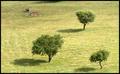
| 04/29/2005 05:44:43 AM |
Standing Tallby rexComment: there's nothing interesting enough in this photo to catch my eye. The trees are too blurred also. If they were sharper, then this would look better. |
| Photographer found comment helpful. |
| 04/29/2005 05:37:48 AM |
An inhospitable place to growby audinutComment: I think you've overdone the sky, the clouds are burnt out and I don't like the light blue color in them. Otherwise this idea is good, but I think that you should have taken this closer to the plants and then vertical, but leaving space above it as you do now. |
| Photographer found comment helpful. |
| 04/29/2005 05:34:20 AM |
The Lonely Parkby SlowPoetComment: Very well seen motive, but if you would have just cut the shadow at the top off, then this image would be A LOT stronger, just try, maybe you will agree. |
| Photographer found comment helpful. |
Home -
Challenges -
Community -
League -
Photos -
Cameras -
Lenses -
Learn -
Help -
Terms of Use -
Privacy -
Top ^
DPChallenge, and website content and design, Copyright © 2001-2025 Challenging Technologies, LLC.
All digital photo copyrights belong to the photographers and may not be used without permission.
Current Server Time: 08/05/2025 10:29:15 AM EDT.