| Image |
Comment |
| 02/08/2003 10:41:24 AM |
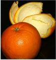
Peeledby svitalComment: Strange border, thick on 2 sides and thin on 2 sides. The composition is decent, but there are odd effects in the background. The lighting is a little harsh. More diffusion (with paper or cloth over the light) would help get rid of that hotspot on the orange. |
 Photographer found comment helpful. Photographer found comment helpful. |
| 02/08/2003 10:39:31 AM |
|
| Photographer found comment helpful. |
| 02/08/2003 10:37:49 AM |
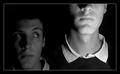
Growth Spurt!by KonadorComment: This is nice. I love the rich black and white tones. However, I'm not sure if your dramatic lighting and composition really suit the subject matter. In another context, this would have been really cool, but just to show the effect of a growth spurt... it seems like you're subverting your theme for humorous purposes, but it doesn't quite work. |
| Photographer found comment helpful. |
| 02/08/2003 10:36:01 AM |
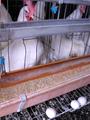
Sky-scraper topping out--before and after.by catpixelComment: You seem to have a low end camera, but I used to, so I sympathise. I think this photo would be a lot stronger if you worked on the tonal depth in some image processing software. The composition is OK. It's hard to photograph a tall building effectively. There are many examples to look at on this site. I think you could have cropped out the dark spot in the top right corner without losing anything. |
| Photographer found comment helpful. |
| 02/08/2003 10:32:25 AM |
Pop!by chakkobboComment: Interesting idea, but I think the light is a little too harsh. There are hot spots on the corn kernels and dark shadows. Also, the composition is a bit loose. |
| Photographer found comment helpful. |
| 02/08/2003 10:30:05 AM |
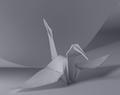
Origamiby mcmurmaComment: I love this! The crispness of the paper is gorgeous, and origami is something I enjoy a lot. It seems a little too grey, though. A little bit longer exposure would be more to my taste. Composition is perfect. |
| Photographer found comment helpful. |
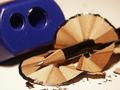
| 02/08/2003 10:26:41 AM |
... and the sharpener wins!!by CreativeFlyPhotoComment: Effective DOF, bringing the focus right to the tip of the pencil. The composition is strong. I like the textures ofthe wood shavings, etc. Thematically, it's on theme, but it doesn't grab me. |
| Photographer found comment helpful. |
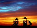
| 02/08/2003 10:20:05 AM |
Playtime is over after 6 monthsby Frank BeckmanComment: This photo is effective with the title. Without it, the connection to the challenge is loose. I think it passes though :). Spectacular sunset, which I'm sure you're getting a great response to. I like the framing of the playground. |
| Photographer found comment helpful. |
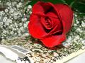
| 02/08/2003 10:17:54 AM |
Baby's Breath in Bloomby GekkerComment: I don't quite see the point of the rose. It doesn't look like a real flower, either, it looks like fabric. The baby's breath is lovely, with that shallow DOF effect turning it into a pretty white cloud. I think you could have taken a great photo without the rose. |
| Photographer found comment helpful. |
| 02/08/2003 09:34:12 AM |
|
| Photographer found comment helpful. |
Home -
Challenges -
Community -
League -
Photos -
Cameras -
Lenses -
Learn -
Help -
Terms of Use -
Privacy -
Top ^
DPChallenge, and website content and design, Copyright © 2001-2025 Challenging Technologies, LLC.
All digital photo copyrights belong to the photographers and may not be used without permission.
Current Server Time: 08/26/2025 12:29:31 PM EDT.