| Image |
Comment |
| 02/13/2003 06:52:05 AM |
Where Valor Proudly Sleepsby MiekaComment: Good perspective, but the photo is busy. It doesn't need all the trees to be there. Take a much smaller crop of the photo and you'll have something with loads of impact.
In fact, I just tried it out. I cropped it, enlarged it slightly, sharpened it and played a little with the colours, then added a border. Tell me what you think:
//lisa3d.org/images/photos/dpc/valourExperiment.jpg |
 Photographer found comment helpful. Photographer found comment helpful. |
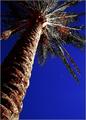
| 02/13/2003 06:42:21 AM |
Moon Palmby AnnidaComment: Anniiiiiiida.... i love the vivid colours in this photo, but after seeing a bunch of others so far in voting on this challenge, the low resolution of the camera does stand out, making the photo seem soft. I also don't think it focussed on the top of the palm tree. The very closest part of the tree is sharper. It's so bold and vivid though, I like it :). |
| Photographer found comment helpful. |
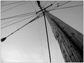
| 02/13/2003 06:39:45 AM |
The Squirrel Highwayby RuchartComment: Interesting lines, and nice textures on the pole. The composition is good. The Black and white has nice, rich dark tones but doesn't seem to go all the way up to the whites, making the photo a little too grey overall for my liking. I just tried playing with it, and with a lighter sky the pole stands out beautifully. Perhaps it's because my monitor is calibrated for the squares on the bottom of the voting page. |
| Photographer found comment helpful. |
| 02/13/2003 06:36:52 AM |
The Guardiansby DennisFComment: Lovely shallow DOF and rich black and white. I'm not sure that the subject of the photo is interesting to me though. If it had more texture and weathering, or was more fancy, it would hold my interest, but this seems kind of static and boring. |
| Photographer found comment helpful. |
| 02/13/2003 06:29:14 AM |
Structures of an Old Factoryby nathaliedooComment: Very cool textures, and the use of perspective is great. I feel like it's a little tilted though, and underexposed since the colours are all a bit pale. If you turned up the saturation a little it could have been very vivid. I just saved it and tried playing with it, and it looks VERY cool in high contrast black and white too. |
| Photographer found comment helpful. |
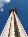
| 02/13/2003 06:25:01 AM |
Looking up to the skiesby xertionComment: This photo is dramatic and effective but a little monotonous. The centred composition is very formal, and there isn't much about the tower that captures my interest. The little puff of cloud in the top left is a great touch though. |
| Photographer found comment helpful. |
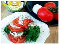
| 02/09/2003 10:16:55 AM |
Insalata Capreseby GraciousComment: So colourful! This would look great in a cook book, to tempt you to try out the recipe on the opposite page. As a work of art it isn't as interesting to me, but as an illustration it works well. |
| Photographer found comment helpful. |
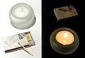
| 02/09/2003 10:15:07 AM |
|
| Photographer found comment helpful. |
| 02/09/2003 10:13:05 AM |
Day and Nightby elgominComment: Cool! You did really well to set this up. The rotational symmetry of the piece is a little too static and formal for me, but I appreciate that technically it is a very good photo. |
| Photographer found comment helpful. |
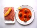
| 02/09/2003 10:11:26 AM |
Matballs, my recipe...by pitsamanComment: It's hard to enjoy a photo like this when you don't eat meat, but it's nicely composed and has an interesting, soft focus look to it. I like the different shapes of the plate and the meat tray. The chilli (pepper, whatever) is a nice touch. Overall, though, it's a little bit flat and washed out. |
| Photographer found comment helpful. |
Home -
Challenges -
Community -
League -
Photos -
Cameras -
Lenses -
Learn -
Help -
Terms of Use -
Privacy -
Top ^
DPChallenge, and website content and design, Copyright © 2001-2025 Challenging Technologies, LLC.
All digital photo copyrights belong to the photographers and may not be used without permission.
Current Server Time: 08/26/2025 10:19:47 AM EDT.