| Image |
Comment |
| 10/10/2003 02:44:38 AM |
Singing Walkway between buildingsby GrandmaEMTComment: I really like this image. It could use a slight clockwise rotation. Also, did you consider different viewpoint? Like taking it from lower on the ground. The center is not bad as it creates interesting symetry, but it is a bit off. It also need tiny colour boost. 7 |
 Photographer found comment helpful. Photographer found comment helpful. |
| 10/10/2003 02:33:05 AM |
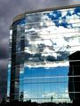
urban landscapeby ursulaComment: Wow, this almost looks unrealistic as the sky in the reflection doesn't match the sky around the building. The whites are blown out and the darks lost detail. Maybe too much contrast adjustment? Otherwise not bad image, interesting to look at. |
| Photographer found comment helpful. |
| 10/10/2003 02:29:31 AM |
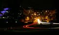
Light By Nightby browntComment: I've see the other similar image in this challenge, but this one has better composition. I also like the blue building on the left to balance it off. Great sharpness and dof. The car light trails are wonderful as they lead you into the street. Good night shot. |
| Photographer found comment helpful. |
| 10/10/2003 02:27:42 AM |
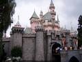
Fairytale Dreamsby larimarieComment: Too bad you chopped off the top of the tower. Image needs brightening a little and colour saturation adjustment would have liven it up a little. I would have also included a tiny bit more of the trees and the water on the bottom to frame it better. |
| Photographer found comment helpful. |
| 10/10/2003 02:23:38 AM |
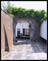
Intimacy of a townby fanfuineComment: Oh, this makes me homesick for Europe. Great capture. The whites are a bit lost due to slight overexposure, but it still hold the image. A lower viepoint could have also made this more unique. |
| Photographer found comment helpful. |
| 10/10/2003 02:17:40 AM |
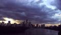
River City at Duskby sleekrComment: Great dramatic sky, but the image lacks detail. There is nothing visible in the lower left corner. The buildings look flat. It looks overprocessed. Good use of thirds and lower horizon. |
| Photographer found comment helpful. |
| 10/10/2003 02:15:45 AM |
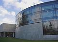
My town's libraryby Bela45Comment: Good composition. It looks almost abstractive - I like that. Consider using polarizer to cut down the reflection in the windows. It could have been neat to see through the windows inside the building (which with polarizer is possible). The sky is greatly dramatic. Your image is a bit pixelated - maybe too much compression? |
| Photographer found comment helpful. |
| 10/10/2003 02:12:29 AM |
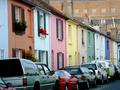
Kemp Street, Brighton, UKby Apollo2077Comment: This is fun to look at. Amazing colour. Sharpness is good too. It feels a bit claustrophobic though. Somehow I feel that there needs to be more space on the right hand side - maybe to let the street go into the distance. But still one of my favs. |
| Photographer found comment helpful. |
| 10/10/2003 02:10:25 AM |
Where the Sidewalk Endsby GrandmomComment: Great composition and dreamy feeling. I would have fixed the purple colour cast due to wrong white ballance. There is way too much sky left, you could have zoomed more in or make it a landscape orientation to emphasize the dissapearing perspective. |
| Photographer found comment helpful. |
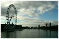
| 10/10/2003 02:08:07 AM |
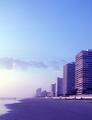
High Tide on the Thamesby e301Comment: Slight underexposure - deatils lost in the dark portions of the image. Can be fixed through levels. Composition is very good, sharpness OK. Great dof and perspective too. |
| Photographer found comment helpful. |
Home -
Challenges -
Community -
League -
Photos -
Cameras -
Lenses -
Learn -
Help -
Terms of Use -
Privacy -
Top ^
DPChallenge, and website content and design, Copyright © 2001-2025 Challenging Technologies, LLC.
All digital photo copyrights belong to the photographers and may not be used without permission.
Current Server Time: 06/17/2025 06:03:22 PM EDT.