| Image |
Comment |
| 08/18/2004 12:15:59 AM |
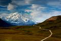
Road to Denali by crabappl3Comment: This is one of the most beautiful photos I've seen in a really long time.
Added to faves. Congrats on the well deserved blue! |
 Photographer found comment helpful. Photographer found comment helpful. |
| 08/16/2004 06:27:43 AM |
Switch-stance 180by ImagineerComment: I thought this was a lock for a ribbon.
4th place is awesome, but this definitely deserved a ribbon. |
| Photographer found comment helpful. |
| 08/12/2004 05:09:44 PM |
MKT Trail, Columbia, Missouri-2004by dustin03Comment: Interesting colors. I can't say I'm a fan of it, but it's definitely different, and that I like.
I like composition of this image. Really fantastic, and, they more I look, the more I do like the colors. It just doesn't look natural, although I'm not saying that it isn't. 8. |
| Photographer found comment helpful. |
| 08/12/2004 05:07:04 PM |
Transitionsby boomerComment: I'm all for high contrast images, but I think this one is a little too high contrast.
That aside, I really, really like it. :| 7. |
| Photographer found comment helpful. |
| 08/12/2004 05:05:32 PM |
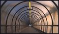
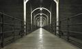
Tunnel Visionby FalcComment: I could do without that guy there, but very cool.
The colors seem kind of flat, but the composition is perfect. 7. |
| Photographer found comment helpful. |
| 08/11/2004 03:55:50 PM |
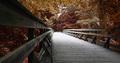
Pedestrian and cyclists onlyby RUEDISCHMUTZComment: Definitely the best so far.
The only thig that bugs me, is on the left we see a bar that's close to the edge of the photo, where as on the right, we don't. It's just a little distracting, since it makes the left side a little heavier than the right. I think cropping it out would add to the greatness of the photo. 9. |
| Photographer found comment helpful. |
| 08/09/2004 12:14:46 AM |
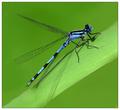
Damselflyby JackoComment: I gave this one a 9. Was my favorite from the challenge. Congrats on this, and the other ribbon. |
| Photographer found comment helpful. |
| 08/08/2004 06:16:05 AM |
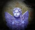
Blue Angelby pearcerComment: I think there's a little too much dead space at the top. So a tighter could make it a little stronger, in my opinion. I like it very much, though. 8. |
| Photographer found comment helpful. |
| 08/06/2004 04:51:54 AM |
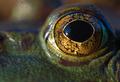
Quite a Lookerby GatorguyComment: Very cool, but, I think it could use a better composition. It just looks odd with the eye where it is. |
| Photographer found comment helpful. |
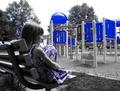
| 08/02/2004 03:29:12 AM |
Blue Park Bluesby taterbugComment: Looks a little bit too saturated. And there is some blue on the trees that think couldn't have been removed. Composition is great. Focus is good. 6. |
| Photographer found comment helpful. |
Home -
Challenges -
Community -
League -
Photos -
Cameras -
Lenses -
Learn -
Help -
Terms of Use -
Privacy -
Top ^
DPChallenge, and website content and design, Copyright © 2001-2025 Challenging Technologies, LLC.
All digital photo copyrights belong to the photographers and may not be used without permission.
Current Server Time: 09/04/2025 05:14:57 PM EDT.